Women Overcoming O-Syndrome

The author says:

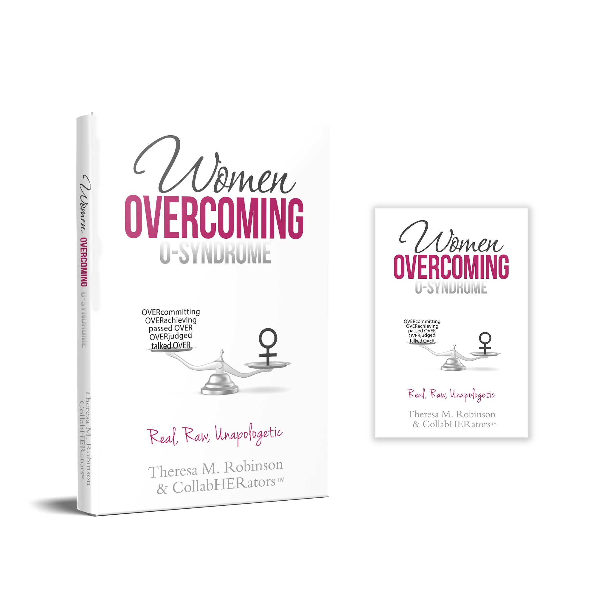
This book is for professional women, ranging in age from 20+ to 60+, who live with the challenges of men talking over them, passing over them, and over judging them. The book is also for these same women who tend to grapple with the self-imposed pressure to over achieve and over commit themselves. These experiences are described as O-Syndrome. The book is filled with stories, advice, and strategies from badass women who are overcoming O-Syndrome at work and in life!

The cover design is not a quick concept but the finished design minus any refinements. Thank you!

Nathan says:

At the risk of being accused on mansplaining… [That’s a joke. Stand down.]

The first thing I saw is the all-white background. As most online bookstores have white backgrounds to their pages, the cover image ends up not having any visual boundaries.  Even just a line around the border can help.

(Full disclosure: The full image send to me is below, and I trimmed it for presentation here. But unless the plan is to include that gray glow as part of the ebook cover when it’s uploaded, the criticism stands.)

Second point: The novelty term on the cover (and in the title) is “O-Syndrome.” A novelty term like this is intended to be something that catches the browser’s eye and makes them ask, “Huh — what’s what?” Not only is “O-Syndrome” in the smallest type of the three words in the title, the gradient makes it even less noticeable.  You can still have “Overcoming” in magenta, since it implies contrast/conflict with “O-Syndrome,” but you should make “O-Syndrome” the largest word in the title, and at least give the letters a solid border. (Given that it’s a neologism, you should consider placing it in quotation marks, signaling to readers that it’s a term you’ll be defining, not one with which they should already be familiar.)

Third: While the book as described is largely about assertiveness, the general feel is not overbearing, and that’s good; the way to overcome at work is to hold your own while not making enemies, after all. But the “Real, Raw, Unapologetic” line drags it into overbearing territory — that’s the kind of wording one uses on placards and Facebook where the the goal is to sharpen discord.

Third-and-a-half: You’ve got one too many fonts here; the elegant cursive of “Women” clashes with the casual cursive of “Real, Raw, Unapologetic.”

Fourth: Maybe it’s just me, but the insertion or erasure of incidental gender terms into other words — “HERstory,” “womyn,” and in this case, “CollabHERators” — seems to me to be more of a hallmark of the strain of feminism which focuses on highlighting and winning systemic gender conflict.  I don’t understand this book as principally being about fighting the nebulous “patriarchy,” so I think that’s a bit of a false flag.  And putting “TM” after the word is unbearably cutesy.

Other comments?

NOTE: Tensions have run a little high among commenters over social hot-button topics of late. Please don’t wade into either criticisms or defense of feminism, “the patriarchy,” etc. any further than I’ve gone, i.e., only bring it up in the context of how connotation of terms affects the possible perception of the cover’s audience. 

The Lost Colony

The author says:

Searching for the wreck of an eighteenth-century Spanish treasure ship, underwater salvage expert Jax Malone discovers an uncharted island, and the Holy Grail of historical mysteries. When he and his crew are attacked by natives on the island, the Americans are rescued by an unlikely troop of soldiers from the past, descendants of the English colonists who were sent to settle the New World over four centuries ago – then vanished without a trace. While stranded on this island, Jax and his crew are relieved to be among civilized people, and exploring the old world commonwealth that they’ve built. But they gradually find that things are not as they seem. When their group becomes separated between the English and the natives, the Americans discover that their survival is further threatened by another force, one which they have even less control over.

Nathan says:

It took me a second — which is too long for a book cover — to identify the image as the top of a palisade (at first I took it to be some kind of cathedral). My impression from that, combined with the antique type, is of a purely historical novel, probably one detailing how the lost colony was lost.  Given that your setting is the present day and your protagonist is a modern American who discovers the lost colony, I would suggest a mix of elements with both a historical and modern flavor — either both present in the image itself (a modern semi-automatic juxtaposed with a flintlock, for example), or a historical image combined with a modern typeface (a flintlock with a modern military stencil font, for example).

It’s also waaay too bright and cheery for a novel with so many suspenseful/dangerous elements.

Other comments?

A Forsaken Breath

The author says:

Only God defines the future. Jessica Thaller struggled to complete anything in life. She quit college twice, jumped from one entry-level job to another, and let Hector crawl back into her heart one too many times. The last reconciliation resulted in her getting pregnant. Jessica decides to keep the baby over the objections of her boyfriend and parents. Jessica wakes up from a coma unable to recall the event that landed her in the Intensive Care Unit. Her very survival sparks a national firestorm over a forsaken breath. How does she deal with those who despise her existence? God has a purpose for the tragedy, but will she stay on the path he gave her long enough to see the reason for her life?

Genre: Christian Thriller

Nathan says:

I’m a little stymied here.  I really can’t tell what the novel is about — i.e., the “national firestorm” described in such vague terms in your description that I’ve got no idea what you’re talking about.  The cover’s competent, but not really intriguing — but without a description that actually spills the goods, I’ve got no idea what direction it needs to be intriguing in.

All We Hold Dear

The author says:

After the murder of her grandmother, Dora Baskin inherits her home, a 172-year-old log house in Manitou Springs, Colorado. Was the murder a random act of violence, or something more sinister? With her new friend, Shawn, Dora gradually finds the answer in a handwritten account of one of her ancestors, Isadora Byrnes, a nineteenth century Englishwoman taken in by a Cherokee family. In the pages of this journal, they learn about the secret organization which spent decades pursuing Isadora Byrnes to America, beyond the Trail of Tears and into the Rocky Mountains, seeking to acquire the mysterious silver artifact she possessed. They also find that this organization is still around, and they still want that artifact. And they think Dora has it.

Nathan says:

Nice try, but I can see misfires at every turn.

First: This is a thriller/mystery with a centuries-old secret society, right? Something like that should have high contrast and plenty of shadows, not be all sunny and cheerful. This cover looks from the get-go like it might belong to an uplifting historical novel (possibly even a “mail-order bride” romance).

Next: Most of these cheap stock image models are cheap for a reason. I have no idea what the expression is on the mail girl’s face, but it makes me want to slap her. The central girl above her looks like she’s been eating hashish brownies.  And the digital airbrushing on everyone’s costumes is pretty noticeable, as are the hard edges where they were cut-and-pasted together.

Third: Nothing about Celtic knotwork says “Colorado” or “Cherokee.” Plus, its inclusion in the type (along with the internal shadow, external glow AND drop shadow) renders everything completely unreadable at anything less than full size. (And even at full size, as God is my witness, I thought the title read” All We Hold Bear.”

I think you need to scrap this and start again with a cover concept that conveys a primary impression of “suspense,” and a secondary impression of “historical.” A dark rustic cabin at night, with light coming from a single window, and clear but slightly antiquated type, would serve the sales needs of the novel 1000% better than what you have here.

Other comments?

Colfax and Dead

The author says:

Book Description: Life is tough. Living on Colfax, the longest wickedest street in America, it is often fatal. Since Daxx died, the world keeps trying to put him back in the ground. There is much for Daxx to do, however; seek forgiveness, make sure his daughter doesn’t end up on the streets, and figure out why the hell he doesn’t die. A beautiful lady hires Daxx to find her brother, someone’s kidnapping the homeless, and his daughter still hates him. Daxx needs to solve the case to get paid. Life may be cheap, but living even for the dead is not.

Genre: Urban Fantasy

Comparable books: Dresden Files, Felix Castor, Grave Report

Nathan says:

The image is okay — not great, but adequate as a starting point; however, the font choices doom it.

Let’s take a look at the three comparable series you cite. Here’s The Dresden Files:


Here’s Felix Castor:

And here’s The Grave Report:

What do I see in common?

  • Dark backgrounds. You’ve got this one.
  • Strong typography. (I actually think that the Felix Castor type is a little weak, especially with the byline that keeps blending into the background.) This is a major failing in your cover. Your type politely declines to intrude on the rest of the cover, and the bloody font for “Dead” falls flat.
  • A dominant color. If you look at covers for these and other paranormal fantasies, you find that the initial impression of “magical” is conveyed by the color, long before the viewer can actually pick out any specific details.
  • Some visual detail that further conveys “magical” and distinguishes it from an urban drama. For The Dresden Files, you can immediately see the silhouette of the uncommon hat, and secondarily the staff.  For Felix Castor, the magical element is actually in the title type on each cover.  For The Grave Report, it’s the mutilation of the head on each figure.  By contrast, your image is just a guy at night. (And the hoodie doesn’t help things — it’s become a visual cue for real-world social drama, not escapism.)

I think you could work backwards in conceptualizing your cover. Your book (and, presumably, series) is about a guy who doesn’t die; could he have several bullet holes and a machete sticking out of his back?  Then work on finding a color scheme that features a limited palette of bright colors against a dark background, and then top it off with strong, bold typography.

Other comments?