The author says:
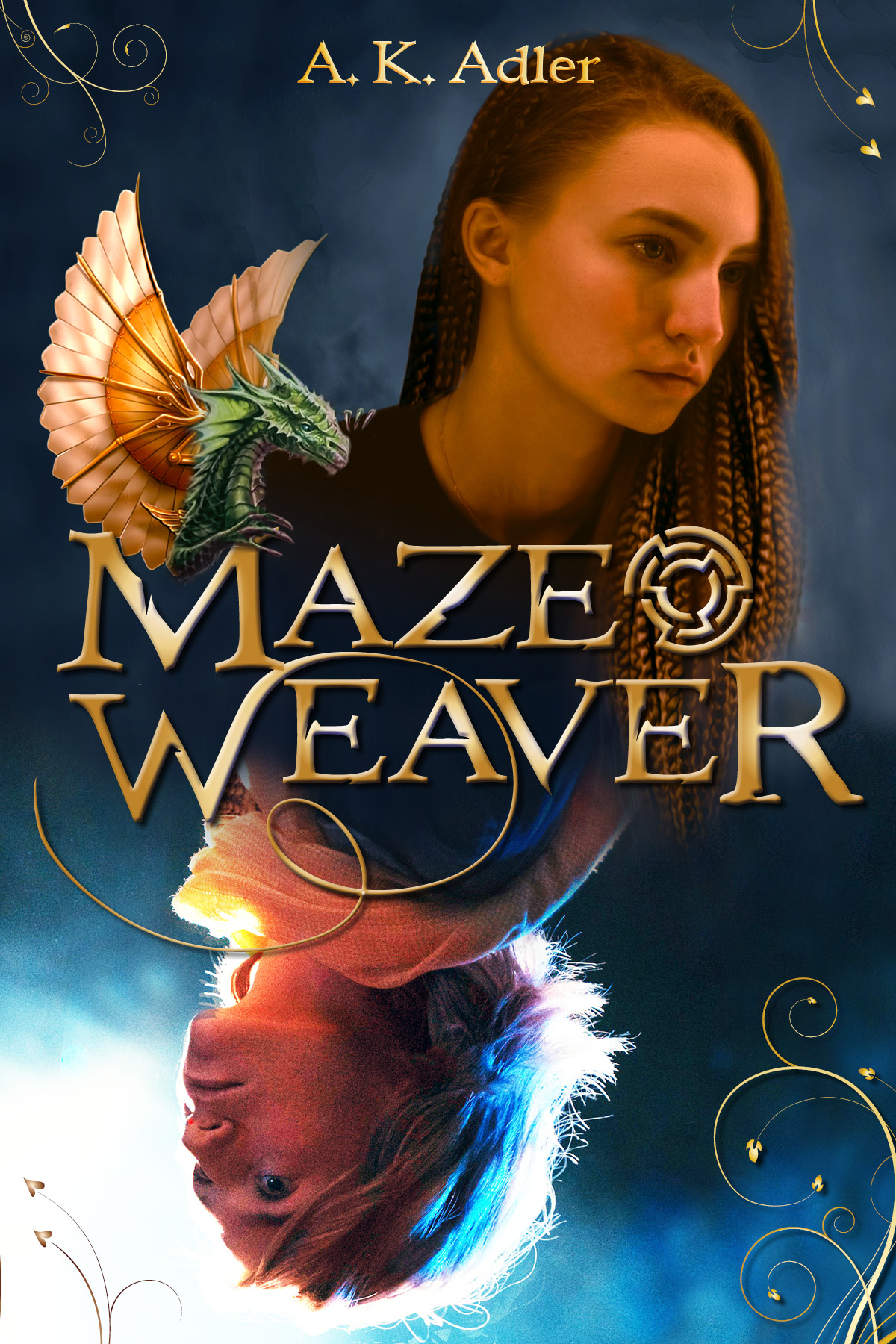
YA fantasy (sequel, so I have to have the same models on this cover as on the first book, which you can see here: https://www.goodreads.com/book/show/62990067-dreamwalker )
Nathan says:
For everyone’s reference, here’s that first book’s cover:
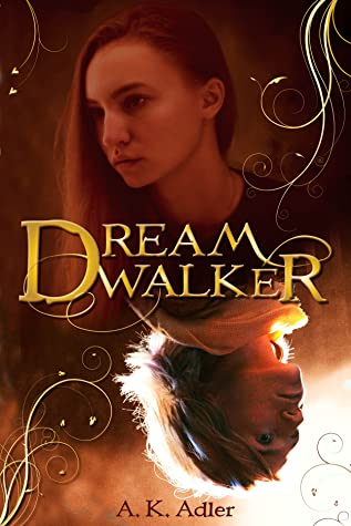 Well, you’ve definitely got branding down…
I think the biggest problem with both covers is that the photo you have on top is just not impressive — between the lack of expression and either the poor original photography or the processing which washes out a lot of the contrast, it’s a lot less worthy of focus than the lower photograph. However, if you flipped it, the currently-on-top photo would be even less worthy of attention, and the readers who focused on it (secondarily, after the top image) would subconsciously feel that they had expended the brainpower to interpret an upside-down image with no real payoff.
My advice is to revise both covers, using the bottom image as your main image, and ditch the whole concept of the flipped upside-down images. I see from your book’s description on Goodreads that parallel/linked identities is a big part of the novel, but I think you can find a different way to indicate that visually.
Other comments?
Well….yup, the branding is definitely there.
I know that you, submitter, said that you need to use the same models, but isn’t this layout actually using the same exact image, but rotated? That’s how it looks to me. So, I’m inferring that you cannot, actually, find other poses, etc. of these two, is that right?
I have to wonder if Nathan’s advice is the best–nuke the two-head idea (Vertical Janus!); preferably find a model that has a portfolio, on DP.com, or one of those, so that you’re not left holding the model bag, and do a new cover concept, the one-head concept, for both books. I know, I’d rather not have anyone suggest that to me, either, but…it would be less restrictive for you, in terms of a series, than what you have now. If this series starts to really run on, you’re going to be jammed up. Getting yourself some breathing room, now, early on, relatively, might be the smart play here.
I’m not sure that the upside-down heads are really doing for you, what you think that they are.
Other than that, there’s a lot about these covers to like. I love the coloration in the suggested second book’s cover. I like the play of the blue against the Fire-Lizard’s goldish wings. Nicely done there. And pretty nice work with the fonts, too. Better than MANY that we see here.
You should heed Hitch’s advice about finding a model with multiple poses. Why would you want to use the same image for both covers anyway? (I also don’t like the two-headed idea.)
The title font/treatment is nice, though maybe a little too heavy and reliant on the Photoshop effects, which look a little dated to me.
I think the author name should be much larger and at the bottom.
https://imgur.com/a/46PFAKB
this is a quick crude example attached here.
adding light to the woman would help a lot as would continuing the texture that’s on the bottom to the top but I really think you need a new model unless this will be only 2 books because it’s already a hair on the redundant side to have the same image on both covers.
I get you changed the woman’s hair but on first glance, it’s the same just flipped and recolored.
The close up of the head is probably not the best idea for this genre anyway. A nice fix might be to find an active image of a woman. I don’t mean use the attached it’s just a quick mockup to better show what I’m trying to say here. you don’t need to show the woman’s face in either ‘world’ is all you need is a woman and an active pose. The colors of the top and bottom should mesh, the light and dark should draw the eye with neither overpowering the other except intentionally to make something more prominent like here the light is just a hair brighter on the bottom to both highlight title and the feet. you don’t need to show your story at all. what you need to show is the tone of the story, so pick the sort of activity the girl would be doing and the sort of background texture that shows her environment like magical effects or castles or whatever it is that makes the book unique. (I picked at random) it think if you added some indisputably modern detail to the woman in this world (maybe a modern lamp post to the top and an old-fashioned light to the bottom. something like that) and an otherworldly detail to the other world half that would be more than enough to get the point across.
I loved your text. I liked your flourishes on the edges. I was just too lazy to duplicate it. I think that’s all you really need for series branding.
I agree with Shel’s comments about the font and I agree that’s likely all you need, generally (!!) for branding. I also like her idea about the two worlds–being contrasted some way that’s obvious on the cover if that contrast exists in the plot.
I know this will sound bizarre, but I find that model’s philtrum distracting. I really do. The first I noticed it, I thought it was a flaw in the artwork; then I realized it was her philtrum and…to me, it draws the eye–not ideal. It’s simply very deep and in this image, it’s dark. I would encourage you, submitter, to find a different model for the new covers.
HTH.
I appreciate the attempt at branding, but each primary image shlould be unique and reflect the story. Also, if you include a symbol for one, include one for all that fits the title.
Make more room for the byline and make it bigger. Show the world you’re proud of your work (assuming that’s the case).
Too much. You could easily dispense with all of the extraneous decorative details, from the swirlies to the dragon and maze device.
The face is very unattractive and would put me off.