The author says:
Something peculiar is lurking beneath the prestigious veneer of The Blanchard Corporation. Sam Maxwell is a recent college graduate who accepts a surprisingly generous job offer to work for the high technology giant. Meanwhile, his life is surreptitiously watched and evaluated by a board of directors anxious to recruit candidates into their clandestine consortium. He’s unwittingly drawn into a dangerous chain of events that lead to his premature discovery of a secret program that’s simply known as: The Initiative. THE INITIATIVE: VULNERABILITIES is the first in a series of thriller novels that follows the extraordinary covert career of Sam Maxwell (starting in 1994).
Nathan says:
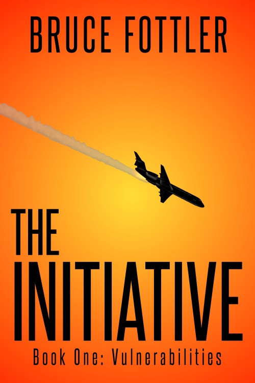
It’s a good clear cover, recognizable and readable at thumbnail side, and the no-nonsense type and image of the airplane definitely puts it in the “suspense” category. So how can we tweak it to turn it up to 11?
Is the angle of the plane supposed to indicate that it’s going down? If so, I think that deepening the background hue from top to bottom would strengthen that impression by giving a clear idea of the horizontal for the diagonal contrail to contrast.
If you do that, changing the title type from black to white with a black border or drop shadow would help it stand out against the darkened background; it would also give a bit more variety to the whole thing.
Any other ideas?


I like it, although I’m not convinced the plane going down alone hints hard enough at the high-tech in the description. For me there was a small disconnect, as in I wasn’t sure how to interpret the plane in relation to the description. Is it suggesting that the Initiative is a terrorist-type program? As Nathan said, it does suggest thriller but I worry that it may not be quite strong enough an image. Although, the cover is clean and simple yet bold and catching so my concerns over the plane may be just a personal thing, and maybe the plane is the perfect fit for the plot, in which case, ignore the hell outta what I just said!
One other thought: While I’m not one for making a big fancy “do” of type, this black against the orange/yellow could use a little dimension, IMO. Nothing major, a slight simple shadow or something to give the cover an added bit of depth. Right now with simple black type and the black image of the airplane, they “feel” one note.
I do like this overall, in large and thumbnail. Any changes should be subtle, I think. You’ve got cover ba-da-bing going on here.
This cover pretty much meets what I expect from a pro book cover. I’m going to join the others, though, in saying that the title treatment could use a little more oomph. Nothing too fancy, just a bit of depth would be nice. Well done in the whole.
This is a really strong cover, but as Sirona said above there is no hint of the high tech mentioned in the description. If I saw this cover, I would think it was about terrorists. Perhaps a different font for the title could be used to convey that theme.
Something about the plane doesn’t resonate with me. I wish it were either flatter or going down at a steeper decline. The current angle feels a little too in-between.
It’s a bold, striking cover, and I like it a lot as is. But I don’t get corporate/high-tech/spy thriller, I get terrorism. (To me, even without any further visual cues, the civilian airplane is clearly coming down, and it’s trailing smoke; that’s not a contrail.)
Personally, I think it’s pretty much a win as is.
One thing I just noticed: the jet stream graphic doesn’t stretch entirely off the cover on the left ( note the rounded bit) as it should IMO.
Not too much I can add to everyone else’s comments, other than that I may agree with Kurt that the angle might be a little steeper, with Adrian in that the end of the smoke trail should bleed off the left edge and with Take Cover in that the smoke trail doesn’t immediately read as smoke. A darker smoke trail would also allow what I take to be flames to have more contrast. The engine fire would also be more apparent if it were on the near side of the aircraft.
Thanks to all for taking time to provide feedback on my cover. This is my first time having a cover critiqued before a release, and it’s been a very helpful exercise. There are several great observations and suggestions.
My major area of concern is the title treatment. I’ve always liked the font, but have never been satisfied with how flat it looks on the cover. I haven’t been able to come across a good effect/filter to make titles in a black font look better. Nathan, I plan to experiment with your suggestion of deepening the hue and trying a white font (with black boarder or shadow).
The angle of the plane can easily be deepened (and the smoke trail was supposed to stretch off the cover – I’ll fix that). I’ll try out different angles, but I also wonder if it’s something that should be left as is. Maybe it’s good to cause a reader look and wonder? Maybe it’ll make them curious enough to take a closer look? Or am I over-thinking that?
Overall, I’m pleased to hear that it’s a striking cover design. I also understand the comments regarding confusion (disconnect) between the plane and the book description of a corporate/high-tech/spy thriller. I’m thinking I’ll probably need to work on a better description. If a book cover is typically seen first, and it creates enough interest for a closer look, then job done. It next falls on the book description to build on a potential sale. At least that’s my thinking.
Hey Bruce,
That’s a good point that the reader will be seeing the cover before they read the blurb, but I think the cover still creates expectations of terrorism — the subtitle provides a nice hint in the same direction too — so there’s still going to be a bit of a disconnect if there’s no mention of it in the blurb. I’m guessing that it’s one aspect of the ‘secret program’ and I don’t think you’ll be giving too much of the story away if you mentioned that.
Also, fwiw I actually *like* the stark flatness of the font. But that’s just me 🙂
Nice job. Good font choice, and powerful colour scheme.
I love the stark black against the orange. For once, I completely disagree with Nathan on that point. I think making it white with an outline would soften the impact. (pun intended).
I too am fine with the angle of the airplane. It clearly says “going down” to me.
The one thing that troubles me is the smoke. It looks flat and pasted on. Yes, I agree it should look more like smoke, but also more blended. If you have the right kind of program, you can do that with blend modes and opacity. Give it some highlights, lowlights, shadows, opacity and transparency. It’ll help it look more real and integrated into the scene.
The second thing that seems flat is the background. You could kill two birds with one stone by adding some techi element as a texture to the orange and yellow. Say a ghosted back circuit board. Not so visible that it becomes busy, but just enough to give the flatness a little interest, and say “Tech” at the same time.
Hope that helps.
I can picture this cover on a book sitting on an endcap in a bookstore.
I think that this is a pretty good cover, and I agree with much of what’s aleady been said. Terrorism was the first impression that came to me, but I have to say that the subtitle, Book One:… did mitigate that first impression a little. I certainly didn’t get a particularly tech vibe from it and perhaps Tamian’s suggestion of a hint of a circuit board would help.
The reason I thought it worth commenting, was that if this really is book one of a series, then I think the extreme starkness of the cover really helps to define a clear style for a whole series. Not only can I picture this cover on an endcap, I can also picture three or four of these on a shelf (face out or spine out): All with the same black font, the same gradient in different colors, and each with a single stark graphic element.