The author says:
In an infernally corrupted hellscape, paladins serve the Goddess Afodisia in her war against the demons. Aurianna is among Afodisia’s favored, but she has regrets stemming back a decade when her master Matthias sold his soul to protect her. When she meets him in battle, she is determined to end his tormented existence as a monster, but Matthias has other plans.
Nathan says:
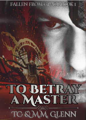
It sounds from the description like a colorful fantasy, but the major visual cue on your cover — the pensive off-center face — is something more commonly used (and thus more commonly associated) with political or dramatic thrillers. You run the very real risk of attracting the attention of readers who won’t buy, and leaving out the readers who would.
There are also design problems — the text tends to blend into the background, and the byline is too ornate to be readable (and why does “TC” have no periods but “M.M.” does?), but I think you’d be better off reconsidering the concept and starting from scratch. If the book’s about battles in Hell, show me battles in Hell.


Gray and red can work but this feels off because the guy is a black and white photo and whatever the other picture is isn’t. I love the red glint in his eye but it would work better if he wasn’t black and white. Making the focus his eye and the glints a reflection might work but it’s been done to death….
Your font is too pirate. I like the points, points are great for demons, but you have too much curve in it. The clump of hair doesn’t help as it says eye patch at first glance witch adds to the pirate feel. Try a more jagged font but as Nathan said this needs a total redo. I can’t make out what I’m supposed to be seeing in the colored bits and it has the wrong vibe. It is saying thriller but not otherworldly thriller. The color choice for the font is to blah and hard to read
You need something that says battle and Hell. This cover has lots of options, there are tons of images that would say both. I recommend choosing a nice picture with one strong graphic but not one of a person unless there are multiple pics of them in poses you can use because this is a series. ( when choosing pictures if your eye is captured by one that’s generally a good sign. If you think, I might be able to make this work, unless you have some editing skills keep looking. The picture needs to be good to begin with) You need a graphic that will ‘brand’ your books. Say, for instance, you use this guy on book 1 and then a picture of a random guy with dark hair facing away for book2 , what graphic will make the reader assume this is the same guy/world? You need something, a spell, a weapon, an article of clothing, it doesn’t matter what it is but you do need something if you wont have the same face.
You can use your background to give the similarity, the fonts of course and the layout of the font and graphics but you do want a similar theme to them. A half of a face on each doesn’t really fit the genre.
I am actually planning on using different characters (and therefore models) for the other covers. I switched composition to focus on the model on top, and fade into a setting image on bottom. I am hoping that template, with my font choice and layout, will suggest they are part of the same series.
Not really all that bad… My biggest issue is that I have absolutely no idea what’s going on in the left-hand side of the cover. I really have to get in close to make out anything…and I still don’t know what it’s all supposed to signify. And this is not a good thing at all: A cover should intrigue a potential reader, it shouldn’t puzzle them. And it absolutely shouldn’t require several minutes—let alone several seconds—of scrutiny. It needs to get its message across with immediacy and clarity.
A few other issues: I haven’t a clue what that black blob at the upper right is supposed to be or why it is there.
You have worked too hard at making the typography hard to read. There is no need to add gradients apparently just for the sake of doing it. All you are succeeding in doing is making most of the title and other text blend into the background.
In fact, there is, overall—art and text—a lack of contrast that really hurts the effectiveness of the cover. In thumbnail size, let alone full size, the only thing that stands out is the large face.
And that black blob.
By the bye: that “not really all that bad” referred to the general composition…not the way in which the elements of that composition were handled.
The model is wearing a heavy hood, which hard to discern in this version.
I’ve always felt that “real people” faces on covers tend not to do the book inside favors. Custom-drawn illos tend to be better, particularly for fantasy/sci-fantasy, because the heroes/heroines can be impossibly beautiful/ugly/scary, etc., and can wear stuff that would look absurd in real life. I find the image on the cover a bit offputting.
Everyone else has already mentioned the fonts; they need to go. Fantasy fonts are one thing, but these are tortured and hard to read. That’s the opposite of what they should be.
I think that the cover would be better served with the spidery-monster-creature that’s been hidden in the background–wrongly, to my view. The man’s face, red eye, etc. doesn’t help, and it obscures the far-more-interesting demon-monster behind.
I’d love to kibitz on the fonts when a new iteration comes through. But at the moment, I think that this version needs a total redo, so there’s no point in getting minute about the lettering.
Maybe this is just the version you submitted here, but my main objection is that it’s too small, and therefore I can’t see what’s going on well enough to give you more specific feedback. Like I was trying to figure out if the thing on the center-left is related to demons or Hell, but I can’t make it out at all, even at full size.
As usual, I agree with a lot of the comments, but I just wanted to include some tips about text:
Using a gradient on your title text is not a bad idea, per se. It’s better than using flat primary colours [or white/black] which a LOT of newbies do. Though in this example it could be more subtle and possibly a horizontal gradient rather than a radial would work better.
However, having said that…. if you have to use a black stroke to make your text stand out… you’ve gone off the rails. This type of text treatment tends to make the whole thing look DIY.
I would challenge you to find a better way to create contrast between your imagery and your text. For example you could use a dark smudgy smoke in the area just behind the text and keep the text brighter to stand out against it.
And I’m totally with Ron on the black blob observation. It’s not coming off as a hood at all.
It’s a hood? Well, how about that.
I thought it was emo hair.
I should also mention, that I would probably not use a gradient on your smaller text at all. It’s just making it harder to read. Period. And that’s never a good thing.
Messy. I couldn’t make out the image on the left, and after studying it I still don’t know. My best guess is an undead Doctor Octopus from Spiderman. Gradients are fine for text over very simple images, but when you’re image is busy the text must be simple. And readable.