The author says:
Q: When trusting your baser instincts threatens to strip your hold on sanity, who do you turn to?
A: A turkey in the woods.
A primal force awakens in Tommy after learning of his mother’s impending death. She’s all right, not in the hospital on life support or anything, but her days are numbered. Returning to Buffalo made all kinds of sense, but Tommy’s efforts to “take care of” his mom faceplant when she refuses to let him help around the house. He teeters on the cusp of crashing into old patterns – but this canine has learned a few tricks since leaving for LA. Tommy engages his writer-brain in passing the time concocting elaborate plots, second-guessing his cousin’s livelihood – certain something more nefarious is brewing. And yet, who is he to point fingers when waking up covered in dirt with no memory becomes a regular “thing”. Amidst a neurotic, potentially psychotic, break Tommy is forced to face a past ready to plow right into his future.
Reminiscent of Salinger’s Catcher in the Rye, I Animal immerses you in the head space of a Xennial neuroses.
[original submission and comments here]
Nathan says:
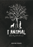
This cover certainly isn’t as guilty of “false flagging” as the last one was. Bravo!
I’ll let others weigh in on how appropriate it is to the novel, since I hate The Catcher in the Rye and am therefore definitely not your target audience. I’ll just weigh in on a couple of design choices:
- Where did the comma in the title go?
- I appreciate the use of negative space as a design element. However, I think you’ve taken it too far with how small the byline is.
- The same goes for the tagline, with the added problem of the ornate handwritten font. Rule of thumb: The smaller the type is, the more readable it needs to be.
Other comments?


I’m digging the artwork and the texturing. For something on the more literary side, I think this is great. (And I no longer think it’s a werewolf story.) I do think the title may be working against you still; that title still evokes a shifter romance or something to me, and that just makes it look out of place on the cover. But maybe other people feel differently.
Other notes:
-There’s a thin white line on the top and bottom visible at full size.
-If the tagline is a complete sentence, the first letter should be capitalized.
-I agree about making the byline bigger. In fact I think you could make everything bigger; you’ve got a lot of space.
I can’t exactly remember the other version, though I’m pretty sure I at least saw it, because I remember the tag line. This I like. I agree that everything could get bigger. Don’t be afraid to fill the space. And don’t be shy. Even though you are not Stephen King, we still want to know who you are. Let your by line fill the space too.
I agree with the others. Make everything bigger. Whip out your bleed and trim variance template and let the tree fill the space between, then make the text almost that big. Also, three different typefaces is too much, especially when one is unreadable. Nathan includes a thumbnail for a reason. Use it.
I still prefer having the title at the top, but in this case it acts to root the tree so it works.
I realize the description is for us, but when you publish your blurb will need to be much more succinct. I still don’t like the comparison to Catcher in the Rye, but iIf you’re adamant about it I’d suggest changing the word ‘reminiscent’ to something like ‘inspired by’. That way you’re paying homage rather than emulating.
Oh yes, agreed. Three fonts is one to many. Especially if two are fancy fonts.
I like this cover a lot!
If anything, it just needs a little tweaking here and there.
The graphic, author name and title could all be just a little bit larger, as the others have suggested..and the tag line much more so. The black space overalll is just a little too dominant. I would also abandon the script face on the latter and go for something much simpler. The typeface you used for the author name would be fine.
But overall a great job!
It’s a beautiful cover. Like everyone else I think your tag line needs a different font and to be bigger. My one major concern is this cover says literary novel to me. It doesn’t say paranormal at all. It doesn’t say mystery.
It is super nice. Its a very pretty cover, and who knows, maybe that will be enough….