The author says:
Lieutenant Commander Vinyanel Ecleriast, a dragon-riding elf cavalry officer, embarks on a reconnaissance mission vital to the security of his homeland. On a cross-continental quest, he hunts stolen talismans before they fall into the hands of those who would use them to penetrate the illusion that shrouds the elven capitol from enemies. A gypsy prophetess, a rival marksman, a bookish swordsman who fights with grace, and Vinyanel’s would-be assassin make up his eclectic squadron. Only if Vinyanel can keep his worsening symptoms of battle trauma at bay, and the whole squadron can learn to trust one another’s strengths will they intercept the malice set to befall the elven race.
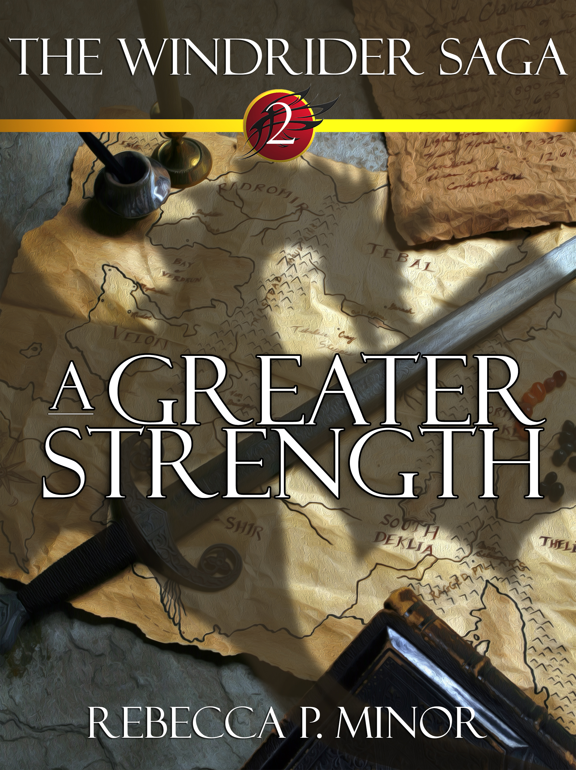
A Greater Strength is sword-and-sorcery fantasy that appeals to the readers of Terry Brooks or Tracy Hickman (Or Jill Williamson in the Christian Speculative Fiction market, but that’s probably more obscure than helpful.) The books aim for a New Adult and Adult audience. This cover is for an ebook re-release of the book, as I have reclaimed my rights from a defunct publisher and would like to get the book back on the market, rather than collecting digital dust on my hard drive. Thanks for any input you have for me!
Nathan says:
Since this is labeled as the second book of a series, I looked up the first book’s cover on Amazon, because consistent branding between books in a series is very important:
![cover[1]](https://covercritics.com/wp-content/uploads/2016/03/cover1.jpg)
The first two things I noticed are:
- The dimensions aren’t the same. (The first cover is taller than the second.)
- The type treatment, while similar, is still distinctly different. You have the title in a different place, and you haven’t continued the larger initial letters to the second cover. The leading on the second cover (that is, the space between lines of type) also makes it harder to read.
I think you should definitely follow the first book on those details — not only are they an integral part of your series’ identity, but their handling on the first cover just looks better.
As far as the cover image itself, the best option would obviously be to have another painted cover in similar style as the first one (again, series identity), but if that’s not an option…
I think the areas for improvement on the second cover become more obvious in the thumbnail: There’s not a focus to your image. Nothing is central; nothing is distinct, save the dragon’s shadow, which is then competed against by map and sword and book and… (Plus, if you move the title higher to match the first book, it will interfere with the shadow’s head, which is the most visible part.)
I don’t know how much of the original image was cropped to make your cover; if there’s extra, my first step after moving and conforming the title would be to scootch the image down, so that the shadow’s head is central to the space left between the title and byline. Don’t worry that you lose the sword etc. in the thumbnail if you do that; your thumbnail is better off with a single focal image. The other details will be just fine if the reader only discovers them at larger size.
Other comments?
Everything that Nathan said, but this in particular:
The way my eyes went over the cover, I was first drawn to the circle with the number two, because it’s red. Then I noticed the map, the letter and the ink bottle. After that, a whole second or two later, I noticed the dragon shadow. Only then, several seconds after that, did I even notice the sword, and it’s right there in the middle of the cover. I don’t know if it’s the shadow or the title that covers it, but it gets lost somehow. Which tells me that for a few seconds, I didn’t even know what I was looking at. It’s much different from my reaction to the cover of book 1: “Oh, a dragon! And a guy and the girl!”
The art itself is extremely well done, very clean and crisp. It’s beautiful. I couldn’t even tell if it’s a photo or 3D until I zoomed in (at which point, the textures get a bit weird, but it’s not a problem). Technically, it’s done better than Book 1, which has slightly awkward anatomy of both dragon and the humans. But, as Nathan said, there is nothing special in the image.
I’m curious about something in the summary. You say there’s a Roma character, but this genre is usually set in alternate pseudo-medievalish worlds — is your series set in real-life Europe?
…oh, nevermind, you were just using “gypsy” to mean a generic mystical nomad person.
I…did not notice the dragon shadow. (God, half my comments here are “I didn’t notice that large central element in the picture.”)
But I actually think this one is really nice; it’s a nice crisp bold image and the lack of focal point doesn’t bother me.
If it’s your own render that you can tweak easily, you might muck around with simplifying it–say, remove the book and move the sword down so the shadow has the center of the image to itself–but it’s really fine as is.
But I agree that it’s a problem that the image doesn’t match the other cover at all. I might consider updating the image on the first cover to match this one instead of vice versa, since I like this one better, personally. Prop covers are a lot more in vogue than illustration covers, so this one feels more up-to-date while the other one looks too old school.
Everything Nathan said.
The cover art is a great idea…but the dragon shadow fails to come across with enough immediacy. (Like Katz, I only saw it on second glance.) One reason for this is that there is too much going on. Not only are there extra elements such the ink bottle, paper and book, these lie in the corners so they not only distract they draw the eye away from the center of the image. Meanwhile, the sword lies directly across the shadow, further obscuring it.
I think all you really have to do is simplify the cover: reduce it to just the most essential elements—just the map and dragon, for instance—and it will work fine.
I do like the cover – of the first book (soundeffect…)
Yes, the moodily lit object covers are in vogue now, and I do not see why – the illustrations are much more interesting to look at. Since there is already a strong part 1. cover, I would just continue with that look, but if we must go with the flow, as other’s have pointed out: it’s a jumble of things lacking any central point. Also the sword can’t decide if it is 2- or 3-dimensional, and I can vouch for being yet another person going, right, a map, a sword, some inkbottles, maybe… Oh right there is a shadow of a dragon too.
The moody object covers in general seem to work best with: 1 object, sharp light, textured bacgkround.
Epilogue; I took a peek at fantasy in Amazon, and there seems to be actually more illustrations with people on covers, than covers with objects: some good examples of the latter are of course the current George RR Martin books (not the TV series tie in set), or the newer UK special no-fun covers for Terry Pratchett or Harry Potter.
I’m definitely following Nathan’s lead on this one; consistency between covers in a series is important. Your first book’s cover may not be perfect in every way, but it’s well-drawn and professional looking, and gets your reader straight to the point. Your second cover seems drawn in roughly the same style, but there’s not much life in it; nothing that really leaps out and grabs my attention. We could really do with another shot of that dragon, or some of the characters from the book, or just about anything besides the inanimate objects dominating the cover now. If you want to draw your readers a map, put that on an inside page ahead of the story the way Tolkien’s Lord of the Rings books did; save your cover artwork for living (or at least animate) beings.
You mention Terry Brooks, Tracy Hickman, and Jill Williamson as having roughly the same target audience as you. Might I mention your cover also reminds me more than a little of John White’s Archives of Anthropos series? His series is for rather a younger audience than yours (preteens to early teens by my reckoning), so the cover artwork has for a deeper contrast and is more saturated with brighter colors than yours, but you can take a lesson in how to maintain a style while varying the imagery from one book to the next from studying the covers for that series. As Nathan notes, the proportions ought to be the same for every cover as well, and I would add that shorter and wider aspect ratios are generally for a younger audience while the taller and thinner ones are for the more mature; considering that your audience is apparently late teens to early-twenties adults, I definitely recommend sticking with your first cover’s aspect ratio.
Being a little dour and moody in your artwork is fine for an older audience, but unless you’re planning to go all Game of Thrones sordid-and-horrible on your audience, stick to showing them beautiful people and fantastic beasts colored in moderation the way you were doing on your first cover.