The author says:
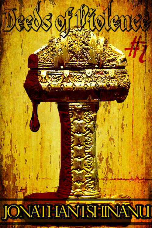
In an ancient medieval fantasy-esque world, Ahliss, a would-be hero travels in search for fame and fortune with a great sword of intimidating proportions at her side. The sword has a tendency of remaining bandaged up due to the smallest cut being an exercise in murder. It’s an epic fantasy serial covering the travels of a quasi-mythological hero, inspired a great deal by the shounen-genre in the way its lore is built. It would likely appeal to males 13+, but featuring a strong female protagonist as its principal character, I’d like to think female fans of epic fantasy 13+ will enjoy it as well.
Nathan says:
I think the first problem here (which is actually two separate problems) is the sword.
Problem #1a: I can figure out that we’re looking at a sword hilt, but my first impression is that it’s a… hammer? Casket on a pedestal? You can see how it’s hard to make out.
Problem #1b: There are a lot of fantasy books, mostly indie-published, that feature swords on their covers. It’s much less impressive than most of them think. According to your description, the sword in this book is visually distinctive because it’s usually wrapped up; think of how much more compelling the cover would be with a sword (not just the hilt, but most of the sword) partially bandaged, with a gleaming edge showing through where it’s unraveling! I doubt you could find a pre-existing stock image like that, true; but if, say, you contact someone who has posted stock photographs of swords on DeviantArt and asked how much to get a custom shot of a wrapped-up sword, I bet you’d be pleasantly surprised at the price. (I’m not saying the wrapped-up sword is the only way to go; I’m just trying to work with the cover ideas you’ve already decided on.)
The second problem (or third, depending on how you’re counting) is itself a multi-part issue: The type.
Problem #2a: I think the outlined title is a bad decision. Calligraphy already can present a hurdle to easy readability; the hollow outline only makes it worse.
Problem #2b: The “#1” seems more appropriate for a comic book or K-Mart flyer. Fully spelling out “Book One” or “Episode One” or whatever seems more in keeping with the epic character.
Problem #2c: The spaceless all-caps byline. As I’ve said before, the more unusual a name is, the more clearly readable it needs to be. If your name were Bob Smith, you might get with “BOBSMITH” for the byline. But with a name as long an uncommon as yours is, the byline is just a hopeless jumble.
Problem #2d: The layout of type around the central image. If your cover art were custom-made and fascinating right down to the details, you might — might — be justified in squeezing the words out of the way so that art wouldn’t be obscured. There’s no such justification here. I’d say that your title here should be broken onto two lines, and all of it (including any “Book One” subtitle) could take up a full third of the cover at the top, and your byline — again, broken into two lines — should take up a quarter at the bottom. You’d still have plenty of room for a simple but arresting central image (such as a bandaged sword) in between.
So there you are. Two problems, or maybe six. Math is hard.
Other thoughts?


Nice idea, but a few problems…
Too many fonts with none of the typography handled well. The outline font used for the title makes it hard to read. The “#1” tucked into a corner looks like an afterthought. And I am pretty sure that your name is not one long word. At least I hope it’s not.
The basic premise of the image is nice, but you fell into a snare that traps too many: you didn’t consider the placement of the type when either designing or choosing the image. This left you with nowhere to place the title and author name effectively.
The notion of the bloody sword hilt is nice, but you absolutely need to render the blood more realistically…the drip looks nice but simply superimposing a transparent flat red layer everywhere else negates the realism you have in the rest of the image. In fact, when I first saw it, I saw the red area as a shadow on the hilt. And let me add right here that I did not know that was the hilt of a sword until I went back and read Nathan’s notes. I had thought it was some sort of a chalice and that was what I called it when I first started writing these comments.
Oh, it’s bloody. I also didn’t notice that until I read Ron Miller’s comment, and saw the reddish area as a shadow.
It has a unique look. I kind of like the large ornate thick sword handle. The drip of blood, which is very hard to pull off, unfortunately deters many sales on the many books where it isn’t pulled off. This image can probably work without the blood. The title style just doesn’t work. Not sure it’s the right background; the whole cover seems monochromatic, but it may stand out in terms of brightness with that background. This may have potential.
I also thought it was a treasure chest on a pedestal or something, and that the blood was a shadow. Create a more recognizable central image and then work on fitting the typography around it.
Yup, me too. I’m with katz, I thought it was a treasure chest on a pedestal, and had no idea what the blob (blood) was. The bottom line is, in my opinion, it’s not adequately recognizable. And while some authors think that’s a good thing, it’s not. Many writers think that if they make people guess at what the thing is on the cover, it will pique their interest, but it doesn’t. It usually turns them off.
The monochromatic theme is also not good for sales. There’s no contrast, and that’s a needed eyeball-catcher.
And yes: fonts gotta go. The book title font is not readable, easily; the byline font isn’t bad, but it’s not suitable for your (very lengthy) name, in smallcaps. Also, again, it’s the same color as the rest of the cover, so…you’re not getting any bang for your buck.
If it were me, I’d find an instantly-recognizable sword-hilt image. Remember that if the sword is effectively a character in the book, people will “see” it as they imagine it in the book. The more detail you give them, the more you restrict their imaginations (never forget that one of the reasons that the dreaded Twifright is so successful is because the author didn’t describe the main character for HUNDREDS of pages, although she lavishly described the male vampire character).
Either that, or, as it’s fantasy, go for something symbolic, not specifically graphic, ala Hunger Games, etc. Find a symbol, a logo, etc., and use that. What matters is that it’s a grabber–not what it really looks like.
Offered FWIW.
I am going to second, third, fourth, and even sometimes fifth what everyone else said.
I must now be what, 7th person who did not see blood. I sort of thought the blobby was some extra ornament, and the rest was shadow -I didn’t see it at all.
I personally like the colour scheme, but a bit of contrast would make it ‘pop’ more. Font, i will just agree with everything said so far.