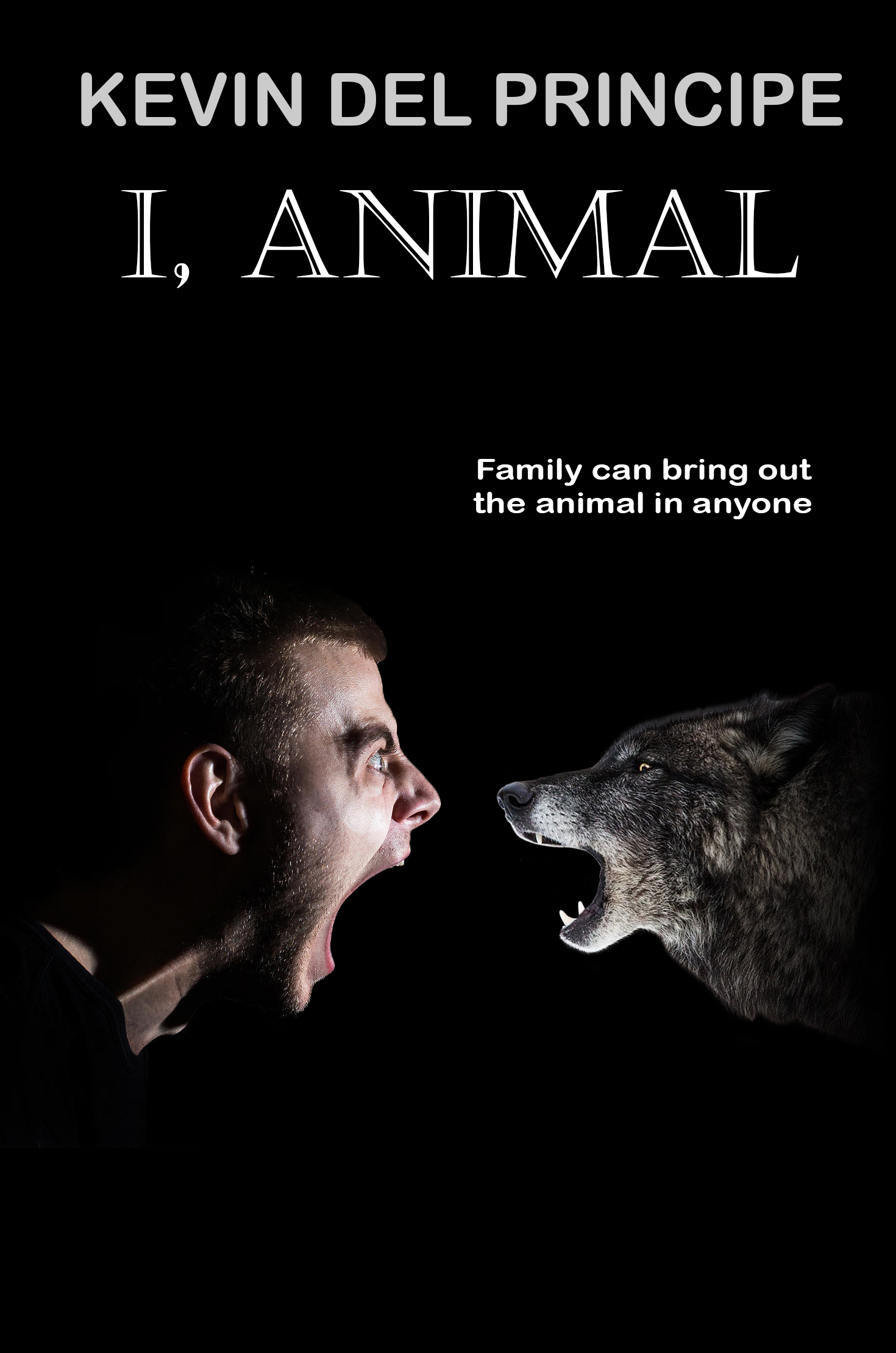
The author says:
Jean has been called Blue Jean since childhood, but not because of her clothing. She wears nondescript colors and avoids people when she can. Her world is unhappy but predictable, until the new pastor and his handsome brother move into town. A chance encounter brings the town prostitute to church that Sunday, starting a chain reaction that will shake the church to its core. Will Jean embrace the truth that will set her free, or will fear keep her captive forever?
Christian romantic suspense on fighting human trafficking in small-town North Carolina.

Nathan says:
I’m not getting a good feel for this novel from the description you sent — there isn’t much in the description that points to Christian romance, and human trafficking is a big enough deal that one would expect to find it in the description instead of as an afterthought.
In any event, in my experience “Christian romance” (even the suspenseful kind) both portrays in the novel and tries to project on the cover a kind of wholesome quality that I don’t see in either your description or your book cover.
As far as simple design comments go, the elements in the top half of the cover seem ill-positioned. The Publishers Weekly pullquote could stand to be smaller, giving room for the title and subtitle to expand upward and from side to side.
For that matter, the photograph could stand to be larger — the fold at her back could taper off-cover just like the fabric at her feet does, and I don’t think anyone would feel cheated if the byline appeared on that area of her dress under her forearm and waist.
Other comments?