The author says:
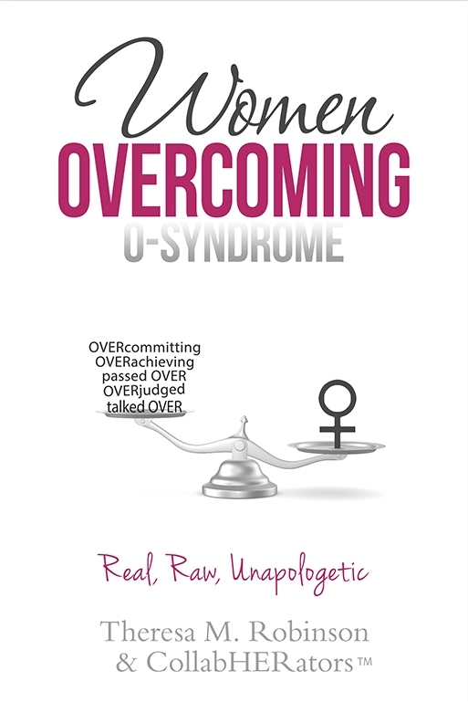
This book is for professional women, ranging in age from 20+ to 60+, who live with the challenges of men talking over them, passing over them, and over judging them. The book is also for these same women who tend to grapple with the self-imposed pressure to over achieve and over commit themselves. These experiences are described as O-Syndrome. The book is filled with stories, advice, and strategies from badass women who are overcoming O-Syndrome at work and in life!
The cover design is not a quick concept but the finished design minus any refinements. Thank you!
Nathan says:
At the risk of being accused on mansplaining… [That’s a joke. Stand down.]
The first thing I saw is the all-white background. As most online bookstores have white backgrounds to their pages, the cover image ends up not having any visual boundaries. Even just a line around the border can help.
(Full disclosure: The full image send to me is below, and I trimmed it for presentation here. But unless the plan is to include that gray glow as part of the ebook cover when it’s uploaded, the criticism stands.)
Second point: The novelty term on the cover (and in the title) is “O-Syndrome.” A novelty term like this is intended to be something that catches the browser’s eye and makes them ask, “Huh — what’s what?” Not only is “O-Syndrome” in the smallest type of the three words in the title, the gradient makes it even less noticeable. You can still have “Overcoming” in magenta, since it implies contrast/conflict with “O-Syndrome,” but you should make “O-Syndrome” the largest word in the title, and at least give the letters a solid border. (Given that it’s a neologism, you should consider placing it in quotation marks, signaling to readers that it’s a term you’ll be defining, not one with which they should already be familiar.)
Third: While the book as described is largely about assertiveness, the general feel is not overbearing, and that’s good; the way to overcome at work is to hold your own while not making enemies, after all. But the “Real, Raw, Unapologetic” line drags it into overbearing territory — that’s the kind of wording one uses on placards and Facebook where the the goal is to sharpen discord.
Third-and-a-half: You’ve got one too many fonts here; the elegant cursive of “Women” clashes with the casual cursive of “Real, Raw, Unapologetic.”
Fourth: Maybe it’s just me, but the insertion or erasure of incidental gender terms into other words — “HERstory,” “womyn,” and in this case, “CollabHERators” — seems to me to be more of a hallmark of the strain of feminism which focuses on highlighting and winning systemic gender conflict. I don’t understand this book as principally being about fighting the nebulous “patriarchy,” so I think that’s a bit of a false flag. And putting “TM” after the word is unbearably cutesy.
Other comments?
NOTE: Tensions have run a little high among commenters over social hot-button topics of late. Please don’t wade into either criticisms or defense of feminism, “the patriarchy,” etc. any further than I’ve gone, i.e., only bring it up in the context of how connotation of terms affects the possible perception of the cover’s audience.
I love it! I am a sucker for clean layouts and the white feels fresh and empowering, and I think it’s a great balance between feminine and professional. I also think the use of the scales is very good imagery – simple and universal. The only thing that kind of doesn’t work for me is the font used on the left side of the scale. It just feels too generic to me – like a Word doc. What if you were to try the same condensed font that you used for ‘Women’ in the title? It doesn’t bother me THAT much, but otherwise I think this is a very clean, professional looking cover, but with enough feminine flair to suggest that it’s directed towards women.
Oops – I meant you could try the condensed font you used for ‘Overcoming’ not for ‘Women.
Thank you for your time and your comments regarding the cover. The cover is an earlier rendition. The fonts used on the left side of the scale were changed to the light gray shading and same font style as the authors info. The female symbol on the right was replaced with a small image of a group of women standing on the scale holding hands. The idea behind the cover is that a group of professional and polished women are sharing stories and experiences with brutal honesty while also offering advice and strategies to all women. Thanks, again. I appreciate you.
As a female book designer whose core audience is female professionals, I agree with everything CoverCritics said. He is spot on as a professional designer. A good book designer educates, and he has done that well.
Thank you for taking the time to review the cover. Great insights from Nathan, indeed!
Thank you for your assessment of the cover! Really appreciate your taking the time to be so thorough. Since submitting the cover, there were changes made, some minor and some not so minor. I particularly like your comment about the two types of script fonts used because we were trying to figure out a way to capture the dichotomy of professional polished women who share their stories and experiences with brutal honesty. The disruption to continuity between the two script fonts may very well do this per our thinking and your subsequent feedback.
I agree completely with Nathan.
It could use some work on balancing the scale. Specifically, matching the tones of the black and using the space better. The words looked crammed on, the font appears chosen at random. The way the words are capitalized implies the readers are too stupid to figure out the connection themselves. Id recommend going with simple title caps instead.
Maybe you could convey it’s real raw and unapologetic, instead of stating it, by font choice or adding a graphic like a ripped up male symbol beneath the words? try a really bold powerful font for O-syndrome, one that’s bold and unapologetic for being so…lol
Thank you for taking the time to provide your impressions. The cover had already gone through a reworking of all items on both sides of the scale. Your comments are a welcomed confirmation of what has been changed.
A small note, unless ‘CollabHERators’ actually is trademarked by yourself there may be some legal danger in using the ‘TM’. I’m not a lawyer, this is speculation, but copyright and trademark law can be quirky and unforgiving. Whatever you do, it is worth vetting it thoroughly in this case.
Another small note: an unfortunate reality of mechanical balances is that the heavier tray must reside below the lighter tray. In this case that places the female symbol beneath the various ‘O-syndrome’ components, displaying the syndrome more prominently than the woman overcoming them. This seems backwards of the sentiment a cover graphic should ideally portray for this book concept. However, I work professionally in an analytical laboratory. The emotional content associated with assaying equipment could be over-sized and very skewed in my case.
Perhaps a bigger Venus symbol, taller so it stands above the text in the other tray, could provide a solution.
Thank you for that. I had mentioned to my left-brained analytical engineer husband that the mechanics of the scale unfortunately “lift up” the elements on the left side making them look “elevated’ above women — a sentiment I wanted to be careful not to convey. It is a valid concern to consider. Appreciate your feedback.
While I am also not a lawyer (a happy circumstance for us both): As long as something is not already being used as a trademark by someone else, anyone can say “TM” on a mark or phrase. It’s the “R” (For REGISTERED trademark) that gets you in trouble.
Thanks for the attention to detail regarding the legality of the trademark symbol. I am encouraged by all of the thoughtful consideration of all aspects of the cover. I wish I had found this website months ago.
Even if it didn’t have 18 too many typefaces, the cover would still need to be redesigned from scratch. I cannot think of one redeeming quality.
Thanks for providing your impression. Though the font types had been reduced already, it is good to get feedback on the overall look of the cover outside of the specificity of fonts.
I for one would like to see the reworked cover, so as to not spend time on those things that have already been changed. The change with the group of women, on the scale, actually doesn’t sound that great to me, but seeing is believing. I’d be quite interested in seeing it, and I’m the target audience, basically–a professional woman in the stated age range. I’ll omit commenting on whether or not I’ve endured mansplaining, etc., in my career. 😀
Thank you very much for your kind and gracious note. Yes, it’s kind of unfortunate that changes were made to the cover post-submission to this website. On the other hand, it’s still good to get the feedback as it reinforces changes that were made and also highlights things that could have been better addressed or abandoned altogether. We tried several images on the right side of the scale and abandoned each one. The idea of a group of women holding hands was inserted initially as kind of a joke. But then, it actually looked kinda cool. After some tweaking, we sent it out for a vote to a select group of women along with other cover options. We also sent out this cover with other options of images on the right side of the scale. The cover with the women holding hands standing on the scale won the vote, so we went with it. I understand that it still may not work but we are hopeful that the women who participated by sharing their stories in conjunction with our partnering with the “Dress for Success” charity for cross-promoting purposes will generate buzz about the book as well as activate a forgiving spirit around any pitfalls with the final cover. Everything is in motion for an August 1 launch. Thank you again for your thoughts.
Hoo boy… well, I wouldn’t say there’s some one big thing wrong with this cover so much as a whole bunch of little things. Taking it from top to bottom:
1. The plain white background certainly can work on physical covers, but will indeed make the cover difficult to see on sales pages. I recommend drawing a neutral gray line a single pixel wide around the very outside to counteract this: it’ll help establish the boundaries on sales pages, won’t be noticeable when looking at the cover on an electronic reader, and will almost certainly be cropped from any physical edition of the book (assuming you release one; all online print-on-demand publishers seem to be doing their best to discourage the release of physical editions these days).
2. Maybe my mind is just in the gutter here, but the very term “O-Syndrome” sounds vaguely pornography-related. Assuming you can get prospective readers to stop snickering about such unfortunate associations long enough to read the explanation in the tagline (a very risky assumption indeed), the gradient on that word also makes it look more like “U-Syndrome” by chopping off the top of all the letters. I’d recommend getting rid of that gradient at the very least.
3. The scales I can understand, but the meaning of the visual metaphor in this case seems rather elusive; [feminine symbol] outweighs… a bunch of text. Note that at thumbnail size, the text isn’t even legible. Even at the more legible full size, however, prospective readers aren’t likely to spend much time trying to make sense of all those words containing “OVER” in all caps in them. Whatever this “O-Syndrome” is, it needs some kind of visual representation that’s at least as immediately recognizable as that feminine symbol on the other end of the scale.
4. That “Real, Raw, Unapologetic” tagline is, to summarize our host’s criticism more concisely, a case of trying too hard. As more jaded and cynical readers (and critics) will tell you, if you feel compelled to use adjectives like these on your cover, chances are you aren’t actually very confident that they accurately describe the book. I would recommend simply dropping that tagline altogether.
5. While words like “CollabHERators” might indeed raise a few political hackles with a few hotheaded and highly partisan individuals, the more common reaction is likely to be one of mild amusement mixed with dismissive contempt: “African-Americanjack, Wommon, xim and xer, and now CollabHERator! Ha ha! You can’t make this stuff up, people! What’ll those crazy academics think up next?” Either way, the portion of your target audience that might actually have any respect for such recent inventions in academic jargon is awfully tiny, so I’d recommend just using the more generic “collaborators” or the more concise (and traditional) “Theresa M. Robinson et al” for your byline.
While I’m not sure how much target audience (i.e. market) books on this particular subject have anyway, you certainly don’t want to make your marketing niche any narrower than it (probably) already is. As I often say concerning the necessary compromise between one’s aesthetic/intellectual principles and the inherently pragmatic nature of marketing, write like a you’re starving artist, but market like you’re a shameless money-grubbing mercenary. In your case, all the major and minor tweaks your cover needs should be aimed at broadening its appeal to as many prospective readers as possible.
Thank you so much for the thoroughness and organization of your critique. Much appreciated. This cover had already gone through changes after submitting it here on this website, some of which address your comments. What I should have included with the submission is that this is the second book in the O-Syndrome series, so that expression is integral to the content. The title in totality was crowd-sourced and voted on by a test group of professional women and also by the women whose stories and experiences appear in the book. In short, we tested various aspects with the book’s target audience. Submitting it here was a desire to get a critique on design elements from a completely objective group. We went into the design process knowing that the title was set and the goal was to try and translate the winning title into a design that would continue to speak to these women. I am saving all these comments for a future update and refresh. Thank you again for such detailed feedback.
I’m a woman whose design aesthetics tend to veer wildly away from gendered conventions, so you might want to take my suggestions with a grain of salt, but purple and light gray on white doesn’t feel assertive to me. White background, small imagery, and light font colors make this cover feel like it’s trying to be unobtrusive, which is the opposite of the message it’s trying to send.
Thank you for your thoughts, which are very valid concerns. We tried only two background colors — black and white — and tested both with a test group of professional women. The vast majority of the women preferred a white background citing that it was more of a “clean” look. One reviewer even went so far to say that she would never buy a black book. Admittedly we didn’t test any other background colors other than white and black, because we wanted the color palette to complement the first O-Syndrome book in the series. Some women also commented that they liked the fact that the cover is re-appropriating the “soft girly stereotypical pink’ with a bolder grown-up mature version of pink. One, however, commented that she didn’t care for the pink. LOL
Our hope at this late stage with the book launching on August 1 is that the book’s cover will speak to the majority of professional women enough that they’ll be curious enough to look further. it’s good for us to get the thoughts of both women and men on this website. Very helpful.
Oddly enough, one of the things that I liked the least about this was the pink/berry color; to me it was sort of a bow to the girly aspect. But, the cover is a week away from launch, so realistically, at this point, it’s too late to kick around.
Even beyond all the insights shared on this site, even within the target audience, there is no guarantee that a cover will appeal to everybody. Ready or not, we launch August 1. Thanks!
Best of luck Theresa. Looking forward to seeing the revamp. Perhaps you can post a link here when it goes on the interwebs.
Thanks for the kind and gracious words, Tamian!