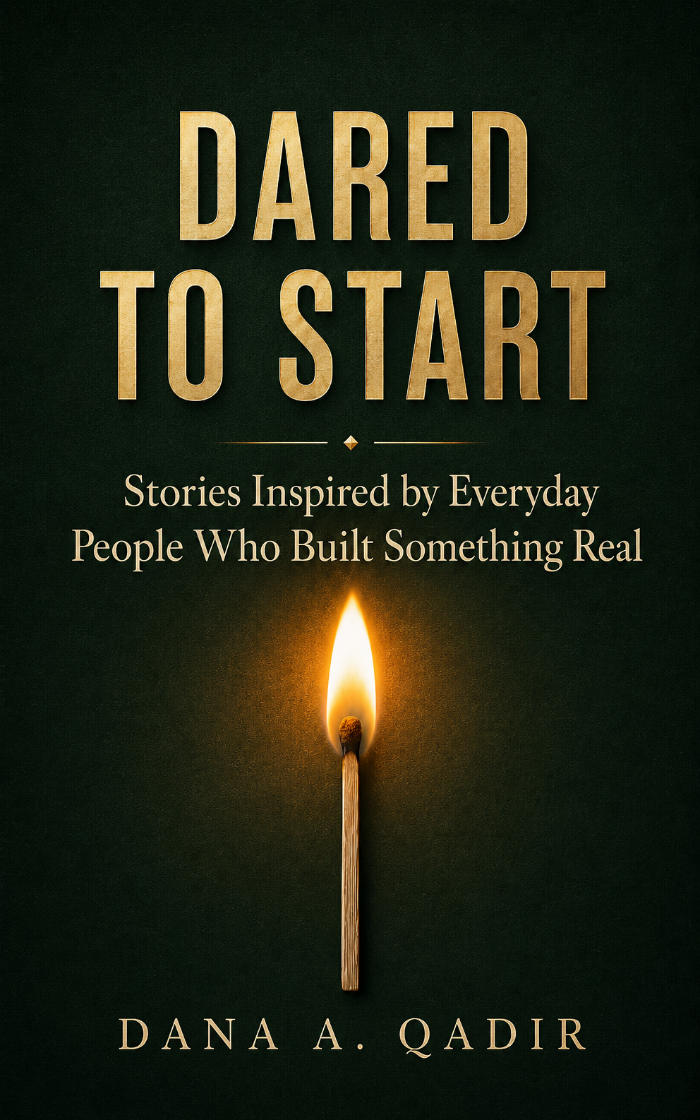
Fundamentals of Financial Success

The author says:

The book presents a Christian covenant-based view of financial success, arguing that wealth is primarily a spiritual matter rather than merely an economic one. According to the author, financial prosperity flows from: Having a God-given purpose and vision. Living in covenant relationship with God. Practicing biblical giving (tithes, offerings, generosity). Walking in wisdom. Exercising faith. Practicing prudence and avoiding waste. Developing spiritual and practical ability (“power to get wealth”).

Nathan says:

If the book is so consistently Christian as the description states, why is there so so little indication of it on the cover?  Prospective readers would complain of a bait-and-switch, and they would be right.

Even just a single Christian symbol added…

…could make a big difference.

And if you wanted to rework the cover entirely, there are plenty of visual possibilities. The one that comes to mind immediately is “loaves and fishes.”

Other comments?

The Seed of Joy [resubmit]

[original submission and comments here]

Nathan says:

I definitely think we’re getting closer — we’re now entering the zone of personal preference, where several of us might agree that it needs something, but disagree on what that something is.

My suggestions would be:

  • Add color into the flag, about half as strong as in RK’s revision.
  • Make the female figure slightly warm-toned — not all the way to sepia, but just so the photo looks slightly “historic” and less like a stock image.

Other thoughts?


Jose Luis Vazquez novels

The author says:

Hello, everyone. I am writing a dark fantasy book series (?) that sets in Mexico. Mixing a lot of prehispanic and european folklore. I am doing a rebranding (and a heavy edition) of all my books (30+) and I want to unify the look of my covers. These are my main series, the gates to my books. All the other books, while related to these, are standalone stories featuring important characters from this series. What do you think about them. I don’t want the covers to say “hey, this is mexican Lore” that’s why I don’t use any symbology related to prehispanic Mexico, but I want to give the idea of “hey, this is like a light novel”. Do you think it works? There’s room to improve? Thank you in Advance.

Nathan says:

I’m always a little leery of commenting on covers for a foreign-language audience, as I might miss some of the visual cues that are common to another culture.

My only comment here is that using anime-influenced art might limit your audience. I know that I personally avoid books with anime covers, as I assume they’re aimed at people devoted to — or at least more familiar with — the storytelling tropes of that genre.

Other comments?


The Seed of Joy

The author says:

The Seed of Joy is a historical novel set in South Korea in 1979 and 1980. It spans the time from the assassination of president Park Chung Hee to the end of the May 18 Democratization Movement, commonly known as the Gwangju Uprising. During this time, Korea endured the most turbulent months it had seen since the Korean War.

Paul Harkin, a US Peace Corps Volunteer from Indiana, comes to Korea on his first trip away from home. The Peace Corps gives him more than he ever bargained for − from a comically inept public health official, to violent political strife in the cities, to a hard winter in a leper colony. But when he falls in love with Han Mi Jin, a troubled, politically active schoolteacher, he defies the Peace Corps, the United States government, and the Korean martial law authorities to take up her cause. Caught up in the bloodshed of the Gwangju Uprising of May, 1980, he wrestles with love and loss, freedom and responsibility.

The author himself was a Peace Corps volunteer in Korea at the time of the story. This book should appeal to readers of “Human Acts” by Han Kang , “The Island of Sea Women” by Lisa See, and “The Living Reed” by Pearl S. Buck.

Nathan says:

I can see you’re going for a low-key vibe here, and I respect that.  That said, if the violence mentioned in your description plays a significant part in the book, then I would suggest a slightly more energetic look.

One possible suggestion is to add a bit of color back into the Korean flag in the photo — it would give those readers who encounter the thumbnail first (as most readers will) an initial impression of the subject matter that otherwise they wouldn’t get until and unless they clicked through for the larger version.

Also, use a different typeface than Times New Roman for that pullquote — it’s just too generic.

Other comments?

Reconstructing Christmas

The author says:

Reconstructing Christmas is a closed-door sweet romance novella with Christian themes, set in Atlanta during the Christmas season. Taking place one year after the events of For the Love of Rhett, the story centers on love, healing, and renewed hope against a festive Southern backdrop. The target audience is readers of sweet, faith-filled contemporary romance who enjoy emotionally rich holiday stories and gentle happily-ever-afters, particularly fans of authors such as Debbie Macomber, Becky Wade, and Denise Hunter.

Nathan says:

You mentioned that it’s a follow-up to The Love of Rhett, so I looked that up-, and found that it’s the third volume of a series:

I think you’re missing a bet by not continuing the branding.  A reader of your previous books should have some indication that this is a Christmas story that involves the same characters and/or setting. You should be looking at creating a Christmas-themed continuation of the common elements of your previous covers: Same typefaces and locations, same general layout… even just putting a central figure in cold-weather clothing and hanging ornaments on the background tree might be enough.

Even if you want to indicate more of a break between the previous trilogy and this volume, you should look for ways to make it stand out, because as it is the cover of Reconstructing Christmas is far too generic. It looks like the result of asking a LLM for a Christmas romance cover. So even if you don’t want your readers to immediately connect this book with the previous ones, just things like carrying over the title and byline typeface and layout at least preserves an element that isn’t so bog-standard.

Other comments?