[Apologies for the delay! I moved servers, and this site had a persistent problem that took days to correct.]
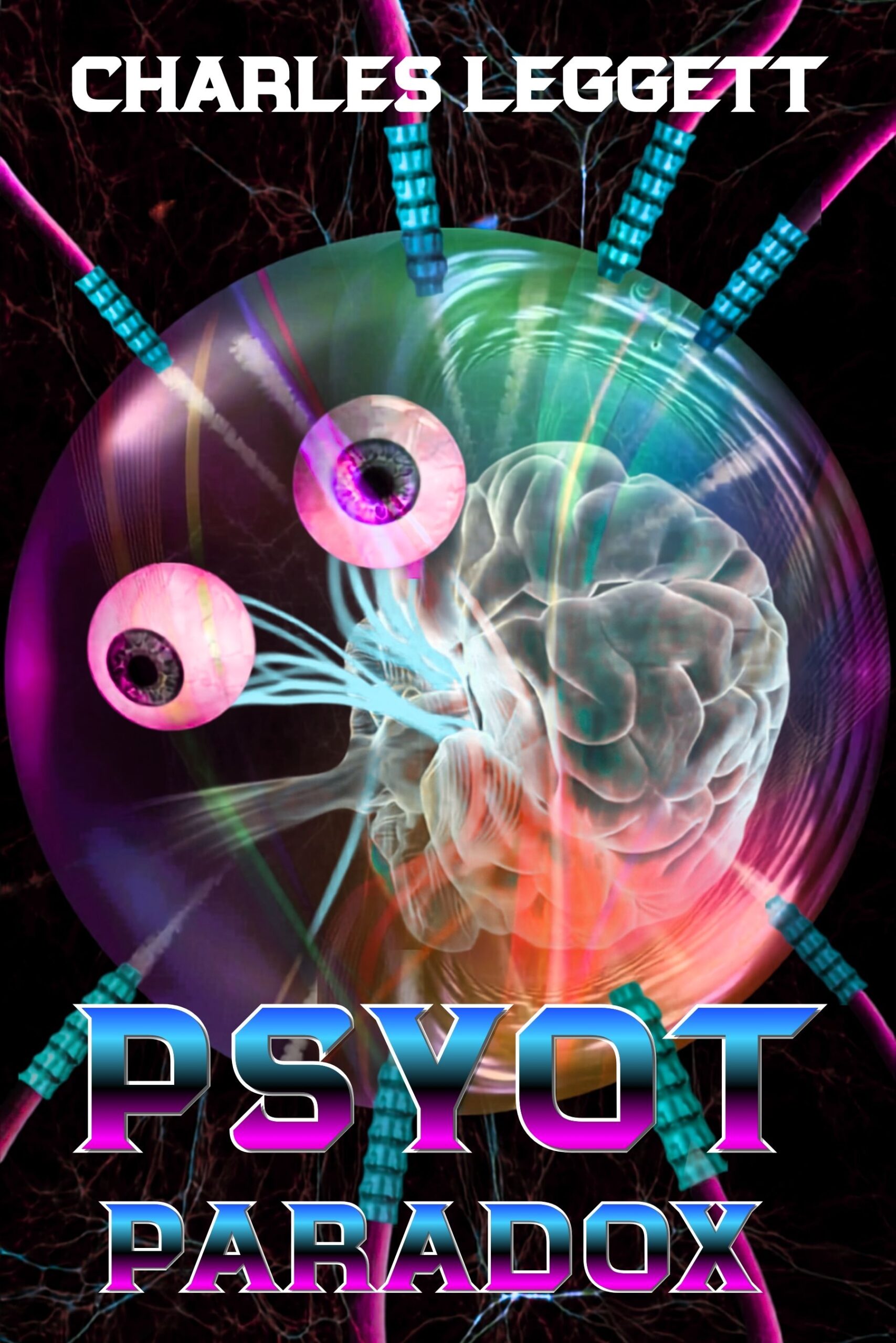
The author says:
PSYOT PARADOX is a science-fiction/horror novel with elements of surrealism, dark humor, and reality-bending weirdness. I’m looking for constructive feedback on the cover as a finished, publication-ready design.
Nathan says:
I think the biggest thing that’s visible right-off from the thumbnail is that the title is unreadable. Remember that most potential readers are going to encounter your book at thumbnail size on Amazon etc.; they should at least be able to make out some of the title at a glance.
Beyond that, though… I mean, “weird” definitely comes across. But humor and surrealism? Not as much. Can the type do some of the work conveying “dark humor” through a slightly (SLIGHTLY) “zanier” font? Can an incongruous image element — a hat on the brain, a picket fence in the background, or something drawn from the novel itself — give the impression of surrealism?
Other comments?
As I remember the late great humorist Scott Adams stating in one of his Dilbert books, humor—dark or otherwise—consists of combining two or more of the following elements:
* familiar
* cute
* bizarre
* mean
* naughty
Beyond Scott Adams himself, Gary Larson and Gahan Wilson were two comic strip creators who were especially good at combining these elements to make them funny in just one panel, with Larson typically combining bizarre with cute and/or familiar things and Wilson combining bizarre with mean and/or naughty things. For your cover, think of it as being a sight gag like something out of one of those one-panel strips, and ask yourself what would look funny if combined with your current cover image.
The “bizarre” element you’ve clearly got here, and anything out of the ordinary like that is practically surreal by definition. For those (such as yourself) specifically going for surreal humor, I recommend combining the existing bizarre image with something familiar. In this case, maybe show that apparently disembodied brain and eyeballs wandering (floating?) around in some extremely mundane setting with lots of people present and no one so much as batting an eye at what nearly anybody here and now would consider a strange and unsettling sight.