Burner

The author says:

Homicide detective Kim Phillips isn’t like the other officers of the Chicago Police Department. She’s quiet, isolated, and she can speak with the dead. Born with the ability to see into and interact with the afterlife, she is a Burner: a person tasked with hunting down dangerous spirits and sending them to the other side. When Kim exorcises the ghost of a young girl, she’s dragged into a new and unsettling case, one where people like Kim are being killed. The only problem? There’s no connection between the victims, and no proof that they were murdered in the first place. Kim has to catch the killer before he finds his last victim and unleashes an unknown evil on the world.

Burner, the first book in the Affinity Series, is a dark exploration of how life and death are only separated by a single breath and how even those with power can be powerless.

Nathan says:

I think this is a very professional cover — the limited palette works well with the focal element of the art, the fonts chosen are distinctive without being overloaded with novelty… I think it says “urban fantasy novel” very well.  However, as the story is also a police investigation, I think it would work better if you could find some way to say “urban fantasy crime novel.”

Could there be yellow traffic lines on the ground, underneath the glowing sigil (muted to match the color scheme, of course)?  Or some police tape in the shadows behind the title? Or a pair of handcuffs on the ground by the byline?  I would brainstorm on some simple addition like that to add the angle of police involvement to the cover.

Other ideas?

(And since everyone expects me to say it: “Burner? I don’t even KNOW ‘er!”)

A Hostile Takeover

The author says:

This is a science fiction novel set in a post-cyberpunk world, struggling with the rise of corporate gangs and untamed technology. I wanted it simple as possible and chose the skull motif to represent criminal/piracy elements to the story involving corporate banksters, slumlords, rogue AI’s. It is set in a near future, post economic super-depression civilisation. I’m aiming to soon publish a new edition and am wondering if I should redesign the existing cover or ditch it altogether.

Nathan says:

As a practical matter, you should always put a distinctly different cover on a new edition.  Which gives you lots of room to play with this one!

First: The sizing of the words in the title make it look like “A” is the most important word/letter.  Meanwhile, “Takeover” becomes unreadable in the thumbnail.

Second: While the digitalized, dot-matrix effect on the skull comes through at full size, that’s completely lost in the thumbnail; it could a cross-stitch, for all we can see.  Coupled with the fact that “blank white” isn’t a a color that anyone associates with cyberpunk, the cover fails to let potential readers know in their first glance that this is a post-cyberpunk criminal dystopian novel.

My suggestion? Steal. Add Matrixy, grungy elements.  Let “cyberpunk” and “dystopia” and “crime” be the first thing people notice, even before they read the title.

Here’s my five-minute redo:

I know I’ve got your title font somewhere on my computer, but I couldn’t find it quickly, so I substituted.  I played with the color balance until it looked like The Matrix, enlarged your name, and added the first “broken glass” wallpaper I found.  I’m not happy with it as a final, obviously, but I think it’s a good starting point.

Other ideas?

Viridian Gate Online: Cataclysm

The author says:

This is the first book in a new series. I really like the cover art and think it fits for the genre, but I’d love to get any extra feedback before I release this bad boy into the world.

October, 2042 An extinction level asteroid, 213 Astraea, is cannonballing toward earth. Collision, imminent. An international team of scientists are working around the clock to avert the cataclysm—few are optimistic. World Governments are preparing for impact with deep earth bio-dome bunkers, but only a select few lottery winners will be saved.

Jack Mitchel, a thirty-two-year-old EMT living in a tiny studio apartment on the West Coast, isn’t one of those winners. Still, there might be a way for him to survive Astraea; a slim chance, requiring a radical leap of faith. Through a connection at Osmark Technologies, Jack’s acquired a NexGenVR capsule and with it, a one-way ticket to the brand new, ultra-immersive, fantasy-based VRMMORPG, Viridian Gate Online. Taking that leap of faith, though, means permanently trapping his mind in the game, killing his body in the process. Worse, one in six die during the transition and even if Jack beats the odds, he’ll have to navigate a fantastical world filled with vicious monsters, domineering AIs, and cutthroat players.

And when Jack stumbles upon a secret conspiracy to sell off virtual real-estate to the ultra-wealthy—transforming V.G.O. into a new feudal dark age—the deadly creatures inhabiting Viridian Gate’s expansive dungeons will be the least of his concerns. If Jack can’t game the system, he’s going to be trading in a quick death for a long, brutal one …

viridian-gate-cover

viridian-gate-cover

Nathan says:

The artwork is beautiful, and the font is well-chosen.  My only concern is with the length of the title: there are so many colons, line breaks, subtitles and series titles that it almost seems like a parody.  I would say put “Viridian Gate Online” in one font and “Cataclysm” in the other, and skip “A V.G.O LITRPG Adventure” altogether.

Good work!

Any other comments?

The Eden Conspiracy

The author says:

The Eden Conspiracy is a standalone thriller that follows a gun-for-hire and a virologist as they go head-to-head with an ancient religious order plotting a global pandemic to bring about a new Garden of Eden. Professional killer Jack Reagan is hired by a mysterious group to kill virologist Daniela Grosskopf and steal a vial of a deadly virus known as the Omega Strain. But when Jack has second thoughts and decides to instead protect Daniela and the virus, he must face off against modern-day Knights Templar seeking to recreate the Garden of Eden.

the-eden-conspiracy

the-eden-conspiracy

Nathan says:

My biggest concern is how the elements overlap, or don’t.

To wit: There’s a lot of space between the byline and the top of the cross — not a problem in itself, but the bottom of the cross then runs into the title at the bottom, which is already hard to read in thumbnail (the tiny white border around the letters doesn’t set it off sufficiently from the black-and-white background).

There are other little tweaks I’d try — the parallel placement of “THE” and “A THRILLER,” for example — but that’s my big concern.

Other comments?

Wish For Amnesia

The publisher says:

Barbara Rosenthal’s Magic Realism / Philosophy / Political Fiction / Literature novel, WISH FOR AMNESIA, is a modern-day mix of futuristic fable and historical fact that follows six idiosyncratic characters in New York and Rome from 1968-85, Hippiedom to Halley’s Comet.

It pivots around Jack Rubin, son of Holocaust resistance workers, who develops a Messianic Complex as he struggles to be as exemplary as his father. “His genes alone were salvaged from the wreck.” Jack embarks on a life of politics, anthropology and early computer technology, but is beset by doubt, paranoia and voices in his head. They say he has no right to lead until he has the perfect plan. A troubled relationship with Beatrice, a blind Black performance artist, moves him to marry one of her students, Caroline, stunning, Jewish and disturbed. Caroline grows up in a dismal little town, her character set by rivalry. Jack becomes a tyrant to his family. The artist is named godmother to their precocious daughter, Jewel, and she takes the child to Rome, where they fall in with a nefarious cabdriver, Toto. “Toto shut his off-duty sign and crept along the curb next to the signorine curiose, following behind them several lengths.” Jack desperately strives to fulfill the potential of his father’s sacrificed generation, but when he travels to Rome to meet up with his daughter, as he descends a ramp at DaVinci Airport on the date of a historically infamous attack there, he’s killed by someone he knows.

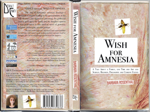
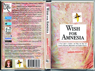
There are 55 of the author’s images between the chapters (50 “Surreal Photographs” and 5 collages). This extraordinary book has been in development for 38 years, and is due for release Nov. 30.

deadlychapspress_barbararosenthal_wishforamnesiaopencover2016

Nathan says:

This is the actual size of the image I was sent, so a lot of detail is lost. I can’t tell from the cover what the book is about, but then again, I can’t even really tell from the description what it’s about, either. However, I think everything you truly need to know about this book is contained in the last sentence of the description that came with the cover:

This extraordinary book has been in development for 38 years….

This book isn’t the work of a storyteller attempting to entertain a potential audience in hopes of some modest commercial success; this is a labor of love, worked on in bits and pieces over the years for personal fulfillment in between the other demands of life.

As such, is there anything that we can say to make the cover appeal more directly to its target audience?  The author is its target audience — her, and people who know and love her, and will appreciate the book because its hers.

I guess the only advice, then, is to enlarge the author portrait on the back.

Other thoughts? Am I wrong? Or am I right but to brusque about it?

November 21 Update:

The publisher updated with this:

I am re-submitting this cover in higher resolution. Hopefully, this will alter the understandings of your cover critics because I put the description of Barbara Rosenthal’s book on the back cover. I’m publisher of Deadly Chaps Press, and I published WISH FOR AMNESIA because this is the most extraordinary, comprehensive book I’ve ever read; not in the least a book for only her friends and family, but truly for the world. It IS aging skin, the author’s right forearm, in fact — there had been 12 proto-editions over the years; we published these last 6, and this one, due to launch Nov 30, is the Definitive First Edition. The first of our covers was pure white, then aging gradually until this one. I am taking your comments VERY seriously, since so many of you are grossed out by what I found to be extremely intriguing, so I MIGHT change the cover as time goes along, even if the inner text remains the same, but I want you to see the cover as it looks to buyers (at 100% resolution) so here it is again.

barbararosenthal_wishforamnesia-cover-two-may24-july18-2016-gasch-createspace-cropped