The author says:
OK, so this is a pretty standard plot for a romantic comedy: schoolboy meets schoolgirl, schoolgirl likes schoolboy, schoolboy likes her back. Romance ensues, but they face some major hurdles to their getting together, as not everybody around them at their school and at home approves of their relationship. Will their love be able to overcome these obstacles, or was it never meant to be?
Twist: uh, did I mention these schoolkids are ELEMENTARY schoolkids, or that they’re, like, ten? (“But going on eleven!” they’ll tell anyone who looks askance at them and asks just how old they are when they say they’re dating.)
Target audience: anyone who likes “puppy love” romantic comedies like Melody (1971) or Little Manhattan (2005) or Moonrise Kingdom (2012).
Title: I’m tentatively going with “Cooties” for now, though I’m open to suggestions. You may notice I haven’t put this title or my byline on the cover yet, and the art’s a bit rough.
Explanation: this being a first draft, I haven’t actually spent any money on higher-resolution copies of the stock images I used here yet. As for the title and byline, I’m not quite sure what kind of lettering to use: see, I’m pitching this sort of like I would if it were a Y.A. romance, but the story’s a bit more mature (as in, it would probably get a PG-13 rating if it were a movie) and a lot longer (as in, slightly upward of 100,000 words) and more in-depth than any Y.A. novel typically would be. In short, this is only a rough draft, and I need some advice on how to refine and caption it.
Nathan says:
Showing people in an embrace — especially headless people, which takes away most age identifiers — is definitely going to hit the WRONG audience for this. I didn’t catch the age of the cover models until I read your description and then went back, looking for cues, which is the wrong way for a cover to function.
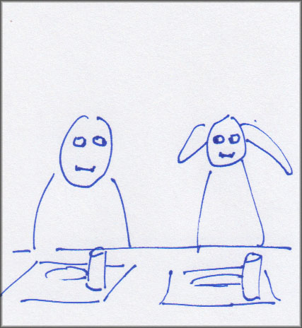
You’re definitely going to have trouble finding the right image for this book, because it’s got to portray preteen protagonists without giving the impression that it’s for a preteen audience. And “preteen romance” isn’t exactly something that stock photo banks specialize in. My first idea was of a preteen boy and girl sitting at a lunchroom table, with their heads facing straight ahead, but with sidelong glances and subtle smiles…
(I R ARTIST!)
…but that may still give too much of a middle-grade-audience vibe.
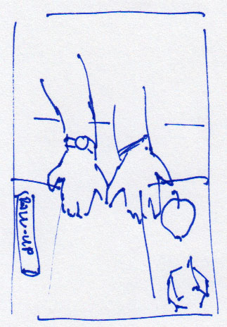
My related second idea is, I think, a little less obvious, and thus a little less likely to seem aimed at a middle-grade audience. Two lunch trays (with apples, drinking boxes, whatever conveys a grade-school cafeteria) and between them a boy’s hand and a girl’s hand, with their pinkies reaching out to each other:
 But again, these are off-the-cuff ideas. I think your best bet is to sit down with someone who understands cover design from a marketing perspective and figure out how to convey a grade-school romance without attracting a grade-school audience.
Other comments?
Hi:
I’m definitely struggling with this one. At first, having read the description, I thought “well, okay, it’s a puppy-love story,” but then you say that it’s more PG-13 than not, which…I dunno, with 10-year-olds, seems a bit, well, off-kilter to me. I understand that it’s a romance of sorts and a comedy.
I’m heavily leaning toward Nathan’s suggestions–the shyly exchanged glances over the lunch trays or the touching fingers, either on a desk or again, in the lunchroom. I think having elementary-school-style lunch trays with elementary-style food (say, those kiddie pizzas, maybe? what do they get in today’s world?) might also help say, “these are pre-teens,” which seems to be a rather tricky market.
May I ask you this, submitter? When you envision your perfect reader–the person that you envisioned and to whom you wrote this, whilst working on it–who is it? Is it a 13-y.o.? A YA audience, which is 12-18? You’re straddling two categories here–Middle-Grade readers are for 8-12 y.o.s but YA is 12-18, in trade publishing.
Your definition of your marketplace seems to be for adult readers, not YA and not MG. Especially when you say PG-13, that skews heavily toward YA, but I can honestly say that I don’t think I’ve ever seen a YA novel with 10-y.o. romance protagonists. It’s hard to sell 12-y.o.’s on reading novels about 10-y.o.’s; YA typically tends to have mid-teen and older protags.
So, if you could tell us about that perfect reader, that perfect buyer, so we better understand who it is that you’re targeting, it would be enormously helpful on cover design.
Maybe something more like this?
https://imgur.com/a/2aIjT0w
with more ‘adult’ type art? it might be cool to add some hand drawn doodles, but then again you don’t want it too fussy. Black and white is really in right now, which the simple art like this lends itself to.
This one is a real challenge… lol
this artist has a bunch of nice drawings here:
https://depositphotos.com/similar-vectors/36348149.html
Shel:
I actually rather like that. 🙂
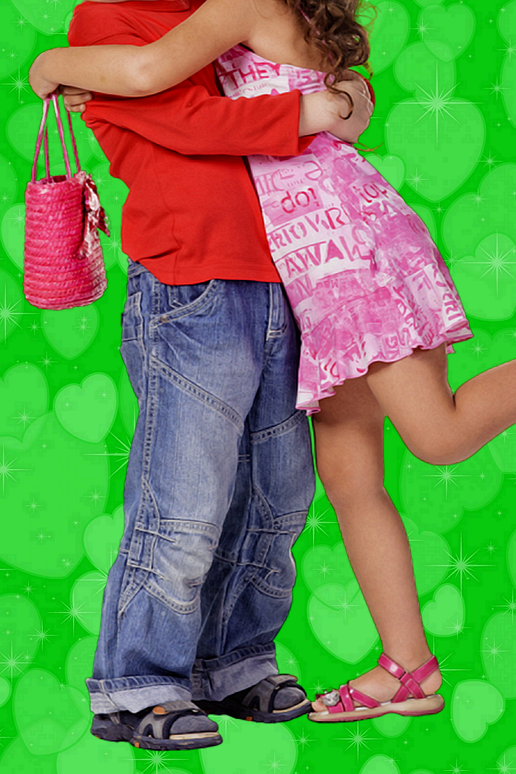
All right, I did spot the signs of this being a “puppy love” romantic comedy in the thumbnail, so you’re off to a decent start. Our esteemed host does have a point when he says putting the protagonists’ heads out of the frame like that makes identifying their ages rather difficult, however, though the brightly colored clothing and accessories and those baggy jeans on the boy in particular set against a green (not red or pink like on a trashy Sweet Valley High book’s cover?) background might be a decent clue that these young lovebirds aren’t even teenagers yet. Even so, there being Y.A. romances set in middle school and even high school showing just the feet and legs of their protagonist couples on the cover, these clues to your book’s protagonist couple still being young enough to be in elementary school might be a little too subtle for your prospective readers to notice.
Speaking of prospective readers, I appreciate your mentioning your target audience overlaps heavily with the target audiences for Melody (1971), Little Manhattan (2005), and Moonrise Kingdom (2012), as it just so happens I’ve seen and enjoyed all of those movies. (So: target audience, c’est moi?) You should definitely look to the posters for these movies for pointers concerning what to put on your book’s cover, and especially the ones for Moonrise Kingdom, as it was in fact rated PG-13 just as you say your story would be if it were a movie. Even so, I should also point out your target audience is a bit limited, as none of those movies were exactly blockbuster smash hits in their time (though Moonrise Kingdom in particular made a respectable profit at the box office).
Contrary to what our esteemed host says, while stock photo sites might not tend to focus on preteen romance specifically, any decent image search engine can turn up loads of stock images of prepubescent boys and girls (aged anywhere from two to twelve) doing various romantic things like kissing, hugging, giving each other valentines, etc. In fact, using just such a search engine, I turned up a certain awfully familiar-looking stock image of a little girl quite enthusiastically hugging and kissing a little boy; am I right in guessing you cropped this particular image and rubbed out the watermarks before cutting and pasting it on some other stock image of an abstract sparkles-and-valentines themed background? If so, not a bad cut-and-paste job, I must say; though our esteemed host and my colleagues here might be right when they say it’s not quite what your book cover needs. (For one thing, the little tykes look to me more like they’re seven or eight than ten-going-on-eleven, though—full disclosure—I’m not exactly an expert at guessing children’s ages.)
Our esteemed host’s second storyboard sketch showing the children’s hands brushing pinkies is—perhaps not entirely coincidentally—rather similar to one of the images on one of the movie posters for Little Manhattan, so probably a good suggestion to keep in mind for your next draft of the cover. In addition to hugging and/or kissing, some of those stock images also show those precocious little couples doing some quasi-romantic hand-holding, so you could try zooming in on something like that in a stock image. Alternatively, you could go with Savoy’s suggestion to try a somewhat more abstract image, though it seems to me the art he suggested would be more appropriate to the likes of Diary of a Wimpy Kid than your kind of story.
Concerning your story’s rating, how soft or hard of a PG-13 rating are we considering here? I mean, Moonrise Kingdom is PG-13, and yet I suspect a lot of tweens from today’s rather jaded generation of children could probably take most of its vaguely sexual/violent/disturbing content in stride, whereas viewing Red Dawn (1984) (the first PG-13 movie ever to be released to theaters) would probably still be a rather traumatic experience for the majority of children under thirteen these days. So, do you think your story would be all that traumatizing to children the same age as the protagonists, or would you say the rating’s just a general disclaimer to those children’s parents to cover your backside legally the way Moonrise Kingdom‘s was?
Concerning the lettering, our resident typesetting expert Hitch here could probably help you out on that; but as she says, she needs to know a little more about your target audience too before she can determine what’s appropriate. Oh, and by the way: Cooties sounds like it might be a pretty fitting title for this kind of story, but I don’t think we caught your name anywhere in the pitch? What name do you plan to use in your byline?
Uh, with due respect, I kinda thought that’s what this site was. You’re saying you people don’t understand cover design from a marketing perspective?
As I said in the pitch, Hitch, I was specifically thinking more of the Y.A. crowd, albeit the kind who are mature enough for PG-13 material. (So yeah, it might be a bit much for 12-year-olds, although maybe not: with some of the crap they’re getting from public schools and our highly sexualized popular culture these days, kids tend to be a bit more desensitized to sex and violence at younger ages than they used to be.) It’s meant to be a sort of retrospective insty-nostalgia for teens old enough to understand the facts of life and have a little experience with being in romantic relationships, as in “If you’d known then what you know now, would you have gone for a full-blown romantic relationship back when you were just starting to think maybe the opposite sex wasn’t so bad and you might like them after all?” I’m thinking that particular crowd is probably aged about fifteen or sixteen and up.
Perhaps an important detail, since you and the other critics here seem to be getting a bit hung up on that PG-13 rating: that rating’s not coming so much from anything the protagonists themselves do in this story; for all their precocity, they don’t really do much more while “making out” than lots of hugging and kissing while remaining fully clothed. What sex and violence there is (mostly sex, though there’s a little violence due to their peers bullying them) all comes from the adults and children around them. Much of the comedy in this romantic comedy comes from a lot of the people who think them strange to be dating each other at such a young age being awfully freaky themselves, such as the butch female coach (never openly stated to be into lesbianism, though she’s pretty heavily implied to be) asking the boy at one point “Aren’t you two a little young to be deciding to be straight with each other already?” (Boy’s response: “Well, why shouldn’t we be honest?”)
These jokes are kinda like those “parental bonuses” writers throw into family friendly books and movies to keep the adults in the audience (who have to read the books to/watch the movies with the children) from getting bored. There was some stuff like that in that movie Melody I mentioned: for instance, a scene in which the ten-year-old protagonist Danny is at a dinner party with his parents and they get to joking with their friends about a certain Catholic gal they know who tries to use prayer as a method of contraception. “Not her hands she has to put together,” his father remarks. The difference in this story is that those references that fly right over the children’s heads (specifically the protagonists’) are targeted more at those mid-teens-and-up readers in the target audience.
I agree with RK: that looks kinda like cover art for Diary of a Wimpy Kid—although that’s not necessarily a bad thing. I’m thinking maybe to try using this image: https://st.depositphotos.com/1793489/1876/v/950/depositphotos_18766175-stock-illustration-valentine-doodle-boy-and-girl.jpg What do you think?
D’oh! Busted! Yeah, that’s the image, and that’s more or less what I did with it.
As for guessing their ages, the secret for guessing when they’re preteens is that when boys and girls are nearing puberty (which is happening younger and younger for some reason; the average age at which a girl’s menarche commences these days is just four months past her twelfth birthday), the girls typically get a growth spurt first, making them a bit taller on average than the boys. Once the boys hit their stride—usually somewhere around thirteen—they’ll shoot up past the girls and be taller on average for the rest of their lives. Until then, though, if a young couple are indicated to be the same age and the girl is the same height as the boy or just a little taller, they’re probably preteens. (See: the protagonist couples in all three of those movies I mentioned in my pitch.)
Oops! I forgot you wouldn’t know that since I didn’t put my byline on the cover yet. Silly me. Well, now you know, right?
As for my target audience, it’s as I said in my pitch: “anyone who likes “puppy love” romantic comedies like Melody (1971) or Little Manhattan (2005) or Moonrise Kingdom (2012).” You say you saw and liked them all; and I presume you’re over fifteen years old and experienced in romantic relationships by this point? So yes, I guess you’re one of my “prospective readers” there, RK.
With all due respect, all we knew about the book was your short description, and as you can see, that confused a lot of people. We critique covers here and give short-term suggestions; we don’t *design* covers for posters from the ground up. Your book doesn’t fall easily into a genre with well-set parameters. Spending time with a designer so you can discuss the book fully and brainstorm ideas and strategies for a hard-to-market book is.something you should expect to pay for.
https://st.depositphotos.com/1793489/1876/v/950/depositphotos_18766175-stock-illustration-valentine-doodle-boy-and-girl.jpg What do you think?
The girl looks a bit too old with the dress and heels but it could be fixed
If the dress and heels could be fixed, Shel, I think that one is adorable and good cover base stuff. 🙂
You and RK always find the bestest stuff! 🙂
All right, so I took one of your ideas and ran with it a bit; no heels and no big girl dress, but you might find most of this revision’s origins recognizable:
https://i.ibb.co/vvGFjNx/Cooties-Rough.png
Now, if I could just find more impressive typefaces for the byline and tagline…
https://imgur.com/NCPUPg3
excuse the quick crappy blends.
adding some doodles could add to the tone. I’m not sure these sample ones would be right because I think this story is told in the male POV so maybe something with more stars/fireworks feel. stars would also give it a more adventurous tone.
something more like these https://depositphotos.com/8680665/stock-illustration-back-to-school-sketchy-doodle.html
I don’t think it absolutely needs doodles but does help to break it up and look more finished.
It might be fun to put his quote on top in a handwritten font because it’s his words, not narrator voice.
If you opt for that maybe emphasize the word love by tracing over it, making it a hair bigger, the way kids do to make it darker.
my title is crap- it should look hand drawn so it needs much better shading and the letters could do with some staggering so it looks more like a kid did it
Your kids are nice. I was too lazy to get them to incorporate them. these kids have more of an us against the world vibe. Your kids have more of an we’re not really paying attention to anything else vibe because they’re focused on each other. I spent no time really seeing if there was a version that better captures the tone of the story.
you might want to smudge the paper up a bit.
when picking the elements consider what you’re trying to convey. it might be fun to draw a heart with their initials. it might be fun to have a face/ family scribbled out in the doodled bits.
I think those doodles still look somewhat girly. I agree that if the POV is the boy, then you’d want something more boyish on the cover, doodle-wise and I also agree that some doodles would be good.
I like these doodle cover suggestions for this book.
Well, like in those movies that inspired me (Melody especially), the boy does sorta take the lead, but the girl has a lively personality too and the story’s point of view keeps switching back and forth between them. (Something else worth noticing: in both Little Manhattan and Moonrise Kingdom, the girl was slightly taller than the boy, and in Melody, she and he were just about even. Like I said, those preteen years are when the girls tend to spring ahead of the boys with their first growth spurt; which is why I modified the doodle of the girl to make it stand a bit taller than the doodle of the boy.)
I did like the idea of using something like the standard three-ring binder writing paper you see in elementary and middle schools for a background, but I’m concerned that adding extra doodles might clutter the cover too much. Here’s my latest draft: https://i.ibb.co/WF4MvnB/Cooties-Rough.png While I could maybe throw in an extra doodle or two, doesn’t that look kinda full already?
Something else worth mentioning: though I learned how to do cursive writing in third grade, schools these days are barely teaching children how to print legibly, let alone how to write. That’s why I tried a basic printing typeface for the tagline and a fancy cursive typeface for the byline. If you have any other ideas for what typefaces to use, I’m open to suggestions.