The author says:
The Seed of Joy is a historical novel set in South Korea in 1979 and 1980. It spans the time from the assassination of president Park Chung Hee to the end of the May 18 Democratization Movement, commonly known as the Gwangju Uprising. During this time, Korea endured the most turbulent months it had seen since the Korean War.
Paul Harkin, a US Peace Corps Volunteer from Indiana, comes to Korea on his first trip away from home. The Peace Corps gives him more than he ever bargained for − from a comically inept public health official, to violent political strife in the cities, to a hard winter in a leper colony. But when he falls in love with Han Mi Jin, a troubled, politically active schoolteacher, he defies the Peace Corps, the United States government, and the Korean martial law authorities to take up her cause. Caught up in the bloodshed of the Gwangju Uprising of May, 1980, he wrestles with love and loss, freedom and responsibility.
The author himself was a Peace Corps volunteer in Korea at the time of the story. This book should appeal to readers of “Human Acts” by Han Kang , “The Island of Sea Women” by Lisa See, and “The Living Reed” by Pearl S. Buck.
Nathan says:
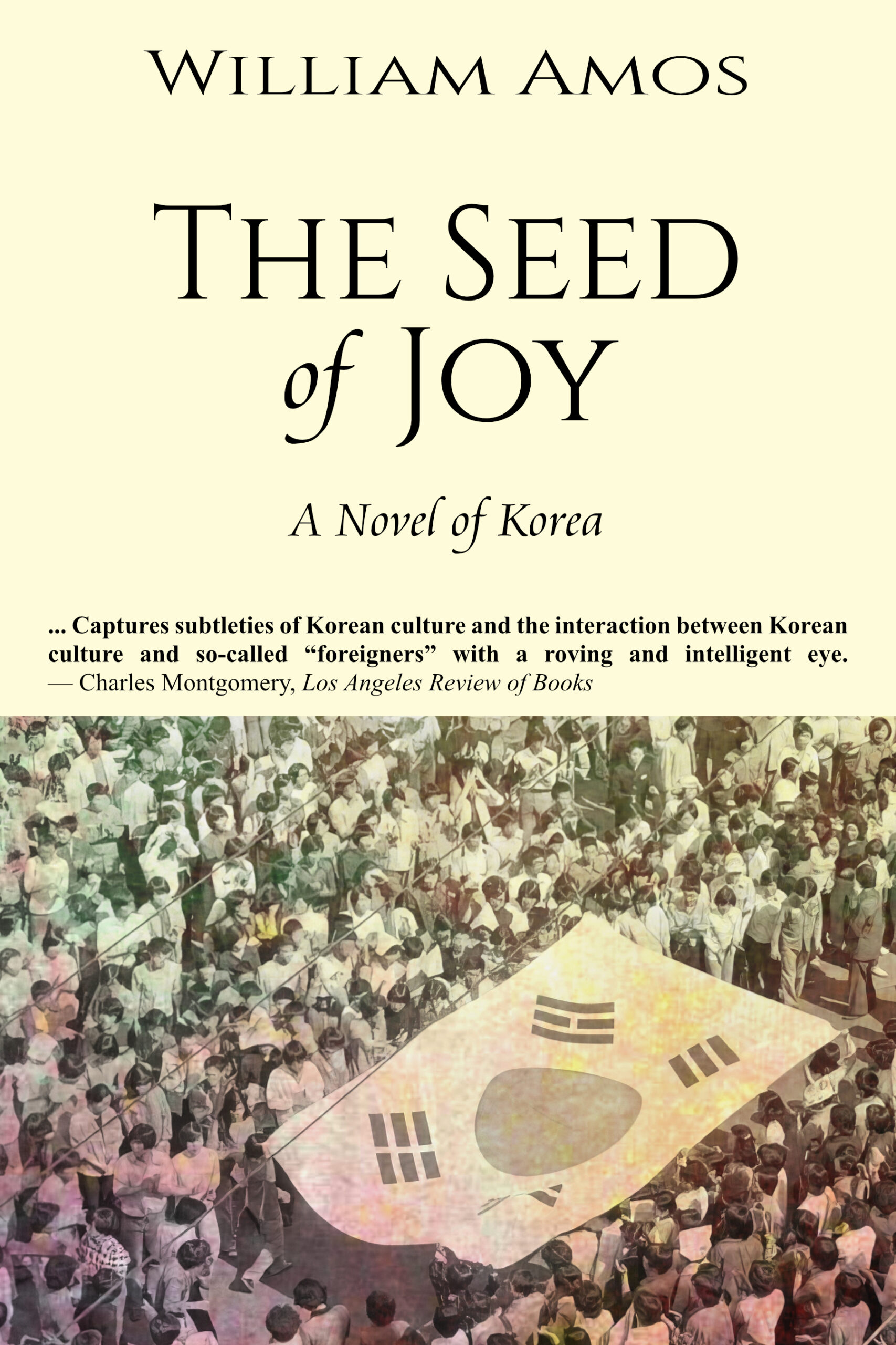
I can see you’re going for a low-key vibe here, and I respect that. That said, if the violence mentioned in your description plays a significant part in the book, then I would suggest a slightly more energetic look.
One possible suggestion is to add a bit of color back into the Korean flag in the photo — it would give those readers who encounter the thumbnail first (as most readers will) an initial impression of the subject matter that otherwise they wouldn’t get until and unless they clicked through for the larger version.
Also, use a different typeface than Times New Roman for that pullquote — it’s just too generic.
Other comments?
I can see the concept (i.e. what you had in mind) behind your cover’s design clearly, but its execution is rather ho-hum. By the look of things, the shot of the crowd carrying a South Korean flag is either an old black-and-white photo printed in a newspaper that’s gotten discolored with age (and possibly mold from water damage) or a screen capture from an old documentary shot in black-and-white and played back from an old VHS tape on an old NTSC color television screen. (It’s not for nothing that the old National Television Standards Committee format’s detractors often referred to it as Never The Same Color.) Either way, the image as currently displayed isn’t working; a cover’s being serious (as yours is clearly intended to be) doesn’t mean it has to be boring.
Your layout also leaves something to be desired: as a general rule, it’s best for whatever image you’ve chosen to be on your cover to fill it completely. If—for whatever reason—that’s not possible (e.g. maybe this is all the image you’ve got as it was shot in a 4:3 landscape ratio), the next-best method is to center it on your cover and place some of your captioning above it and some below. Since you’re evidently not a big famous author whose books can sell on the strength of having your name on them alone, I recommend placing the title and descriptive sub-title at the top, the image in the middle, and your byline at the bottom with the pull-quote underneath it.
As for the image, once you’ve got it properly centered, I’d recommend gray-scaling the entire thing (to dispose of the discoloration from water damage/NTSC television interference patterns) and then colorizing the South Korean flag as our esteemed host instructs to show off the vibrant blue-and-red colors of the taegeuk at its center. Even if it ends up looking a little fake for that (as colorized old black-and-white photos often did, particularly back in the 1950s), at least it’ll drive home the point about the time and place in which this story takes place. If your protagonist and deuteragonist are supposed to be in that crowd (e.g. I could totally believe a certain guy and a gal in the middle of the crowd in the upper-left corner of this image are the loving couple in question), colorizing them as well to make them stand out from everybody else would help emphasize the “…and these two were witnesses to the entire incident!” aspect of your story.
Here‘s a “five-minute revision” showing you what I have in mind for your cover. (Note that the “colorized” people are actually just some discoloration from your original image I left in place to show which couple I had in mind to emphasize.) It still needs a better typeface (and since your byline has room to breathe now, it should obviously be bigger and less vertically squashed than it is right now) and I’m thinking with the South Korean flag so prominently on display, that sub-title might not be necessary at all. Nevertheless, you see how just re-calibrating the layout and image coloring a bit to place the proper emphasis on the appropriate subjects helps improve the cover, right?
Thank you so much for your quick revision! I see exactly what you’re getting at. Thanks also for your thoughtful comments. It’s back to the drawing board, but with a lot more to consider. Thank you again!