The author says:
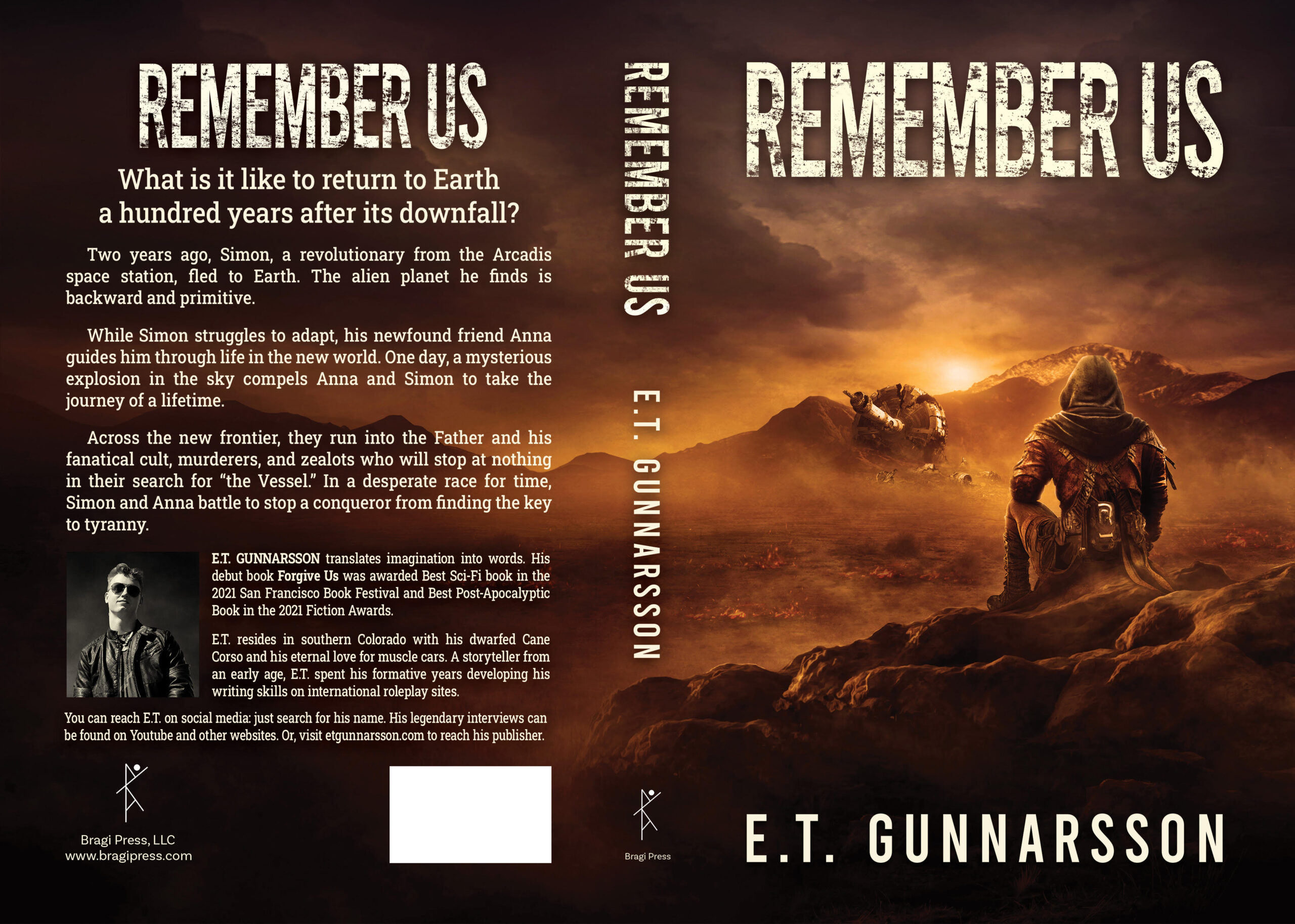
“Remember Us” is the third book in the Odemark series. This cover must have a look and feel that matches the other two covers: the orange hue, ground fog, embers, and a point of lighting are important. The cover art shows the main character Simon arriving at Pikes Peak, Colorado, after traveling over the plains for months. Simon sees the crashed space station from a distance and is seen from an angle facing away from the reader. The sense of distance is important since the space station will become more visible as he and the caravan he travels with gets closer. The scene is meant to be tranquil and lonely since Simon is viewing the home he fled from.
I’m looking at making small adjustments to the overall series. For example, updating the back-cover font to Robot Slab, using a mixed case for the hook sentence, and perhaps using a color author picture. FYI, the Abandon Us cover was updated based on the critique from this site, so I look forward to your input on this cover before the book is published. This is the hardcover version, so titles and text are placed to allow for wrap.
Nathan says:
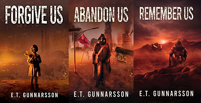
For reference, here are the previous two covers in the series:


I have two comments:
- The spot of color on the Abandon Us cover provides a welcome spot of contrast. I would suggest something of the same on the Remember Us cover — perhaps a distinct pinkness right around the setting (rising?) sun, or a fragment of color on the figure itself.
- It might be worth exploring a subtle but distinct tint progression through the three covers, which will give potential readers a clue that they’re a series in a set order. For instance:
 (That sucks, as a thirty-second version should; I hope it get across the idea.)
Other comments?
Eh, the art looks pretty consistent and to the point. Maybe you should resize the titles and bylines on each cover to be exactly the same size across the entire trilogy for a little extra consistency? Other than that, no fixes or tweaks are coming to mind.
I would agree that conforming the text size, as suggested by RK, might not be a bad idea, but I also see the challenges around that, given the ever-increasing length of each title.
I’d also wonder if there’s any way to take that (rising?) sun, in the third cover and make that some other color as well. I see it’s currently a yellowish-shade; I wonder if there’s any chance it could be a steaming orange? Again, something to break up the sameness of the monotone shades? Is there any chance that that planet’s sun is green or the like? (A girl can hope.)
Or some other color relief there? Just a thought. Other than that, as RK says, you’ve really done a nice job with the consistency, branding, etc.
Thanks for the feedback. The different lengths of the titles will obviously make it very hard to make them identical in size.
Agreed on the sun; will see what can be done.
@Hitch: The mountain is Pikes Peak outside of Colorado Springs so the sun is definitely not green. 😉
Yeah, even if the apocalyptic event threw a lot of dust and gasses up into the atmosphere, all it would do for sunrises and sunsets would be to make them a very pretty scarlet-and-gold color; very much like what happened for about a year after Mount Pinatubo blew its top.
As to titles and bylines? The bylines—at least—can all easily be exactly the same size, since they’re already exactly the same length. I agree the titles might be more difficult, but it seems to me nobody would complain about a modified aspect ratio for the typeset (unlike for the imagery) if you stretched or squashed the letters to make them all fill the exact same piece of real estate on each cover; especially considering that you’re apparently applying custom distressing, which should make the text look appropriate for the book regardless of whether the letters are a little fatter or skinnier from one cover to the next.
As I said, a girl can hope. I would love to see a stronger splash of color, on that third cover, and the sun seems the most-obvious place to try to pull that off. If it can’t be done, it can’t be done.
And yes, you’ll need a compressed face for that title. It may take some serious typographic tinkering to get right! Good luck with it.
Thanks all. I’ve been able to implement these changes. The color splash is taking the Remember Us cover to the next level. The more uniform look will be great for the upcoming box set.
Again, thanks for the help, it’s much appreciated.
If you want to see the updated eBook cover: https://booksirens.com/book/ZFLUVZ7/ER8Z0RN
VERY nice. That color splash is really working! Glad we were all able to help.
Is the website having problems? I attempted to submit a cover on two different occasions and it hasn’t been posted.
Nathan?
You goofin’ off there, kiddo or are your updates on the sites eating submissions?
Hitch
Meesa been a busy beaver on other things. But, unbidden, his submission was posted this morning.
Identical typeface size and placement for the title and byline, and highlight a single item on each cover with natural color.
Here’s one way to make the typeface consistent:
https://i.imgur.com/waosE94.png