The author says:
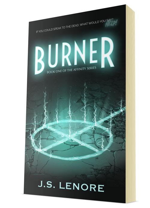
Homicide detective Kim Phillips isn’t like the other officers of the Chicago Police Department. She’s quiet, isolated, and she can speak with the dead. Born with the ability to see into and interact with the afterlife, she is a Burner: a person tasked with hunting down dangerous spirits and sending them to the other side. When Kim exorcises the ghost of a young girl, she’s dragged into a new and unsettling case, one where people like Kim are being killed. The only problem? There’s no connection between the victims, and no proof that they were murdered in the first place. Kim has to catch the killer before he finds his last victim and unleashes an unknown evil on the world.
Burner, the first book in the Affinity Series, is a dark exploration of how life and death are only separated by a single breath and how even those with power can be powerless.
Nathan says:
I think this is a very professional cover — the limited palette works well with the focal element of the art, the fonts chosen are distinctive without being overloaded with novelty… I think it says “urban fantasy novel” very well. However, as the story is also a police investigation, I think it would work better if you could find some way to say “urban fantasy crime novel.”
Could there be yellow traffic lines on the ground, underneath the glowing sigil (muted to match the color scheme, of course)? Or some police tape in the shadows behind the title? Or a pair of handcuffs on the ground by the byline? I would brainstorm on some simple addition like that to add the angle of police involvement to the cover.
Other ideas?
(And since everyone expects me to say it: “Burner? I don’t even KNOW ‘er!”)


A portion a fresh chalk outline on the ground behind the circle could do the trick for the crime aspect, perhaps a head and arm nearby and lit by the circle with the rest of the outline receding into blackness as the ground slopes up and away. It would also emphasize the speaking with the dead angle. The silhouette being upside down on the cover might look odd though.
Separately, my only real concern with the cover is the ‘Help!’ in the upper right. I think it detracts from the ambiance, lessening a sense of danger or tension rather than aiding it.
I love it!
Every bit of it. It is great. Striking and memorable.
If the story is more about the supernatural than detectives, this doesn’t need any additions.
I agree about ditching “Help!” Great job with the cover.
It looks great at this size, but I have a sense that it might look dodgier at full size. The way the light fills those cracks seems okay at this size, but I think if you picked up a print copy and looked at it up close, they’d look very painted-on. It’s hard to say.
The “Help!” definitely needs to go, but honestly, I might lose the tagline altogether. It’s a rhetorical question, and it speaking with dead people isn’t THAT unusual of a premise. Even for a police procedural.
Very nice!
I really don’t think it needs anything else.