Secret of the Master

The author says:

“After discovering that he can enter the World of Books, 15 year-old Tommy Travers has accepted training under the Gifted and now must learn to control his new powers. He has already seen the devastating consequences of ignorance. The repercussions for his past decisions are not over. The escaped wizard Mephitis read his mind. He knows where the Gifted are. If he can just get his powers back the warehouse, the Gifted, the world, will be his. Tommy is the only one who can stop him, but first he must discover the secret that Amelia has been keeping from him all along.”
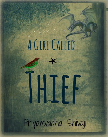
official-book-2-cover

official-book-2-cover

Nathan says:

I love how you took the advice from your last cover submission and made it part of your series branding.

The  artwork is professional, as before. However, it seems to lack a level of novelty appeal. The last cover stood out with magic being used on the tilting deck of a ship; compared to that, this image seems awfully generic — there’s nothing here to stand out from the YA fantasy novels which could be displayed to either side of it.  And while readers who are already fans of the series won’t mind, you’re missing the opportunity to catch the interest of new readers who could see this second volume’s cover and look around to see if the first volume is available.

I don’t know the story, so I don’t know what other details could be pulled out and added to the artwork.  Tentacles? Building silhouettes? Flowers around his feet?  I dunno. But I would suggest going back to your cover artist and seeing if he’s amenable to adding something to uniquify* the image.

Other comments?

*I just made this word up.

The Evil Locked Within

The author says:

Set in the current time, this horror novel follows a serial killer as he stalks his victims. Unfortunately for him, his sixth victim is far from the normal woman he is used to taking. Now at her mercy, he discovers the horrible connection between his latest catch and his departed mother.

bookcover6x9_cream_240

bookcover6x9_cream_240

Nathan says:

The chain is a fair image for this genre, but everything else lets it down:

  • The color scheme is cool and reserved. It needs to be dirty and dangerous.
  • The type is professional and generic. It, too, needs to be dangerous — their bold and brutal, or wild and untamed (or both).
  • Red type is always problematic, as there are always contrast issues; as you can see here, readability as the red crosses both dark and light backgrounds is reduced almost to nil.

Here’s my five-minute redo:

bookcover6x9_cream_240-5-minute

I’m not completely happy with the font I picked, and I think that the texture I added to the photo ends up being too monochromatic, but hey — five minutes.

And finally: I know that the text on the back cover is a placeholder, but please make sure it’s readable, using upper and lowercase.

Other comments?


The Robin Hood Thief

The author says:

The Robin Hood Thief is a futuristic thriller.

(tagline) The opposite of death is courage.

A middle-aged mom and nonprofit employee in 2050s America, Helen M. Dawson suddenly finds out she has 45 days left to live. But she’s not ready to go. Helen decides to become a hero, the Robin Hood Thief, in hopes of righting the wrongs of her increasingly dystopian society. If she can pull it off, perhaps she can cheat death of its final sting. But can she do all the good she wants in the time she has… and can she keep her daughter safe while she throws her own life away?

rht-hilary

rht-hilary

Nathan says:

Hmm.  I don’t think having this face dominate the cover is successful, because there’s nothing about this face that clues the prospective audience in that this book is for them — there’s no distinct expression, no dramatic light… It’s just a face, and not a particularly attractive or distinctive one. I would bet that half the people who glance at this cover at thumbnail would assume that it’s a biography of someone they don’t recognize.

The type is underwhelming. At full size, you can see the binary numbers and understand that this is either futuristic or computer-related, but that detail is lost at thumbnail size; the only thing left to indicate the genre is the typeface, which isn’t equal to the task.  Even something that is slightly more mechanical would work better.

Finally, I think your byline looks awkward.  Three initials and a last name is odd, and with the periods in between, the initials end up taking up more space than the surname! I would suggest rejiggering the layout so that the initials are above the surname in a smaller point size.

Other suggestions?

A Girl Called Thief

The author says:

A MG/YA Fantasy/Fractured Fairy Tale.

Synopsis: Once upon a time, there was a girl who set out to learn the meaning of fear. Twelve-year-old Saena likes to steal words. She sees them shimmering in the air, beautiful and fragile and perfect; sometimes she plucks a word that she really likes and stores it away in her head so that it belongs to her. One day she plucks the word Mama, and her mother disappears into Saena’s head. This time, something is different. Saena has stolen her mother, and she can’t seem to return her. When a gold-necked nightingale with a strangled voice and red-and-green feathers appears at her window one night and promises to help her get her mother back, Saena is only too ready. Thus begins an adventure fraught with danger, as Saena and the nightingale – which calls itself Jiu – travel the secret moonlit roads that will take them into Fairy Country, guided by Saena’s mother and the words. They travel up hill and down dale, and across sparkling seas and cities made of glittering bone. Along the way Saena collects a strange assortment of companions, none of whom are even remotely what they seem. The words have never failed Saena before. But as they come closer to the place where all the lost things go and where the dark fairies hold sway, Saena is finding it increasingly difficult to see them. Her mother’s voice is fading fast, and at every turn Saena discovers more and more about her mother that puzzles and befuddles her. Who exactly is the Red Fairy? Why does the name Marya Morevna taste so familiar on Saena’s tongue? As a word thief, Saena knows better than anyone that nothing can be hidden away forever. But perhaps some things are better left alone…

cover-version-1

cover-version-1

Nathan says:

At first glance, I like it — the only problem I see is that the colors on the bird clash with the rest of the color.

At second glance, a few other problems emerge. The dragon in the upper right looks like it’s cut-and-pasted out of another source, as evidenced by the fact that it’s standing on nothing; you should find an image of a dragon flying (one which you have appropriate rights to, of course). And what’s with that dotted line through the star?

Other comments?