The author says:
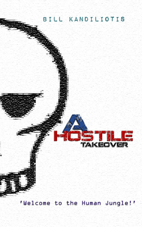
This is a science fiction novel set in a post-cyberpunk world, struggling with the rise of corporate gangs and untamed technology. I wanted it simple as possible and chose the skull motif to represent criminal/piracy elements to the story involving corporate banksters, slumlords, rogue AI’s. It is set in a near future, post economic super-depression civilisation. I’m aiming to soon publish a new edition and am wondering if I should redesign the existing cover or ditch it altogether.
Nathan says:
As a practical matter, you should always put a distinctly different cover on a new edition. Which gives you lots of room to play with this one!
First: The sizing of the words in the title make it look like “A” is the most important word/letter. Meanwhile, “Takeover” becomes unreadable in the thumbnail.
Second: While the digitalized, dot-matrix effect on the skull comes through at full size, that’s completely lost in the thumbnail; it could a cross-stitch, for all we can see. Coupled with the fact that “blank white” isn’t a a color that anyone associates with cyberpunk, the cover fails to let potential readers know in their first glance that this is a post-cyberpunk criminal dystopian novel.
My suggestion? Steal. Add Matrixy, grungy elements. Let “cyberpunk” and “dystopia” and “crime” be the first thing people notice, even before they read the title.
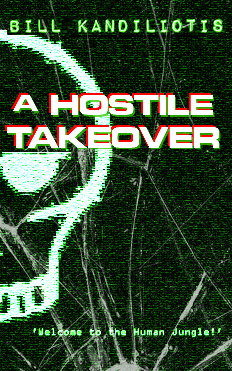
Here’s my five-minute redo:
I know I’ve got your title font somewhere on my computer, but I couldn’t find it quickly, so I substituted. I played with the color balance until it looked like The Matrix, enlarged your name, and added the first “broken glass” wallpaper I found. I’m not happy with it as a final, obviously, but I think it’s a good starting point.
Other ideas?


At the very least you need to put a line around that white book so it doesn’t bleed off into nothingness, as you can see it doing here.
However, I don’t think that it should be white, at least not like this. Photoshop texture effect says nothing. If this looked like a computer screen then white might work, but this does not.
I am sorry, but I don’t like your skull. It isn’t realistic enough to be a real skull, and it isn’t stylized enough to be graffiti or hacker logo, which is what I think you are going for.
Turn that skull up a notch, and I think you would have a better final product.
I agree, in thumbnail it looks dull an pixelated, in full size it looks like a knitting pattern, and there is just a lot of white, with the title huddled together in the middle like lost campers in snow.
And as Nathan says, not the cyberpunk colour scheme – maybe it is post-cyberpunk? (no idea what that is) Incidentally, this came as second result for image search for cyberpunk
http://vladimirpetkovic.deviantart.com/art/Cyberpunk-420524793 – not that you should steal it of course – but that is more like I imagine the palette, dark blue/green and black, splattered with hot neon hues. Blame Blade Runner for that.
While the dark colour scheme looks better, I’m not sure the skull motif serves the book best, though it is not strictly a bad choice. It seems a bit generic perhaps, pirates, graves, poison? Teenager goth graffiti? It fits a bit too many genres from traditional murder whodunnits to YA, and too many themes. The layout is a bit static too, so perhaps it is a good time to start completely anew. I would scrap the Welcome message btw, it is a bit tired* – if you did get a more visual cover, that could do the job of the tagline: now the cover is not crowded so at least it is an element, but it does not add that much in terms of info, or interest.
*I have now a guns ‘n roses earworm going
Generally, I wouldn’t put a white cover on any book meant to be sold primarily online. They look great on the shelf but they just disappear on the web.
But honestly I’m not a big fan of black and green, either. That’s just very basic. I’d like something more like what Tuula suggests.
Actually I think your cover is great for the most part; I find going with the angle of ‘do what other people do’ which is advice I hear a lot on here but it only makes covers disappear in the oblivion of all other books; your first take is original and a step in the right direction.
I think you can further the pixelated look by heightening the contrast and lines of green, red and blue lines like what you see on a smashed computer screen.
http://windowscomputerpranks.weebly.com/uploads/7/4/8/7/7487533/cracked_screen.jpg
Plus emphasize you word takeover and give the title a computerized look like a ‘transmission breaking up’ effect.
Hope this helps and cool cover.
Tiffany,
The reason that “do what other people do” is the cornerstone of a lot of our advice is that genre readers, by and large, are used to being marketed to in a certain way — they make their initial split-second assessment of “Is this book meant for me?” by how the cover looks, and if it doesn’t strike them as “their thing,” there’s usually another book cover to glance toward on the left and the right. Originality has many virtues, but book covers are a marketing tool first and foremost.
This is pretty much a “me too” comment.
Yeah, a white background really doesn’t convey cyberpunk. And the “A” shouldn’t have more font weight than “Hostile” or “Takeover”. Waffles has a point on the skull, but you might be able to get away with it.
I like both suggested approaches: the green phosphorescence of the monitor and the artwork linked to by Tuula. While the former is dead on styling for the genre, the latter really conveys a sense of place. I’m a sucker for landscape covers. Done right, I can’t help but get sucked in.
Here we have a curiosity that crops up from time to time, a cover that actually makes proper use of one of the tagged traits that would usually land it on Lousy Book Covers. Just as it would make sense for a cover to show “pseudohumans” for a story which is actually about people living in a purely simulated video game world, so too does it make sense for a story about a somewhat sleazy “post-cyberpunk” (meaning, I presume, that it’s set after the collapse of a cyber-punk civilization?) world to have some “pixelation” right there on its cover. This is what TV Tropes calls Stylistic Suck.
That said, the artfully scrambled “pixelation” effect on this cover is not only difficult, but nigh-impossible to see in thumbnail. In addition to making the cover more difficult to see on any webpage with a white background (which not-at-all coincidentally will almost certainly include the sales page), a simple fuzzy-looking black-on-white drawing of a skull looks despicably amateurish. It brings to mind an album cover I saw once that consisted of nothing but a crudely drawn sketch of a toilet with stains and water damage on it; somehow, I doubt that album’s sales have been doing very well…
Mr. Shumate’s five-minute revision of the cover works pretty well simply by default; anything with that black-and-green Matrix-style color scheme and a bit of old-style “put on your 3D glasses” color-separated font is bound to look cyber-punkish enough to get most of your target audience’s attention. As the other critics say, that might actually be a little too on-the-nose for cyber-punk however, so you might also want to try some variant color schemes from Blade Runner or even Max Headroom and see if they work better. (Wasn’t Max Headroom in particular kind of a “post-cyber-punk” story too?) In my opinion, though, just about any kind of cyber-punk color scheme should do the trick.
(This works in the same “mad-libs” way that you can instantly come up with a horror movie and accompanying poster just by taking any single relevant noun and putting it in some bloody dripping horror font. Case in point: can a movie titled Parents be a horror movie? Yes. Yes, it can.)
Beyond that, all that remains to fix is that crude skull drawing. Sure, a “post-cyber-punk” novel might require that civilization has collapsed; but if “untamed technology” and “rogue AIs” are a part of this story, people are presumably still using computers and not drawing everything by hand, right? Therefore, unless computer pirates are hand-sewing flags for their cause for some reason (the way the ISIS terrorists currently do), one would expect that any skull drawing would be just as computer-generated as the stylistically sucky pixelation of it.
Did you know that the capital “N” of the “Wingdings” font that comes standard with a lot of computers these days is a very scalable skull-and-crossbones symbol? It couldn’t be too difficult to run that through your pixelation filter and adapt it to some cyber-punk color scheme we’ve suggested here. Moreover, since the skull-and-crossbones has been rolling with the times for centuries in representing both piracy specifically and criminality in general, you shouldn’t need anything else once you’ve got that on your cover.
I think this is one more case of the author knowing more about the book than the potential reader, with the result that the imagery is meaningful only to the author. Even with Nathan’s proposed changes, there is really nothing that suggests “a science fiction novel set in a post-cyberpunk world” (whatever “post-cyberpunk” might be). For instance, one of the last graphics I would associate with “corporate banksters, slumlords, [and] rogue AI’s” is a skull, of all things. Frankly, combined with the title and subtitle, the book could just as easily be one set in today’s corporate world.
I think you need to make it unambiguously clear at first glance what the theme of this book is. And rethinking the cover imagery is going to be the first step in doing this.
Thanks all. Appreciate your comments.
My take home notes.
– white background rethink
– consider the thumbnail, something I’ve neglected to do yet these things are crucial
– ditch tagline
– reduce the ‘A’ with title occupying more space
– cyberpunk color scheme (i was trying to be different but those neons have become synonymous with cyberpunk. Post-cyberpunk i guess is still cyberpunk for most people.
– skull motif was meant to signify criminality/piracy/hacker set against the blue-red-white corporatism but this is meaningless if its not doing it’s job.
Looks like Nathan has sold me on the ‘distinctly different cover on a new edition.” BTW cool redo. Point taken.