The author says:
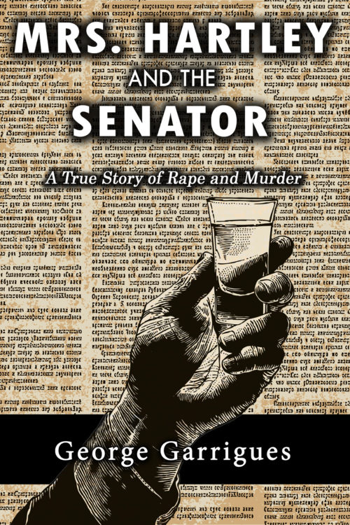
This is a nonfiction book. It is 1895. A young artist moves into the top floor of a bank building in frontier Reno, Nevada. The bank owner slips something into her drink and, well, has his way with her. The book is told almost completely though newspaper stories of the time, with transitions from one to the other by the author.
Nathan says:
An interesting premise. And the cover’s professionally done. But I don’t know that the cover as it is will draw in the audience that would want to read this account.
One of the tests of cover design often mentioned in the comments here (and which I will thus shamelessly steal) is, “Would someone who doesn’t understand English be able to look at the cover and tell what the genre and tone is?”
If I didn’t understand the text, I would assume that we’re looking at possibly a detective story (the newspaper background would lead me there), but I would assume, I don’t know… a chemical or scientific angle? (The drink in the hand isn’t distinctly enough a shot glass at first glance, and coupled with the newsprint, I’d jump to the conclusion of some sort of newsworthy chemical announcement.) And the typefaces chosen say neither “Reno, Nevada” nor “1985.”
Here’s what I’d do:
- For the title, bylines, etc., I’d find some actual fonts used in newspapers of the time. If need be, I’d get things a little more Western-looking than the actual fonts (small-town newspapers didn’t WANT to look small-town, after all), but I’d at least use the original fonts as a touchstone, including the wear and printing mistakes that would show up in newspapers of the time.
- The newsprint is a good idea; I’d put it in several clippings at overlapping angles, riffing off the idea that there are several disparate accounts being assembled here.
- Rather than a male hand triumphantly holding a drink aloft, I think you’d get a lot more mileage out of a female hand, on the floor, a spilled drink next to it. There’s a lot more drama to be had there.
Other ideas?