The author says:
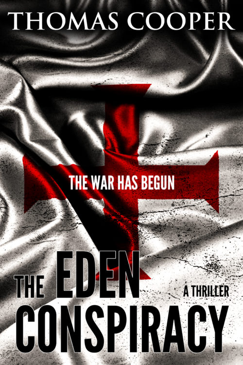
The Eden Conspiracy is a standalone thriller that follows a gun-for-hire and a virologist as they go head-to-head with an ancient religious order plotting a global pandemic to bring about a new Garden of Eden. Professional killer Jack Reagan is hired by a mysterious group to kill virologist Daniela Grosskopf and steal a vial of a deadly virus known as the Omega Strain. But when Jack has second thoughts and decides to instead protect Daniela and the virus, he must face off against modern-day Knights Templar seeking to recreate the Garden of Eden.
Nathan says:
My biggest concern is how the elements overlap, or don’t.
To wit: There’s a lot of space between the byline and the top of the cross — not a problem in itself, but the bottom of the cross then runs into the title at the bottom, which is already hard to read in thumbnail (the tiny white border around the letters doesn’t set it off sufficiently from the black-and-white background).
There are other little tweaks I’d try — the parallel placement of “THE” and “A THRILLER,” for example — but that’s my big concern.
Other comments?


I like this cover, and with a few small things tweaked, it will be great. First, I agree with Nathan, the cross needs to be moved up, so it’s not running into the title at the bottom. I’m also not a fan of the white stroke around the font. I really like the left side of the cross, it looks like its part of the material, but the right side… not so much, perhaps you can manipulate that side a bit more. Once, you make a few changes on this cover it should be great. Good luck, hope it works out for you.
I suspect that the cross and background are stock art, perhaps. What if they flipped the artwork upside down? Put the Dark material at the bottom, and the light at the top? That would move the cross, and all that.
A 1-2 pixel wide grey line would limn the letters nicely, instead of the white. You can’t use red; that wouldn’t work. But a smoky grey might be viable.
You did a nice job with the ripples when you drew the cross onto the fabric, but you’ve got the colorized-photo problem: It’s way too dark because the lightest parts of the cross are dark red, whereas a red sheer fabric should have lighter highlights. (I don’t remember the layer modes you want off the top of my head, sorry…maybe a dodge layer on top of the multiply layer, or something like that? You may need to poke around a bit.)
Aside from that, I’d lose “a thriller” because I think this cover does a perfectly good job of communicating the genre. And I’d blow up your title to be as big as humanly possible. But overall, this is a very solid concept and I don’t have much to quibble with.
I agree with Nathan’s comments about cross placement and Katz’s comments regarding its color.
And the “EN” in EDEN isn’t legible at thumbnail.
I also agree with Katz’s recommendation to ditch “a thriller”. You’ve got “conspiracy” in the title, which makes thriller redundant.
But these are just tweaks to what I consider to be a good cover.
When I first saw this cover in thumbnail, I did pretty much get the idea that this would be some kind of political/religious thriller/drama, so the art is broadcasting the concept clearly enough at least. The trouble with the execution of the concept is that the dark ripples in the flag are making both the title and the Templar cross a bit difficult to see. As katz also points out, the cross is pretty obviously overlaid on the flag too; a real Templar flag wouldn’t look quite like that.
Mainly, I’d recommend just getting an actual photo of a Templar flag; they can’t be that difficult to find, or make for that matter. If you feel the need to keep the “grit” of the current picture’s high contrast, a simple filter or two in your image editor should easily be able to achieve the same effect. Thanks in good part to Dan Brown and Tom Clancy, the symbolic flag picture on the cover makes any description of the genre entirely redundant, so I join with the other critics in recommending that you ditch the unnecessary “a thriller” description.
Apart from that, the title, tagline, and byline fonts are fine; just make sure they stand out better from the background so they’ll be legible. Once you’ve got everything clarified in this manner, your novel should be good to go.
I think the cover is a little confusing. There is little about it that suggests what sort of book it is or what it might be about (something the author may have also suspected, hence the addition of “A Thriller”). It also suffers from depending on special knowledge in order to be appreciated: not everyone is going to immediately recognize the Templar cross. And even for those who may, there is no immediate connection with the story you are telling: from appearances it could be yet one more among the scores of fiction and non-fiction books already in print that are based on various Templar conspiracies of one sort or another.
Since the plot circles around a virologist and a scheme to create a global pandemic, you should find some imagery that conveys this idea, which sets your book apart.
Typographically, much of the title is lost against the background…especially in thumbnail form where “Eden” is unreadable.