The author says:
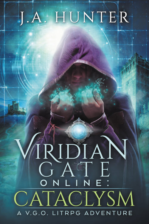
This is the first book in a new series. I really like the cover art and think it fits for the genre, but I’d love to get any extra feedback before I release this bad boy into the world.
October, 2042 An extinction level asteroid, 213 Astraea, is cannonballing toward earth. Collision, imminent. An international team of scientists are working around the clock to avert the cataclysm—few are optimistic. World Governments are preparing for impact with deep earth bio-dome bunkers, but only a select few lottery winners will be saved.
Jack Mitchel, a thirty-two-year-old EMT living in a tiny studio apartment on the West Coast, isn’t one of those winners. Still, there might be a way for him to survive Astraea; a slim chance, requiring a radical leap of faith. Through a connection at Osmark Technologies, Jack’s acquired a NexGenVR capsule and with it, a one-way ticket to the brand new, ultra-immersive, fantasy-based VRMMORPG, Viridian Gate Online. Taking that leap of faith, though, means permanently trapping his mind in the game, killing his body in the process. Worse, one in six die during the transition and even if Jack beats the odds, he’ll have to navigate a fantastical world filled with vicious monsters, domineering AIs, and cutthroat players.
And when Jack stumbles upon a secret conspiracy to sell off virtual real-estate to the ultra-wealthy—transforming V.G.O. into a new feudal dark age—the deadly creatures inhabiting Viridian Gate’s expansive dungeons will be the least of his concerns. If Jack can’t game the system, he’s going to be trading in a quick death for a long, brutal one …
Nathan says:
The artwork is beautiful, and the font is well-chosen. My only concern is with the length of the title: there are so many colons, line breaks, subtitles and series titles that it almost seems like a parody. I would say put “Viridian Gate Online” in one font and “Cataclysm” in the other, and skip “A V.G.O LITRPG Adventure” altogether.
Good work!
Any other comments?


What Nathan said.
I agree: I have no real idea of what the actual title is.
And when you say that the book is a “V.G.O. Litrpg Adventure” it suggests that this will have some meaning to the potential reader…which it won’t since this is the first book in the series.
The art is very nice, but whatever that is going on around the character’s hands does not come off as the kind of glow I think it was meant to be. I would try to make it look more like a light source than a kind of vague fog.
I have mixed feelings about the glowing medallion. It really doesn’t do any harm…but neither does it seem to make any sense.
I would emphasize the visibility of “Cataclysm” over “Viridian Gate Online” in terms of font size and coloration. The logic is twofold: First, that Cataclysm is a more attention-grabbing word for a reader browsing blindly than Viridian Gate Online is an attention-grabbing phrase. Second, until a series is established and popular a book belonging to that particular series will not be a selling point. I think in this early stage it would be more advantageous to try building recognition of Viridian Gate Online by its association with Cataclysm rather than the other way around. This can always be reversed once name recognition is established, just like famous authors’ names burying the titles of their books.
I agree with everyone else: The art is great. Distinctive, attractive, detailed, and I love the palette. But the title is confusing.
Another reason to lose the “A V.G.O. Litrpg Adventure” subtitle is that its immediate association to me is something like “A Warhammer 40k adventure”: A book series based on a popular game, marketed at players of that game. I’d assume that, since I don’t recognize the game, I’m not part of the intended audience. I wouldn’t guess that the game itself was fictional.
LitRPG is a newly emerging genre–having it on the cover is a common theme at the moment to help drive readers toward their books.
There are a few Facebook groups dedicated to the genre, as well as groups on fiction websites like RoyalRoadL and perhaps others.
Well, yes, the art is good as long as the story you’re selling is indeed about the game rather than the doomed Earth from which that game evidently provides a more literal and practical escape than any other kind of game ever could. For a moment there, while reading the description, I was nearly ready to direct you to the movie poster for Deep Impact, from which you initially sounded like you were cribbing your entire premise. For a story about a virtual reality game with a strong medieval fantasy element, though, this is exactly the right kind of picture.
The only problem lies in the captioning; as the others here have already explained at length, having so much text and punctuation along with so many abbreviations clutters the cover and confuses the reader. If I didn’t have your description, I might also think this novel was some kind of promotional adaptation to sell an actual game. While there is a hardcore gamer market for such adaptations, World of Warcraft, Ultima Online, and Magic: The Gathering among others have already vacuumed up most of that target audience; and if someone in that audience were to pick up a copy of your novel, he’d probably be disappointed to learn the game in it isn’t real: “Bummer, man! I kept waiting and waiting for you to tell me where I could pre-order a copy of this awesome-looking new game, and you didn’t!”
My recommendations:
1) Lose the colon and the “A V.G.O. LITRPG Adventure” line at the bottom; all they’re doing right now is complicating the title and confusing your prospective readers. You do not want to confuse prospective readers. As for the colon, you can enter that between the series title and book title on your book’s sales page(s) when you actually publish it, but such punctuation to divide one title from another is redundant and tends to mess up the apparent centering of the text on book covers where the captions’ positioning already properly divides the one title the other.
2) Consider getting a tagline to clarify that the game is purely fictional. Something dramatic and ponderous like “The Viridian Gate doesn’t really exist… but you can go there” should suffice.
3) Finally, put the series title in smaller lettering on a strip either at the top or the bottom and expand the Cataclysm book title as much as you practically can to help vertically balance the byline and series title. Unless and until your name becomes famous, I’d also recommend swapping the position of the title with that of the byline to ensure the cover’s emphasis is on the contents of the book first and its author second.
Basically, you’ve already got a good working cover with good art and excellent fonts; the only tweaks it needs now are to how you arrange the lines of text. Get that straightened out, and you can get busy publishing the book.
I’d had no idea what “V.G.O. LITRPG” even referred to…
I originally had this exact problem as well with my novels (it even is a game). There was confusion as to the real title.
I solved it by giving the game a logo. A distinct identity. Breaking it away from the title. That would probably be a good idea here as well as I am assuming that Viridian Gate Online will be on every book. You don’t want people to think that a new book is not new, but only a cover change.
I would assume the game is fictional, or at least tied to the title, as V.G.O. stands for the name of the game above. I think that most gamers / readers would understand that. The RPG lovers at least, and that’s the market.
Good luck!
Also, the rest of the cover is lovely. Really good everything! Flaming Pits, the title even works really. As long as future books have distinct names, in different colours.
I like it.
Using a logo would make me more inclined to assume it was a real game, since that’s in fact exactly how books based on real RPGs are branded.