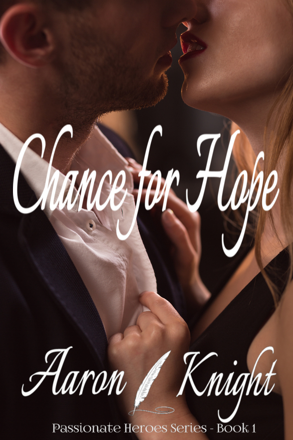
Chance for Hope

The author says:

Steamy Suspense Romance – not for kids or teens ‘Vanilla’ man saves D/s woman from attack in dark alley, they become lovers while fending off the revenge of gangsters. They teach other about their type of pleasures while falling in love. First in series of the couple building philanthropic empire against all odds.

Nathan says:

Now, I’m not the target audience (and I have no idea what “D/s” means), so I hope other can corroborate what I say.

You say this is a “steamy suspense romance.”  What I see is a just plain romance.  The steamier subgenre usually puts more of a focus on bodies than on lips (thus giving rise to the “headless torso” phenomenon), and suspense… well, some indication of danger is usually included.

Who are the books that you would expect to see in the arms (or on the Kindle) of the reader who would enjoy your book?  What are the commonalities between those covers?  How is your target reader used to being marketed to?

Enchanted

The author says:

Hi all, need some direction. My book is a fast-paced high fantasy book heavy on the sorcery, (no swordplay) with the world-building of an epic but the feel of an urban fantasy set in an enchanted, no-tech locale starring a father and his young son.

I’m not sure which book covers I should be using for guidance. High fantasy ranges from swords or symbols on the cover (GRRM) to landscapes/strangely lit arches (Wheeler) to characters looking mysterious (His Dark Tidings, etc). Other faster-paced, character-driven tales like the Palace Job or Nicholas Eames’ Kings of the Wyld use an illustrated group of mysterious people standing about looking tough with swords that look like stick figures when shrank down on the Amazon sales page. But there’s no swordplay in here, just lots of magic and enchanted trees. Did I mention this is a work of high Christian fantasy? Not so much book 1 but the rest of the series, yes. So which subgenre should I use as a guide for covers? O_o

The current blurb, which needs rewriting in case my rant above wasn’t enough:

Evil rises in the enchanted forest. One untrained mage and his son must stop it, if they can.

Start No Fires. Carry No Weapons. Do No Harm.

Those three rules safeguarded countless travelers through the enchanted forest—until they didn’t. One boy’s murder ripped open a gateway allowing evil to enter. Now no one is safe from corruption.

Enchanted trees take Sarn to where the forest failed to uphold its rules. Seeing a dead child gifted with the same magic as his son unhinges Sarn. He vows to find out the truth no matter what the cost. But his gift is untrained and finding answers won’t be easy. Sarn must balance nights serving the Rangers with days dedicated to hiding his son from the dark forces stalking them both.

When Sarn’s masters demand he abandon the quest, he faces an impossible choice—doom the ghost whose murder endangers them all or die from the backlash of breaking his word. With the odds stacked against him, can Sarn fix anything or will all be lost?

Nathan says:

I think the biggest problem is that the way the (completely modern-looking, BTW) father and son’s silhouette is shown makes it look like this is a story about things being done to them (usually the premise of a contemporary suspense novel) than them doing things.  I think a father/son high fantasy is novel enough that that’s what you need to play up here.

Other comments?

Witchy Wickedness [resubmit]

The author says:

Genre: YA Urban Fantasy
Designed by SwoonWorthy Book Covers
About: Ravenwood, California isn’t like other coastal towns. It’s a mystical place built over a gateway into Hell, with some extremely unusual residents. And Shiloh Trudell isn’t like other girls—she’s a teen witch who can sense the things that go bump in the night.


[original submission and comments here]

Nathan says:

Some advice taken, some not. I don’t consider myself 100% infallible in these things, but I think this is a case where the advice taken improved the cover and the advice not taken didn’t.

  • At least she’s hold a recognizable object now!  (Not to nitpick, but she looks like she’s holding it curled in her fingers, instead of back against her palm and the ball of her thumb.)
  • Byline bigger: Good. Title smaller: Bad.
  • The glow still looks more artificial than magical.

Other comments?

Stasis [resubmit]

The author says:

This is an updated cover concept I’m re-submitting for comment, based on several much-appreciated comments from the group. Because the new concept is such a diversion from the previous, I hope you’ll consider it in that light. As for the book, it’s a sci-fi novel targeted at adults. The story begins 50 years in the future as the protagonist and her husband travel to an exclusive resort on the Moon. A bioterrorist attack leaves most of the guests and staff infected with only days to live. The heroine goes into stasis to try and survive long enough until a cure can be found. She’s in and out of stasis for the next 200 years until the day arrives when she can take matters into her own hands.

[original submission and comments here]

Nathan says:

It’s a much more solid design than your first attempt. My two biggest comments are:

  1. Up the sci-fi factor — whether with the font, or adding an instrument panel, or something.
  2. There’s no need for the byline to be crowded into where it is, at the size that it is, when you’ve got all that empty real estate at the bottom.

Other comments?

Alone

The author says:

This book is about a girl who wakes up with amnesia. She has to figure out who she is and why she feels like someone is after her. It is YA and will have paranormal and suspense elements. Cover is not finalised.

Nathan says:

Give that you can’t tell us anything about the protagonist — what can you tell (and show) about the setting?  Is it a high school in suburbia?  The Old West? Thailand? The moon?  You really ought to give us some indication of the one thing you can tell us about.

Despite the fact that albinos are unsettling to some, I don’t see a lot of suspense or mystery here.  What if her eyes were closed? Or blank? Or black?  Or just plain not there?  I’m spitballing here, but there’s got to be a way to show an absence here, which is one way to describe the story.

(Also, the title font isn’t very suspenseful; it seems more appropriate to a coming-of-age drama.)

Other comments?