The author says:
This is the story of a polite and soft-spoken man removed from the consequences of his actions… or maybe not. Though his life has ended many times in many ways, a strange phenomenon he calls “temporal mental regression” forbids it to stay ended. He never lets anyone get to know him very well because anyone who does hates him and considers him sub-human and desires to inflict all the worst imaginable punishments on him. What makes him so bitterly hated is that he is a child molester; and he’s the one telling this story.
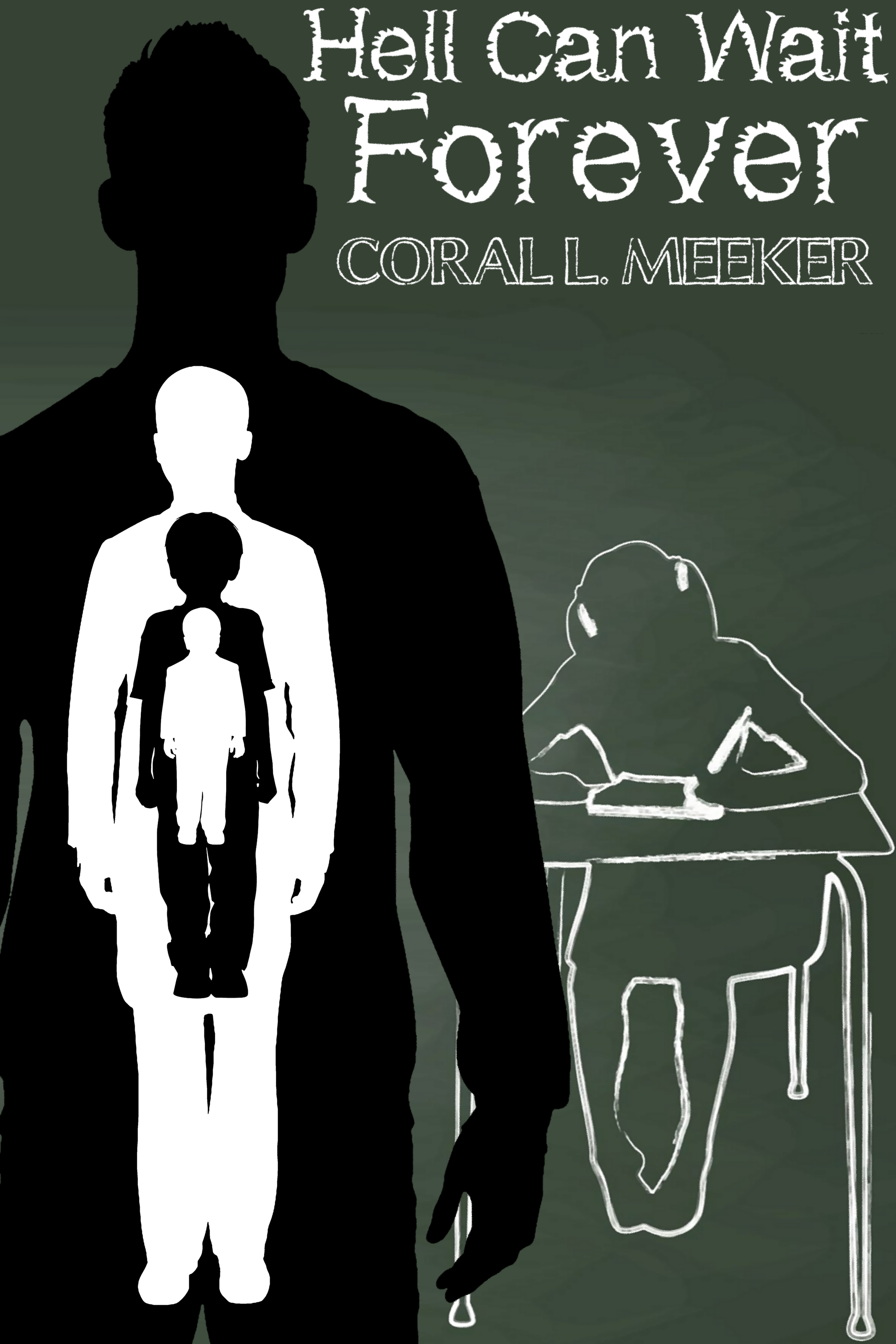
To tell the truth, I’m at a bit of a loss for what to show on this cover. Professionally made covers on books about molesters typically show either a battered-looking youngster curled up in a corner with tear-streaked eyes when told from the victim’s point of view, or a shadowy human silhouette (usually male) looming menacingly over some otherwise innocent-looking scenery when told from the perpetrator’s point of view. I’ve mostly gone with the latter arrangement for this draft, but am wide open to suggestions up to and including a complete overhaul; but my budget is quite limited, so please think twice before recommending I hire a pro to design the cover (which, according to Amazon.com, will “only” set me back $700).
Nathan says:
Well, you may not want me to recommend a professional, but…
I’m really at a loss here, because I still don’t understand the core of your book, or the audience to whom you’re trying to appeal. Would I be right in understanding that this is a semi-sympathetic portrait of a child molester? That’s a hard sell, all right, and I agree that the standard “molester” cover showing a sad-eyed victim wouldn’t work, but I’m not sure what WOULD work. (And that’s without adding in the Groundhog’s Day aspect.) That’s one of the great benefits of working with a professional who can bounce ideas back and forth with you, and have the skills to translate the appeal of your book into visual terms.
I can tell you that your current cover simply doesn’t work — not just for YOUR book, but for ANY book. The novelty font for the title is terrible, and clashes with the byline font. The two image elements are in different styles and convey absolutely nothing to someone who doesn’t already know the novel well (which is chronologically backwards — your cover is what will draw readers to the description, not the other way around).
At this point, even type on an abstract background is better than what you have:
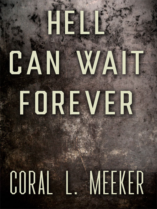
…because I can’t think of anything you can do except NOT try to tell anything about the story on the cover.
Other ideas?
You should probably do some research on book cover designers before assuming that the $700 quote is accurate.
Prices range from significantly below $100 up to $2000 or so. Check Facebook book cover groups, premade cover sites, and book cover designer sites and you’ll find it’s possible to get a cover in any price range. Quality tends to correlate to price, but you can get a decent cover for under $100 if you look hard enough.
Note: If you go to Fiverr.com and get a cheap cover, purchase your own stock photo/s to ensure that you’re getting one legitimately.
(Changing my name to something non-Googleable for this comment as I *am* a designer and I don’t want to be seen as shilling for clients here.)
Hmmm…
I have to agree with Nathan in that you probably need professional help…and in spite of what Amazon says, you can probably get something decent for less than $700.
The problems with what you have now are exactly those listed by Nathan…the prime one being that anyone looking at the cover really would have no idea whatsoever what your book might be about, its themes or ideas.
A book cover is really no place for subtlety. Like a poster, it needs to get across its message in the briefest of glances. It shouldn’t be a puzzle for the potential reader to figure out and it shouldn’t require prior knowledge of the book to understand.
Frankly, I think there are two elements to your story that you might want to focus on in your cover. The dominant one being that your protagonist’s life has ended many times in many ways, a strange phenomenon he calls ‘temporal mental regression’ forbids it to stay ended.” The secondary element is his role as a child molester. But these cannot be depicted separately…as I think you were doing on your original cover. They need to be made to work together as a unified image. For instance, the very first thing that comes to my mind (which may not really work at all—the idea, I mean, not my mind), is an innocent-looking child with multiple threatening-looking figures looming over her, each overlapping the other—like a misaligned stack of ghosts—and all more or less versions of exactly the same person.
I think I’d go abstract. A big title like Nathan did but with hell flames on the bottom and a childs toy falling into the flames.
A pile of the same toy all scorched up and mangled in the flames would get across this keeps happening theme.
All right, to Hell (I say only half-jokingly) with subtlety! Now that you’ve so helpfully clarified those two elements of my story, it occurs to me that maybe what actually ought to be on the cover is the “gist” (or “conceit” as Gwen Katz puts it) of the story each of these elements serve, which is that evil can be its own punishment. My story’s title has a double meaning: it could be a statement from the protagonist because he’s effectively immortal and therefore will never reach the afterlife, but it could also be a statement from Hell because it can lay claim to his soul in this life and therefore really can afford to wait forever for his arrival in the afterlife that’s never going to happen.
Another inspiration for this story is some of Plato and Socrates’ dialogues on virtue, particularly the story of the Ring of Gyges, which is historically the very first “invisible man” story on record. Since many would say using invisibility as a plot device to free an evil character from the consequences of his actions has been done to death, however, I figured using a form of time travel for this purpose would make the story better. Likewise, there are many forms of evil arguably far worse than being a child molester, but the only one people ever seem to condemn more thoroughly and universally is being a genocidal tyrant on the order of Hitler, Mao, or Stalin: a tall order for an isolated individual like this story’s protagonist.
In other words, what I really want portrayed on this cover is “Hell is being yourself.” Think you can help me come up with a blatant and unambiguous way to do that? I’m all ears.
So the first thing I’d ask is: Which is the central conceit, the reincarnation aspect or the child-molester aspect?
If it’s the reincarnation aspect, we want some kind of Groundhog Day-style cover with a theme of time or circularity. A mobius strip, for instance.
If it’s the child molester aspect, then for the love of God, don’t put the victim on the cover. Do one of those covers with a middle-aged white guy bowed under the weight of the world.
(Fritz Lang’s M did a sympathetic child murderer, so it can be done.)
OMG, and here I thought I was one of the 3 people in the world who have ever seen “M”!
In fact, it’s quite the classic. This scene in particular is rather famous, and is studied in college courses on art and writing as an example of how to portray a villain sympathetically.
Thanks for that… Never knew!
As I told Ron Miller, the central “conceit” of this story is that simply being as evil as a child molester (and worse, since that’s far from being the only kind of crime he’s ever committed) can be Hell all by itself. Though it helps clarify what’s so Hellish about being evil, the time travel is mostly just a plot device to remove him from any permanent consequences for his actions. Got any ideas how to portray the self-inflicted Hell of being evil on a cover?
Your blurb could use some work, but mainly I want to know:
Is he a *past* child molestor that just can’t die, who knows hell is his fate but is searching for redemption?
Is he a *current* child molestor, who uses his ability to not die as a way to keep commiting crimes?
Those are going to be two very different genres. The first would have almost a Stars my Destination vibe (classic sci-fi novel where the main character rapes a woman in the first few chapters and starts out very unlikable, but through the course of the book he learns to cultivate himself and to reconcile with those he has harmed.) If a redemption arc is the goal, or at least some sort of sympathetic treatment as the man learns to repent of his crimes and accept his fate of hell, it would be something more of a paranormal drama.
The second would be some sort of paranormal crime horror.
Nailing down your subgenre is really going to inform what type of cover you want. But Nathan is completely on the mark – the one you have doesn’t work at all.
Definitely do not use the chalk clipart. The nesting doll concept of images inside eachother could work, especially with the ghost-overlay type effect Ron suggested.
I’m not sure you should put an actual kid on the cover though, especially if there isn’t a child MC. Plus you’d need to check any licensing terms of stock used as some don’t allow child stock in combo with abuse situations.
Actually, he’s kind of a mixture of both. Yes, like any protagonist good or evil (especially when doubling as the narrator of the story), this one will portray himself as sympathetically as possible, but I don’t figure the reader’s sympathy has to last too far past the cover. The idea here is to make the protagonist fascinating like a horrific train wreck: you don’t want to stare, but just can’t look away.
So this story is definitely horror (specifically moral horror as in the movie M) with a side of either fantasy or science fiction, depending on how you classify an experience observable and repeatable only to one individual. One of the victims is a rather prominent character in an important subplot (a girl from another book I’ve written to which this is kind of a parallel story), but I suppose she isn’t absolutely necessary on the cover. Still, I’d like to have her on it in some way if at all possible.
I’ve not quite finished writing this story yet, so I’m not sure whether the protagonist should be redeemed or not; maybe, like the movie M, I’ll leave that question up to the audience.
I opened one of my books with a dying fetus, yet even I am at a loss regarding how to market a Groundhog Day type story about a child molester. Unlike those previous versions I can’t see any redemption for the main character, so the only conclusion would be to break the loop so he ends up in prison or dies.
For the cover, maybe a grunge version of a silhouette to suggest anguish, repeating within itself rather than having different silhouettes. As suggested elsewhere, perhaps they form a spiral as they recede into infinity.
Tough sell.
Yes, no need to deny it: this is a tough sell. On the whole, though, you and the other critics here have done a good job at coming up with some creative solutions so far. Your first cover is probably the closest to how my story should be advertised, but I agree with RK that your second cover would be a good premade for a generic time travel story, your third for a story from the victim(s)’s point of view, and your fourth for almost any kind of horror.
Part of what makes this a horror story is that unlike Groundhog Day, there truly is absolutely no way out for the protagonist though he tries everything that comes to mind and that anyone tells him. Also, instead of being caught in one of those repetitive time loops you’ve probably seen in some time travel stories, he finds that even the tiniest decision he makes (such as whether or not to wipe a strand of hair out of his eyes) can alter the entire world’s history beyond all recognition in short order. He soon comes to see the “freedom” of two-dimensional time travel (another concept explored in this story) as a form of imprisonment because he can’t ever stop having new-though-familiar experiences.
One question about that first cover: I recognize the Impact font in the byline (which almost everyone advises me you should never use, by the way: it was already overused decades ago back when it was all over the movie poster for The Little Girl Who Lives Down the Lane starring 13-year-old Jodie Foster), but what font are you using in the title? I could definitely see replacing that silly Underworld “novelty font” I used on this draft with that.
The typeface for the first is called Headliner No. 45. I also agree about using Impact or any stock fonts. I only did so because it had a similar typography style. When using themed typefaces I like to use a plain version within the same style for the byline.
You could make the eye from #2 larger and have the image of the first mock-up or the inset of the fourth in the pupil.
Regarding hiring an online artist, buying a premade cover, or using your own downloaded art to create your own, always verify the licenses offered. I’ve seen many premades with trademarked images the seller clearly never licensed. One of my favorite sources is Pixabay, but their “Free-for-all” license must be taken with a planet-sized grain of salt since so many of the entries also contain trademarked images. Even if they purchased a license for the art, that license may not extend to reselling it.
The same is true for fonts. I’ve found so many listed as Commercial Use but in reading the license notes they are not, or have other restrictions. Headliner No. 45 is not free for commercial use, so a license must be purchased from KC Fonts.
Here are a few thriller fonts I’ve found while creating different covers. The title in 36pt and the name of the typeface in 24pt.
https://i.imgur.com/IZ2Kqyz.jpg
I do have to wonder about this site’s sudden influx of books about irredeemably terrible people, though.
Sudden influx? Other than maybe Enduring Pride, what other books featuring potentially “irredeemably terrible” villain protagonists have we had here lately?
Maybe something like this. Slightly descriptive but abstract enough to avoid being off-putting.
https://i.imgur.com/JWytATU.jpg
(MOCK-UP)
Hey, I like that mock-up! I still kinda hope we can get some feedback on our feedback from the author/designer, though.
Thanks. I thought it could be the Creep entering a shed or walking out of Hell, or both.
I would have thought that was him walking into Hell, but we’ll see what we’ll see, I guess.
Wow… this is a tough nut to crack. Since a story told from the point of view of a villainous protagonist like this is typically most sympathetic to him (whether he deserves it or not; everyone’s pretty selfish and egotistical when engaging in “navel-gazing” in the kind of social isolation you mentioned in your description), I’m going to assume the narrative is more sympathetic to him than to any of his victims. Am I also right to assume he lusts exclusively for little girls? (There are a few bisexual child molesters out there, but the vast majority I’ve ever heard mentioned on the news are exclusively into either girls like Jeffrey Epstein, or boys like Jerry Sandusky.)
Assuming (fairly safely, I hope) that he does, and assuming he’s at least a little remorseful about any crimes he’s committed against these little girls (since you undoubtedly want to maintain the sympathies of your target audience for him as well; they won’t finish the book or give it any good reviews if you don’t), having a little girl’s silhouette on your cover could be something of an asset. As you say, tales about child molesters (or any kind of rapist) typically show either the crying curled-up victim or the looming menacing silhouette of the perpetrator over something innocent-looking, though usually not both for some reason. Even so, you’ve got both on this cover (though as an aside, I notice that little chalk silhouette of a pre-pubescent schoolgirl isn’t exactly curled up into a ball or cringing away from her molester in terror the way a victim typically does when she’s the protagonist), and that’s kind of confusing.
Another problem is that while all the silhouettes are fairly discernible in the thumbnail, including even the nested ones, too many silhouettes at once spoil the cover just as too many cooks spoil the broth. Were you to publish your book with this cover, it would earn not only the mystery meat and bad font choice tags over on Lousy Book Covers, but the busybusybusy tag as well. For simplicity’s sake, I recommend showing no more than two silhouettes on any given cover, and even that many is pushing your limits pretty hard.
Put simply, how about this: instead of those four nesting silhouettes (yes, I notice the more deeply nested ones are younger and I get how that symbolizes the character’s “temporal mental regression” as you put it, but as Ron Miller says, a book cover is no place for subtlety), why not nest one silhouette into the other? Since people would probably assume this is some kind of “trans-man” story if you were to nest the little girl inside the man (even or especially if she were curled up in a ball and crying i.e. “I’ve always known I was a man trapped in a girl’s body since I was little, and you would not believe how suicidally depressing that is!”), I suggest turning these cover tropes inside out and nesting the silhouette of a curled-up weeping man with his head in his hands within the silhouette of a little girl posing just a teensy-weensy bit flirtatiously. (Tread very carefully on that last point, since overdoing her flirtatiousness in the slightest will have all your reviewers condemning you for “sexualizing” the girl and accusing you of being some kind of pedophile.) Since I’m almost certain very few outside the “wokest” of the “woke” (i.e. deranged far-left academicians) take Paul Wolscht‘s delusions of being a six-year-old girl trapped in a man’s body at all seriously, no one in your target audience will mistake such imagery for an endorsement of “trans-ageism” or whatever we’re supposed to call such nonsense these days.
With victim and perpetrator’s roles reversed in this manner, your prospective readers should get a sense of the man’s being trapped in some way, with the little girl standing in as the object of his desires (sort of like a particularly well-done cover for Vladimir Nabokov’s Lolita I’ve seen) to symbolize that those desires are what’s trapping him. Whether he’s ultimately condemned to or redeemed from Hell (though from that title, I strongly suspect it’s the former), portraying him in acute distress that way should definitely help you win him the prospective readers’ sympathy from the start. After you’ve captured their attention and sympathy in this manner, all that remains is for your clever writing within to keep that attention and sympathy, and our job here is done.
Of course, I’ve been talking entirely about the cover’s imagery here, but I agree with my colleagues here that your awful “novelty font” has got to go. What you should put in its place, I’m sure our resident expert Hitch will be able to tell you, but I think she’s probably going to need a little more input from you before she can do that; as will we all, in fact. My recommendation: try giving us a few examples of stories similar to your book’s so we can suggest a comparable way to advertise it.
My colleagues and I have already compared the story in your pitch to Groundhog Day, Fritz Lang’s M, The Stars My Destination, and Lolita. Now tell us, if you please: to what stories (be they from books, television shows, or movies; any medium is fine) would you compare this one? What would we mash up or recombine to create a story like yours?
That’s a good question. M, Lolita, and Groundhog Day are especially relevant comparisons, but I would also point to two of my inspirations for this story, “A Nice Place to Visit” from Rod Serling’s original television show The Twilight Zone, and the science fiction short story “The Weed of Time” by Norman Spinrad (which I’ve never seen published by itself, but appears in several collections). To get my story, you basically start with the premise of “A Nice Place to Visit” (bad guy seems to be in Heaven, but eventually discovers he’s in “the other place”) and replace the petty bank-robbing thug with a protagonist very much like Humbert Humbert from Lolita. Then (since this is a book and we’re all living in the 21st century A.D.) ignore all laws governing what could or could not be said (such as the word “Hell”) and shown (such as nudity and sex scenes) on public television back when that episode aired.
For every one of the comparable stories mentioned, how I’d describe my story is “like that, except…” Running down the list:
Hell Can Wait Forever has a sympathetic bad guy like the child-killer from M as its protagonist, except that (as mentioned) he’s more in control of himself and intellectually sophisticated like the pedophile protagonist from Lolita, and therefore is unquestionably morally responsible for all his crimes.
As in Groundhog Day, not even suicide will allow the protagonist to escape from cycling back to earlier in his life, except instead of being confined to the start of one particular day, his cycling back is confined to any previous point of his lifetime. Also, he can only cycle back by dying, whether by suicide or some other cause.
Like “The Weed of Time” by Norman Spinrad, the protagonist is forever trapped in the time frame of his lifetime, except it’s not a stable loop, so how his life plays out each time changes drastically with every decision he makes, great or small.
Like that “A Nice Place to Visit” episode of The Twilight Zone, the protagonist gradually discovers that his seemingly Heavenly freedom from any permanent consequences for his evil deeds is actually a Hellishly permanent consequence unto itself, except that he figures all of this out on his own without anyone having to inform him of it while laughing maniacally.
Or something like this since there is a time element.
https://i.imgur.com/uJ6ENmG.jpg
“He should have burned for his crimes, but fate had other plans”
Or:
[Title] Hell Can Wait Forever
[Tagline] “…and ever, and ever, and ever…”
Or: “You don’t have to go to Hell. Hell will come to you.” …if I need a tagline, that is.
Seems kinda nagilum-ish, but not a bad cover otherwise…
I think that B.L.’s first suggested cover is really, really nicely done. But I am not so sure it would be right for this book. It seems to suggest horror more than anything else. (Imagine the title and blurb in an unfamiliar language: what would you think the book was about?)
The second cover is also very nicely accomplished…but, again, I wonder if it conveys a real sense of the book. We all here have both the advantage and disadvantage of having read the author’s detailed description…but we have to look at the cover as though we know nothing at all about the book. Does it really convey an impression of a protagonist whose “life has ended many times in many ways, a strange phenomenon he calls “temporal mental regression” forbids it to stay ended.” Or that he is a character who is hated and considered sub-human? One so hated that the world wants to continuously punish him, over and over again?
Matching “Forever” with a clock face might be just a little too literal illustration of the title.
Actually, merely having a villain protagonist “removed from the consequences of his actions” in the summary suggests right away that this is supposed to be a horror story. After all, what could be more horrifying than watching a complete monster getting away with all the atrocities he’s inflicted on his victims while you plead “Won’t somebody please stop this guy already!?” or (worse) sympathizing with him enough to be pleading “Don’t do it, man!” I remember feeling that latter way about the vampire protagonist of Mary, Mary, Bloody Mary near the end when she was about to feed on her love interest.
Without the title and byline on B.L. Alley’s first cover, as I said, I’d figure it was a story about a guy either figuratively or literally walking into Hell… which may or may not be appropriate to the story at hand. As for the second cover, I agree with you there: without the title, an eye with a clock face around its iris could fit any kind of time-travel story, including the dramatic, but also very romantic and upbeat The Girl Who Leapt Through Time. For that matter, “Forever” doesn’t really match up symbolically with any kind of timepiece all that well, since it’s too limiting: no timepiece (so far as we know) can actually last forever.
Of course, as you’ve sometimes pointed out yourself, it’s best not to subscribe to the Kitchen Sink School of Cover Design™. While “temporal mental regression” (probably what the author/designer is trying to portray with those nested silhouettes) might be too complicated to symbolize without cluttering the cover, a sympathetic villain protagonist’s being loathsome and despised and considered sub-human should be much simpler. We might be able to skip trying to portray impersonal abstractions like time and eternity altogether, and just focus on more familiar and personal things like making the character look both menacing and pathetic.
Now I’m giving myself the creeps…
https://i.imgur.com/XzQOdwo.jpg
Huh… kinda makes me think of that one poster for Hard Candy 2005, in which the little girl (well, the short teenager, anyway) in the Little Red Riding Hood suit torments and terrorizes a molester into killing himself. It also makes me think of Sid the bully from the first Toy Story movie with the girls in front of that hooded faceless figure being like the toys that kid was mutilating and recombining in his twisted experiments.
Of course, the latter impression is more appropriate to one of those stories from the victim’s point of view. So… nice cover, but probably not right for this book?
For this one I was thinking the victims are his hell and he’s forced to continue facing them. As I said originally, the story is a tough sell and I’m grasping at imaginary straws.
Hm, kinda like the child-killer in Fritz Lang’s M? Yeah, I guess I can see that.
Last one.
https://i.imgur.com/41g9oQX.jpg
And yes, the moment I posted it I realized I should have made “EXIT” red to highlight it. Doh!
That’s another nicely done cover, but awfully generic. I could imagine it being appropriate for just about any horror story with a monster in it from Halloween to It to Nightmare On Elm Street.
You probably ought to take the title and byline off that and sell it as a premade.
There is a little girl sitting next to the doll in the original image, but leaving her even as a translucent ghost didn’t seem appropriate, especially being a photo of a real girl. I’m stumped.
I think that this is a really strong design. About the only real suggestion I would make would be to not succumb to the temptation to make “hell” in red. First, it’s kind of trite and second, because red is low in value, it actually tends to recede and look less prominent than the white text.
Yeah. After I thought of the exit sign I’d probably have that be the only color in the image.
I’d also make the demon face more visible, I think, if appropriate.
BL’s covers for this one are really strong all of them. What if the first one were displayed INSIDE the outline of a little girl?
Trapped by his desires; defined by his lust for the child(ren)?
Just a thought.
As RK said, I need more info about the REAL theme and feel of this book. I don’t have enough to go on yet.
I like that plan!
So, Hitch, RK tells me you’re the master (mistress?) of fonts here. I like the font B.L. Alley uses for the title on that first cover, but might you have any other suggestions?
Hi:
Actually…I think, after some careful cogitation on this, that given the very strong graphic elements and theme of the cover/book, a “foofy” font (which could mean anything from Bleeding Cowboys to one of those Fae-ish fonts or calligraphy) is gilding the lily and not in a good way.
I’m okay with the stronger, blockier Sans fonts, distressed. There is ONE font, though–a newer font on Dafont, called Gold Under the Mud, that might JUST work for this. I’d have to see it, juxtaposed against the final graphics, but just in case you wanted to go a bit outside of the Distressed Sans route, it’s a possibility. It’s not known yet; it’s not overused (Yes, I’m looking at YOU, Papyrus and Bleeding Cowboys!) so…as I said, it’s a possible. (P.S.: play with mixing upper and lower case, especially in double letters like Hell. The designer suggests this and I second it.)
Ghost Factory would be possible, because the erosion on the bottom could very well appear like the flames of hell.
Those are my suggestions, given what I understand about the story and the suggested graphics. I think that a distressed serif, like Times New Yorker, is probably not strong enough for this cover–but you can try it. Hell, why NOT try it?
Good luck with it. I think we’d all love to see the next iteration!
This one is my favorite.
I do think it’s hard to tell whether it’s really an appropriate cover for this particular book, but that’s hardly your fault, because the description is unclear enough that we’re not really sure what the genre or tone is supposed to be.
Wow, that’s a lot of helpful feedback! Thank you, everyone, for all of these helpful suggestions. Thank you especially, B.L. Alley, for putting together those cover drafts.
For the record, I probably could scrape together enough money to afford a fairly inexpensive premade cover or a custom cover from someone willing to work cheaply. The reason I asked everyone to “think twice” before recommending professional assistance is that I’ve been watching this site for some time, and that nearly always seems to be nearly the first suggestion anybody makes. So, you know… thanks for the helpful advice—honestly, I do appreciate it—but it’s only helpful the first time you say it.
With that out of the way, I must say you and your fellow critics on this site have done an excellent job of steering me toward making a better cover with all of your brainstorming thus far. That according to everyone’s advice, everything on this draft cover is going to have to be thrown out is unfortunate, but (after all) not exactly unanticipated. So, thanks again to everybody here for all your help; I mean it!
Now to answer some questions.