Afterlives

The author says:

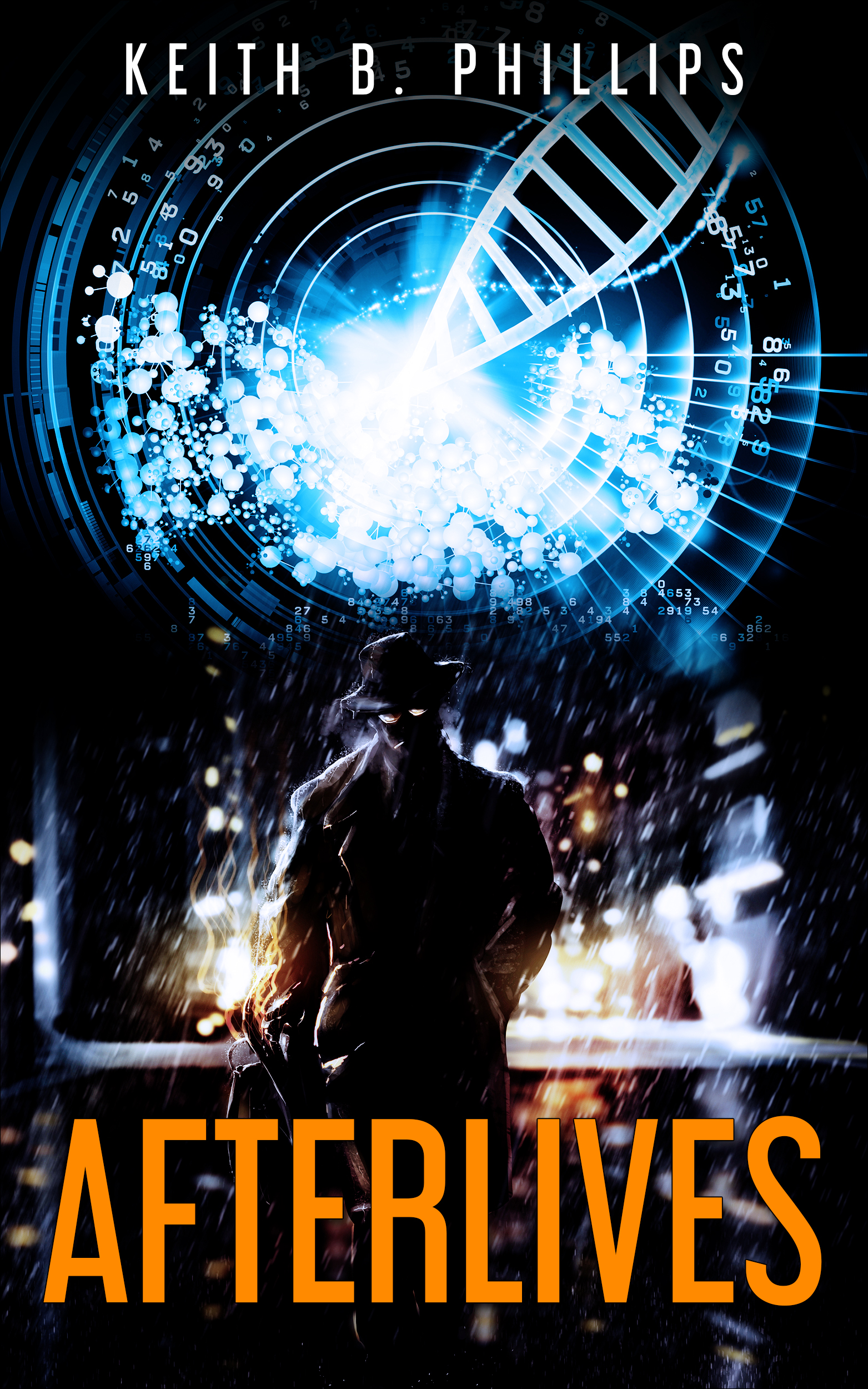
Private detective and military veteran, Martin Coswell never never expected any special treatment from anyone. But when he awoke at Medicore Nanotech five years after dying of brain cancer, he got a second life to live. A life soon to be turned completely upside down by an AI gone rogue, and a daughter with a missing father.

Nathan says:

A good combination of “thriller” and “sci-fi” imagery.  However, the human silhouette gets lost because he’s against the darker part of the background.  I would exchange the DNA and rainy street images so that there’s something bright behind the silhouette’s head.

Any other comments?

The Fruit of Passion

The author says:

I designed this cover for my mythic fantasy novel. It’s not ready to be published. I’m just playing around with various concepts. The book draws heavily on ancient Celtic tradition and the story unfolds in a fictional island somewhere in the North.

Here’s the blurb: Since the death of her mother, Queen Blodwen of the island of Rumia, Morella has trouble adjusting to the changes in her life and cannot accept her loss. Having to deal partly with her own suffering because of that, partly with the challenges her people have set for her in order to be crowned queen, partly with a consuming love affair with Rhys, the king of the fae, and partly with driving away the military forces of the empire in the South that has set eyes on the islands of the North, Morella embarks on a quest of knowledge and maturity that will take by storm the realms of the Otherworld, offer her strong alliances with their leaders, test loyalties and friendships and, above all, prove the strength and endurance of the human spirit.

Nathan says:

The first thing you notice in thumbnail is that there’s a whole lot of unused real estate.  Negative space can be a major design element, but it takes a lot of skill to make it work.  There’s no reason that the cup of petals shouldn’t go edge to edge, that the title can’t fill two lines (please, some other font than Algerian), and that the knotwork can’t be behind them.

Also, that’s a big block of text for a front cover. Save that for the back cover (or the top of the Amazon blurb).

Other comments?

Catslay [resubmit #2]

The author says:

In 1985, a witch turns little six-year-old Dana into a cat. Ten years later, he escapes the witch and takes up with a little six-year-old girl whose legal guardians are sexually abusing her. The witch’s curse gave Dana no special powers or abilities whatsoever apart from being a cat with a human mind, but this is more than enough for his purposes; for when horrendous and often fatal “accidents” begin befalling various unsympathetic people and institutions around him and his new owner (starting with her rapacious guardians) who’s ever going to suspect her cat of being the culprit?

As mentioned on previous submissions, the genre is Suburban Horror-Fantasy, but I should probably also add that Horror is its primary genre, the Fantasy premise being of only secondary importance to the story.


[previous submissions and comments here and here]

Nathan says:

You say now that it’s primarily horror, but is that really the case?  Horror stories are usually about the people that things happen to, rather than the people doing things.  If this were truly a horror novel, I’d say to go back to the first cover you submitted as “Catslash” and work from that concept.  However, since it still seems more “urban fantasy thriller” than actual horror…

(BTW, if Dana is turned into a cat, not a kitten, and then the events of the story take place a decade later and he has “no special powers or abilities whatsoever apart from being a cat with a human mind,” we’re talking a pretty old cat here.)

I think you’re missing the boat by having your cover be NOTHING BUT CAT. The story is how this cat protects the little girl, right?  Then have a sad-eyed little girl holding a cat with red eyes.  Put them against a black or murky background, use a title font reminiscent of the horror or revenge-thriller paperbacks of the ’80’s, and you’re good.

Other comments?


The Souls of Wuhan [resubmit]

The author says:

Resubmit. Souls of Wuhan

[original submission and comments here]

Nathan says:

This is certainly a lot more appealing. I’m going to assume that this is a quick layout version, and so the heavily artifacted layers would be corrected before publication.

I’m going to let those commenters who were more heavily invested in this one take the lead on the critique.

Bitcoin, Ethereum… Les Cryptomonnaies

The author says:

Explains what cryptocurrencies are, how they fit in our economic system, how to trade them and the risks/rewards involved. This book serves as a introduction to the world of cryptos and technical trading.

Nathan says:

I understand the “pirate treasure” motif you’re going for, but you need to switch your emphasis around.  Books that explain something usually put the title and subtitle big and clear, with any picture accompanying it as a definite sidenote.

The font you’ve chosen for the title and byline… again, I understand what you were going for here, but “angular” doesn’t always connote technology. In this case, it looks like cheap do-it-yourself painted lettering that you see on roadside-stand signage made by people who don’t want to pay for a professional sign (“Fresh Strawberries”).  And the italics font for the subtitle clashes terribly.

My advice: Let the title and subtitle take up at least half of the cover, in a clear but professional font.

And for Pete’s sake, lose that skull.  You don’t want the subtext of the cover to be “Bitcoin will kill us all.

Other comments?