The author says:
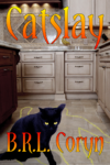
Basically, this is a novel about a boy who gets turned into a cat and then eventually takes up a career in killing evil people. For further details, see the description on my earlier submission when this was called Catslash. (I changed the title because for all of the slaying taking place in this story, none of it is actually done with bladed weapons or claws as a literal reading of that title would have suggested.) While it’s a bit more sophisticated than my first cover, this is still just a scratch cover. I’d much prefer to show the protagonist standing over an actual corpse rather than a chalk outline (especially since that’s a television cop show cliche; real police don’t actually do that), but so far haven’t been able to find a suitable stock photo of such.
Genre: Suburban Horror-Fantasy, which is basically the same thing as its Urban counterpart, but with the setting being mainly in various relatively affluent and wholesome-seeming suburban neighborhoods rather than gritty inner-city ghettos.
[original submission and comments here]
Nathan says:
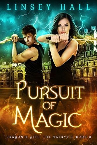
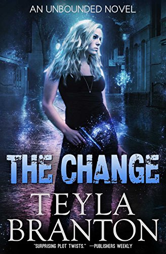
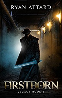
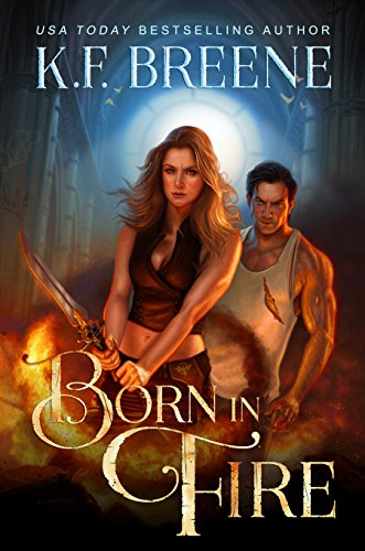
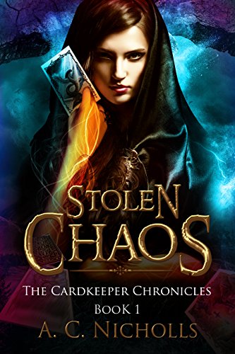
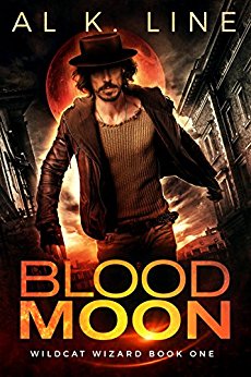
The cover’s completely different, but the same criticisms hold true: Your book doesn’t look like any variety of urban fantasy. When readers who like urban fantasy are look for their next read, this is what they expect to see:
Protagonists. Dramatic colors, with lots of highlights and shadows. Nimbuses (nimbi?) and glows and arcs of energy.
If you are trying to appeal to that audience, you need to market your book in the manner in which your potential readers will instantly know that this book is for them.
You’ll either need to (a) break down and hire a cover artist, or (b) at the very least, brows Deviantart.com and similar sights for finished artwork which you can license. Note that the cover does not need to be a literal interpretation of an event or setting from the novel; it needs to say, THIS IS AN URBAN FANTASY AND YOU WILL ENJOY IT.
Other comments?

I actually think this is a good base but like Nathan says it needs the glow and magic. The cat needs to be bigger and magical with the background faded and spooky. Try making the cats eyes glow and adding a nimbus around him. I’d try fading the background while putting a light trail on the outline of the body. I’d also use a simpler font for the author name without the effects on it. And maybe a more ‘active’ cat a pouncing one or something with more laid back angry ears. sharp claws with a hint of sparkle would be cool. Don’t worry about covering or losing detail in the background, focus on the cat. Add some red for drama and horror maybe on the cabinets in paw prints or his claws. It doesn’t need to be in your face but a teasing hint at murder and that the cat did it. This would be a super fun cover to make!
A middle-ground option, if putting the requisite glowing-magic bits around the cat is impractical, is doing it with the text layer like in the “Pursuit of Magic” cover Nathan references. The cat would be a better option though.
The background isn’t bad, but I think it is well lit and normal-looking enough that fighting past those traits could be a losing game. The bananas in particular ground it too much to give a very mystical vibe.
I generally agree with Nathan’s assessment and the list of examples he provided, but one special difficulty in this case is the cat itself. Cats are much smaller than people, not particularly threatening, and everyone knows this on an instinctual level. In this book it is a killer, and that will be harder to show than with people or a more dangerous animal. Regarding the examples above, having a cat standing tall in the center of the image in the midst of magical chaos (as in every example provided) would be more likely to look cute than edgy if you simply substituted it for the humans in the frame. Moreover, cats on all the covers in this genre that I could find were clearly in the role of familiars, secondary characters to the front-and-center human. Vivid colors on dark backgrounds, swirling lights, and so forth are critical for the genre, but I do think you will need to play with the formula a bit more than just that to get the impact you want.
One idea you might try a top-down angle, by which I mean a shot from directly above looking strait down, or nearly so. The scene would be a chalked body outline on gritty brick or pavement. This silhouette would take the place of the traditional central human on the example covers. The cat would be sitting in the middle, the equivalent of the sword on “Firstborn”, looking up at the camera and practically claiming credit for the act. I’ve seen composition like this work on crime drama covers, but to avoid evoking that genre by mistake you would absolutely need vivid and obvious magical elements. Glowing eyes on the cat I would say is an absolute minimum, but don’t stop there. Some kind of aura surrounding the cat’s body would be best, and something mystical with the cover text. This may be a rare case where subtlety in the imagery hinders more than it helps.
maybe something more like this. The tag line needs more sparkle and nimbus but since it isn’t the real one I didn’t bother. A faded rune would look awesome behind him but I wasn’t sure it ‘matched’ the story. Also the cat is super rough because I didn’t buy the image so there’s lines and stuff in it.
https://imgur.com/a/uJ4GF
https://depositphotos.com/search/by-images.html?idList=%5B1419367%2C51517545%2C9414188%2C81377504%2C10146397%2C118121310%2C25754001%2C70612291%2C9414187%2C7379647%2C55112935%2C82394396%2C16771389%2C25754063%2C55475931%2C151932924%2C63017557%2C28866665%2C80356080%2C49484409%2C133273616%2C70612285%2C80356090%2C19755867%2C7128757%2C9414182%2C80356162%2C19755461%2C1707413%2C60289217%2C28869649%2C32339505%2C32339473%2C81557538%2C1226794%2C132320832%2C41878893%2C32339457%2C2446630%2C177410862%2C9602634%2C176301720%2C54644817%2C32339487%2C40707843%2C77593882%2C43993057%2C62297061%2C5043177%2C123418012%2C10888079%2C41878961%2C151758522%2C162571634%2C132321012%2C68707087%2C71802237%2C71772979%2C1419361%2C3594678%5D&mode=image&imageUrl&qview=1419367
that cat might be cool to use and have him leave claw marks behind, make his eyes a bit slantier and glowy and fade his but into the black
I think a close-up on the cat to make sure people know it’s the main character would be helpful. There’s enough cat lovers that would be a main draw. Right now it looks like one of those cozy mysteries where the detective’s pet solves the crime. Maybe even go for more out and out supernatural horror. I smashed together some examples: https://i.imgur.com/taWWBuF.jpg and https://i.imgur.com/WeTqcRC.jpg
I really like that first one, Viergacht!
Wow, that is great. That is usable as-is great.
I mean, sure, it can be improved. But such a more effective direction to go in. That cat looks dangerous, powerful, and very main-character.
Yes, I agree, absolutely. 😉
https://imgur.com/a/gPEkj
fixed the title and added a sneaker for scale so you see it’s a house cat not a panther. (also some detail)
the font is https://www.dafont.com/aracnoide.font a free font. The author name is a simple sans serif with extra spacing. the tagline is Tempus Sans ITC from monotype. the sneaker was free from pixabay and the cat cost a buck from deposit photo (if you bought the sale). I made it’s eyes glare and brightened them and ears go back a bit but that’s super easy to do. (I’d actually make him even angrier or find a snarling cat)the rest was just dyi painting with splatter and glow brushes.
I had an idea to make the background a cat pupil with a reflection of dead body in it but that might be too subtle. it wouldn’t be hard to make the bright spot in this picture a cat pupil but that might be too busy, the glow in this is pretty subtle. it might be fun to make it white instead of yellow like it is.
Your cover has a couple of problems shared by many others. The first is that the cover conveys absolutely nothing about what kind of book it is or what it is about. It is a prime candidate for a test I have suggested here many times: If the title were in a foreign language (or even missing altogether) would you be able to guess what the book is about? I would suggest that in this case the answer would be “no.” The second problem is related to the first: In order for anyone to make any connection between the cover and the subject of the book they would have to have already read it. That, as I have said many times, is putting the cart before the horse.
You need to make the central theme of your book—“a boy who gets turned into a cat and then eventually takes up a career in killing evil people”—absolutely clear to the potential reader.
The cover also has a number of technical and aesthetic issues (the all-too-obvious cut-and-paste nature of the cat and the fact that a set of kitchen drawers occupies the entire center of the image). But there is little point in addressing these problems since you should rethink your cover art entirely from scratch.
Your test, Ron, has made it into the Booknook.biz vernacular; we call it (‘cuz, we’re mad creative, eh?) “The Miller Title Test,” which is a misnomer, as it ain’t the title we’re really dealing with, conceptually, but that’s what we call it. 😉 You live on in infamy, brother!
I blush.
My comments are really solely about the draft’s font. I really don’t love it, and it’s obviously hard-ish to read, as several folks here read it as “Catsplay,” not “Catslay.” (You may also want to rethink that, too, the title itself, as it’s easy to think that you mean a book about some psycho running around killing cats, too. Even if you only modified it a bit, to something play-on-words like “Cat Slay Fever,” it might work better.)
There are probably…50-100 viable fonts out there available to use, several of which are already shown on the covers that Nathan displayed. You end up with either a Serif-Display type font (normal serif with some addon glyphs/alternative characters that have swash features) or a solid sans. The sans, at least, is fairly easy. I get that you want to convey something “feline” with the font, but…that’s a bit harder to do, without descending into kitsch. Perhaps the other suggestions, about using clawmarks, or even pawprints (in a NOT kitschy way) might work, cleverly wound ’round the lettering.
I do have to confess that what really jumped out at me, unfortunately, was the banana keeper/holder on the counter, so I’d get rid of those. I realize that the body-outline is fake, but it’s an easy way to convey murder victims to the casual browser. I don’t love this one, but I don’t think it’s unusable, for the same reasons that you put it on the mockup in the first place.
Hope that helps a bit.
My biggest problems with the existing image are, first, the fact that the kitchen cabinets occupy the central part of the cover. That is the first thing the eye goes to…and it is unimportant and uninformative. It is essentially empty space. The two most important elements of the cover—the cat and the body outline—are not only crowded into the bottom but also partially obscured by the author’s name. (The body outline suffers from a double whammy: it is not only obscured by the text, it is also half-hidden by the cat.) Everything in the bottom third of the image needs to be moved up toward the center so that the main image elements are not only the first thing to attract the eye but also not under any text.
Even given all of that, a cat and body outline do not convey a sense of the kind of book the author is describing. A casual browser would be forgiven for thinking the book an ordinary mystery, given that a black cat and body outline have been pretty much visual cliches in the genre for a century.
The cover, even with the improvements I suggested, would still in no way inform the reader that the book is a “Suburban Horror-Fantasy.”
a darker vibe
https://imgur.com/a/lh5hT
ps this is what I do to see if I’m track when I’m making a cover (thanks for linking the covers and making it easier, Nathan). I place my picture in with the others and right away you can see I need more words. It needs another line of small text in a sans serif font to fit in better.
https://imgur.com/a/K2piy
Just as designing the cover for your last story was awfully difficult due to its being a bit of an oddball for its stated genre, so too is designing the cover for this piece proving difficult because of its protagonist being a cat in this mash-up of two genres that typically only allow cats to be supporting characters. To be sure, horror and urban (or suburban) fantasy tend to mix a lot better than the usually comedic sub-genre of romantic body-swapping stories and the usually darker and more dramatic genre of paranormal stories. Still, considering what role people expect cats to play in horror and urban fantasy, don’t be too surprised if this book ends up drawing a lot of misguided “shifter” enthusiasts in much the same way as your previous book evidently (if the “This book’s buyers also bought…” section of your Amazon sales page is any indication) drew fans for “TG”-themed body-swapping stories despite having (I assume) none of its characters swapping bodies with anyone of the opposite sex.
Anyway, along with mashing up the genres, you’re probably going to have to mash up several of my colleagues’ suggestions here to get the optimal cover for your particular story. The cats on Viergacht’s mock-ups show sufficient overt hostility to be a proper portrayal of your protagonist, but don’t have quite the right kind of backgrounds around them to establish the genre. S. M. Savoy’s mock-ups show something like the kind of “swirly clouds of potentially magical mystery” background your cover should have, but (I hope you’ll pardon me for saying this, Savoy) the narrowed eyes on the cat on each of those mock-ups make him look more like a stoner getting baked on some of those clouds than a slayer stalking potential victims.
Ron Miller’s assessment seems overly harsh to me (sans titles, a cat standing over some poor sucker’s chalk outline and glaring out at the reader does at least suggest there has been a death, and that the cat might have had something to do with it). I think we can all agree, though, that the cat and possible victim thereof shouldn’t have been shunted to the bottom third of the cover and (in the cat’s case) to the left. If he’s your protagonist, he needs to be front-and-center at any cost, with everything else shunted off to the edges.
While I haven’t whipped up any covers myself, a search for horror involving cats did bring up two covers that neatly illustrate the directions I think you potentially ought to take your cover. First is the cover of Brought to Rune by Brad D. Sibbersen, which shows nothing but the (rather hostile-looking) cat. If you want something more, however, there’s The 13th Warning by R.L. Stine, which has the rather grouchy-looking cat front-and-center amid mystical swirls and potentially occult symbols on the floor.
Ironically, R.L. Stine’s book isn’t really about that cat on the cover, but about the human one sees standing behind it allegedly having a run of bad luck due to the presence of a lot of instances of the number thirteen (and, well, maybe that black cat) in his life. Still, just as a poster for Escape From New York showing the head of the Statue of Liberty broken off and lying in the streets of the crime-riddled city (which never happened in the actual movie; the poster totally lied about that) inspired the director of Cloverfield to make a movie in which the Statue of Liberty really did have its head torn off and knocked into the streets of Manhattan, so too might you let R.L. Stine’s cover artist inspire the cover for your story about a cat actually being the protagonist. “The new must be born out of the old,” yes?
S.M. Savoy’s version is certainly much better compositionally than the original submission, and the title is handled well, but I am not as certain that it conveys any real sense of “urban horror/fantasy”—and certainly not any hint of the were-creature/changeling aspect of the story that sets it apart from other horror novels.
The same problem faces Viergacht’s otherwise excellent suggestions.
One of the problems with using an otherwise ordinary black cat—as in the original submission—is that it has been a cliche for mystery/murder stories and novels for nearly 200 years. Even a superficial search unearths hundreds of examples.
Black cats on book covers
As I mentioned in my original post: looking at the cover cold, there is nothing to suggest that it is not a run of the mill murder mystery or detective novel. There is no suggestion at all of “urban horror/fantasy.” While having the cat sitting by the chalk outline and looking out at the reader seems sinister, there is no immediate connection between the animal and anyone’s death…let alone even hinting at the central idea of the book: that the cat is in fact a metamorphosed human being. I think that the fact that the cat is not only a supernatural creature but a kind of human/werecat needs to be gotten across to the potential reader. It is something that sets the book apart from the masses and needs to be expoited.
Sorry about that bad link. This can be cut and pasted instead…
https://www.google.com/search?q=black+cats+on+book+covers&rlz=1C1RNKB_enUS632US632&tbm=isch&tbo=u&source=univ&sa=X&ved=0ahUKEwiHiIzmzuvYAhUOUd8KHZG1DVIQsAQIKA&biw=1920&bih=949
Here is a pretty good example of the sort of thing I am talking about…
Dammit. I can’t seem to get links right today! Here is the URL https://i.pinimg.com/736x/33/dc/b3/33dcb37573667c15fd3725d9ca375749–horror-fiction-horror-books.jpg
https://imgur.com/a/VP0we
fixed the eyes (I hope, lol) but that cat is crap anyway because he wasn’t bought. This is a super fun cover to play with though, (I mean if you like this sort of thing) both technically and artistically. I need to find a group where they do this for fun…
https://www.dreamstime.com/stock-photo-close-up-black-cat-yellow-eyes-angry-dark-image55010937
this cat has a great expression. He has great detail and he’d look awesome pasted on a cat body
Thanks to everyone for all the helpful suggestions, but now I’m confused: a lot of the advice here contradicts a lot of the advice you critics gave me for my previous cover. I’m not entirely sure what conclusions to draw. Maybe some of you could clarify which advice to follow?
Nathan Shumate:
Nathan Shumate (last year):
katz (last year):
So, katz was wrong about that? Bright colors (especially the cliche orange-and-teal washes so common to movie posters these days, which have also made their way onto five out of your six Urban Fantasy cover examples) are the way to go after all? Believe it or not, the picture of a kitchen I used for this scratch actually came with a bit of a cozy amber-orange glow to it; but since “cozy” isn’t exactly an adjective most cover designers would use to describe a horror novel and (besides) the glow made the titles more difficult to read in thumbnail, I actually altered the picture’s color balance and cut the saturation in half to make the setting look less inviting and more potentially horrific.
In short, are you suggesting I should follow the example of whoever designed the covers for R.L. Stine’s paperbacks for kids, and go for bright colors and subtly deranged imagery instead of washed-out grunge?
s m savoy:
Of course, my previous cover had very nearly all of these suggested items on it, apart from having no nimbus and lacking any hint of a victim or real background. Also, the cat’s eyes on this one are glowing, albeit with a paler glow due to being more straight-up yellow than the golden yellow-orange-with-red-highlights of my previous cover. So, another vote in favor of bright colors from you?
Kristopher Grows:
Of course, part of the reason I gave this cover a background at all was to establish the rather mundane suburban setting and “daylight horror” nature of the story. If I’d realized those bananas were going to draw so much attention, I might have edited them out. Incidentally, “mystical” isn’t quite the vibe I’m seeking here so much as “horrific” in both subtle and not-so-subtle ways; the story’s centered on what the protagonist does with his life after being turned into a cat, not the far-reaching social and philosophical implications of such sorcery being possible in the first place.
Kristopher Grows:
Aye, there’s the rub: much of the horror of this story is based on how beneath our notice house cats typically are and therefore how easily a human turned into one could quite literally get away with murder. Yet designing this cover requires me to draw attention to a just such an otherwise forgettable creature. What to do, what to do…
Kristopher Grows:
In fact, having the cat appearing to be claiming the victim as one of his kills is exactly what I was trying to do here; as with your suggestion of a “dead hand shot” for my previous cover, this is one of those pieces of advice I really, really, really wish I had the means to implement. The trouble is that, as with the dearth of stock images of “dead hand shots” showing the arm and hand from the side (with the camera lying on the floor) rather than from different angles, it’s just about impossible to find a decent “hawk’s eye view” picture of a black cat staring straight up at the camera amid the otherwise abundant stock photos of black cats in numerous other poses. It’s also extremely difficult to find pictures of any place shot from near the ground or the floor where a cat might actually be noticeable; hence my not being able to get the cat into the middle of the frame on this cover the way so many of you are suggesting here and the way I truly wanted to.
If any of you critics can direct me where to find imagery of the sort Kris recommends, I’m open to all such recommendations.
Viergacht:
Yes, it’s another vote in favor of putting the cat front-and-center, and I agree with all such recommendations; again, that’s easier said than done, however. Actually, though not the same genre, this story is slightly related to those cozy mysteries. Like many of the subtler horror stories I’ve read, some of the horror in this one has to do with subverting the expectations of other genres such as… well, those cozy detective mysteries: if the detective’s pet can be sentient enough to solve crimes, what’s to stop one of the other character’s sentient pets from committing those crimes the way this story’s protagonist does?
While the only truly supernatural part of this story is the protagonist’s involuntary (and likely irreversible) transformation in the first chapter, I agree this story is definitely leaning much more toward horror than fantasy. As such, your off-the-cuff scratch covers are pretty good, though I favor the first one (slightly-too-obviously photoshopped eyes and all) over the second. As mentioned concerning my previous cover, my protagonist’s preferred methods are subtle things like poison and arranged “accidents” that can’t be easily traced back to him, since he’s got too much finesse and too little physical strength to do much damage and shed much blood in a direct physical assault: hence, your first cover is much more suitable to this story. (Your second cover, on the other hand, would certainly suit that Stephen King short story “The Cat From Hell” that someone brought up last time, in which the cat did physically assault his victim and there was plenty of bloodshed, at least in the movie adaptation.)
Ron Miller:
Ron Miller (last year):
So if my previous scratch cover had been missing its title and byline, you would have understood it was about a cat who kills? (Granted, the symbolism of the bright red claw marks behind the protagonist on that one might have been a pretty big clue.) Considering how various details of the background on this cover distracted the other critics from the protagonist and the chalk outline more than I anticipated, I’ll agree these elements in the foreground should have been better centered (if I could somehow have arranged for them to be). Seriously, though, a cat standing over a murder victim’s chalk outline conveys nothing to you whatsoever?
Supposing I could find a suitable shot of a corpse (like, say, a guy in the morgue with a sheet draped over him) and show the cat standing over that, would that clue you in to this story being about a killer cat? Then again, did you realize that’s the story’s main plot? Further reading of your critiques suggests otherwise:
Ron Miller:
Um, unless you consider people changed into animals who can’t change back to be “shifters” or were-creatures, my protagonist doesn’t really count as one. Moreover, his being metamorphosed is not really the “central idea” of this story at all; he’s pretty well done dealing with occult transformation by the end of the first chapter when he finally escapes the witch who changed him into a cat. While I’m still considering whether or not to have him break the curse at the end (using old fairy tale cliche: breaking the curse requires a kiss from a princess), at no point does he get his humanity back in the meantime.
The “central idea” of this story, as with my previous story, is of how the protagonist deals with being caught in a fantastic situation from which he can’t escape. Just as parents swapping bodies with their children might not find their situation so comedic as in body-swapping romantic comedies, so too might a boy turned into a cat by a witch’s curse in the late 20th century deal with his plight quite differently from a prince similarly transformed into an animal in an old fairy tale.
None of these abstract themes, of course, is all that easy to portray on a cover; so I went with a more concrete distillation of the story’s other main theme: where horror movies showing a monster killing off a party of unsympathetic characters get their monster. In practical terms, that means this book is primarily about the monster himself: in this case, a killer cat. That he was originally just an ordinary little boy, that a witch transformed him into a cat with a curse, and that his victims arguably deserve what he does to them is all peripheral and secondary; the “central idea” of this story is that its protagonist is a cat who kills people.
That’s one reason why, though the little girl who eventually takes him on as her pet is rather important to this story as well, I don’t show her on this cover. That would be engaging in one of the other common mistakes of amateur cover designers, namely the “kitchen sink” school of design for which you’ve criticized other cover designers yourself. This is also why I don’t even attempt to show his transformation on the cover Animorphs style: this is not really the same kind of story as those at all.
Hitch:
Hitch (last year):
So now Yataghan has fallen out of favor with you? Personally, I rather liked working with it, though getting it legible in thumbnail did require some bolding and further editing. Maybe I’ll go take a second look at some of the other fonts you recommended last time; here’s hoping they haven’t fallen out of favor with you too.
As for the title, I’m as open to suggestions as ever, but I rather liked savoy’s misreading of it. Certainly, if the title reminds people of the Child’s Play horror movie series, that would seem to be great asset to revealing what kind of story this is to them before they even open the book. I mean, both are horror stories in which the killer is difficult to identify as the killer because he’s beneath everyone’s suspicion, right?
RK:
Ron Miller, for example. Actually, there kind of was a brief passage in We Can’t Rewind about someone swapping with the opposite sex, though it was only a historical reference. The point of that passage was to answer the question of whether the protagonists might reverse their swap the hard way through having their brains transplanted back into their proper bodies; but I digress.
RK:
That Brought to Rune cover reminds me a lot of my previous cover, though if you’re paying attention, the synopsis for that story suggests the cat’s not actually the protagonist of that story either. As for The 13th Warning, if I were a lot less ethical and thought I could get away with it, that’s the very cover I would steal for my book! A grouchy black cat glaring out at the reader, the boy in modern clothes standing behind him for comparison’s sake, and even a hint of one of those nimbus auras everyone here has been suggesting floating around him: what’s not to like?
Really, all that’s missing from R.L. Stine’s cover (since the black cat is there for being associated with bad luck, rather than as a protagonist) is the victim. If I could find the kind of “dead hand shot” I’ve been seeking and put that right in front of that cat so it looks like he’s standing over a guy he just killed, that would just make the cover for this story.
s m savoy:
That group would be right here. Of course, if you think you’re professional enough to get paid for making covers, there are a number of online sites dedicated to that very occupation. One of those is where I found Jennifer Givner of Acapella Book Cover Design to make the cover for my last book.
s m savoy:
I don’t know… he looks kinda sleepy to me; not unlike the cat on your other scratch covers. Actually, finding a sufficiently hostile-looking black cat isn’t all that difficult: you don’t even have to narrow their eyes the way Viergacht did on his cover, because they all look hostile once you give them glowing eyes. As I say, it’s finding them in the right pose that’s difficult.
Since designing this latest cover, I’ve gone looking again for a decent “dead hand shot” and come up with one stock photo at the right angle, supposedly showing the arm of a junkie lying dead from an overdose. I’ve also got a great big picture of a black cat walking toward the camera that I could probably alter to make it look like he’s standing over the dead junkie. What do you guys say? Might a scratch cover with a “live” victim be worth a further submission?
In some ways this is a good example of how fickle an audience can be. Even what people think is good advise can change with time, sentiment, and context. Don’t be discouraged, heed what advise seems useful and discard what doesn’t. Try some of what seems off to see if it will work. In the end, you are the final judge.
In this instance, yes, but: when I recommend fonts, I always take the title and test drive it in the fonts I’m recommending. When I listed it to you in the first submission, I liked it, and I thought it would be fine. I just did it again–because, yes, it certainly seems weird that I recommended it and now don’t like it. The update is, I still like it, for a fantasy/horror book, in black against a white background. I took some time and stared at it, to see what I liked, what I didn’t, stared at your proposed cover, etc.
The problem, to me, is the color combination with the ombre/fade effect, used in this foofy-ish font’s characters, against the not-contrasting-enough, busy background. That’s a lot going on, for the human eyeball. If it were a solid color, I’d like it better on that cover. Also, the kitchen counter background and the horizontal planes of the cabinets above, the countertop, etc., all seem to conspire to make the title look a bit cattywampus, as well. (Couldn’t resist the cattywampus, but despite my dreadful punning, it still looks out of whack, a bit crooked, even though I can see upon inspection that it’s not.)
I feel crappy that my recommendation led to this second critique, but I still think that Yataghan can work, if if can be used in the right context. I think because it’s highly decorative, it should be a solid color and it needs strong contrast to keep it readable. And I would either put it against a solid background, or something to ensure that the highly foofy characters/glyphs are not against a busy background, which significantly diminishes readability.
I truly do hope that helps, and yes, I’d revisit the other fonts on that list that I’d also recommended, in case there’s a better option, given how much graphical information you’re planning to convey on the cover. See what I mean?
Hitch
Replying only to my part in this:
The overall trend in urban fantasy seems to be that the original colors are downplayed, in favor of an overall color scheme using one or two strong colors, plus a lot of dynamics (highlights and shadows). That’s in contrast to the R.L. Stine “taste the rainbow” color scheme:
vs.
Well, I did do it in like 5 minutes. Obviously I’m not going to spend effort on a perfect shop for an example. 😛
It sounds very promising. It will be hard to balance the two images because of the natural size discrepancy on a small canvas. By balance I mean making the cat the clear focal point. I think the trick will be to use just part of the dead guy, not the entire dead guy. Also, adding some bloody paw prints, even if he does not bloody the victims in the book, will be a strong visual clue that the cat did it. I recommend adding lots of texture to the background image and highlighting the cat with a nimbus for the same reason. A glow and sparkles says magic at a glance. you don’t have to be using glow and sparkles in the book itself, its just visual clues to the reader. for instance, in your cover if you put heavy texture with darkened edges on the kitchen, giving a dark vibe, ( I might even warp it a pit and reposition crooked) and then make the outline of the dead body glow and make that portion the focal point by sliding it up or moving text around it could be useable. it has great bones it just needs the otherworldly element. although I don’t love that cat but he could be tweaked. I might look for a cat washing it’s paw with it’s back to the corpse to use in your new idea if you can’t find a good one of a cat strutting away.
PS. I appreciate you suggesting a site but I don’t wish to be paid or have real clients. I do this for fun as a hobby. (although I like to think I’m good enough at it to do it professionally, and I do have covers out in the world I designed for friends)I’m looking for a spot where others do it for fun too. I like to talk over the art concepts and tools used to reach them. I don’t want to compete with other artists but collaborate. I belong to a group on scribophile that does it but I’d like to meet more people who have the same hobby. If I did it as a job, it would cease to be fun. That’s why I love this site. I can see what the professionals think with the added bonus of sometimes having a cover tweak my ideas and giving me something to ‘play’ with.
PS. I forgot to say, I thought that cat had a great f-off human expression his face. He’s got great catattude and its a really good picture quality wise
My first impression is that of a murder mystery. Nothing supernatural expected.
About “catslay”, it parses as “cats lay” for me (pretty normal behavior for every cat I know) as opposed to “cat slay”, and if the cat is the good guy as your blurb implies, “cat slay” doesn’t really work.
Not sure a neologism is really needed for your title. I was going to suggest “Cat by night”, but turns out it’s already taken but another book with a premise rather similar to yours. Still there are plenty of other options
One issue with picture is that it makes no sense for the cat to be present at the scene of the crime afterwards. What’s he doing there?
This could be a better way to approach things: http://www.wallpaperdx.com/images/cat-black-moon-night-silhouette-outlines-hd-background.jpg
Put a boy’s face in transparency in the background, a bit of blood on the fence, and you have your boy/cat avenger.