The author says:
This is a fantasy adventure romance set in the volcanic badlands of Idaho. The hero is from an alternate world who travels by magic to our world in pursuit of his king’s missing heart. As he crosses over, he stumbles across the heroine, who helps him and becomes vital to his quest.
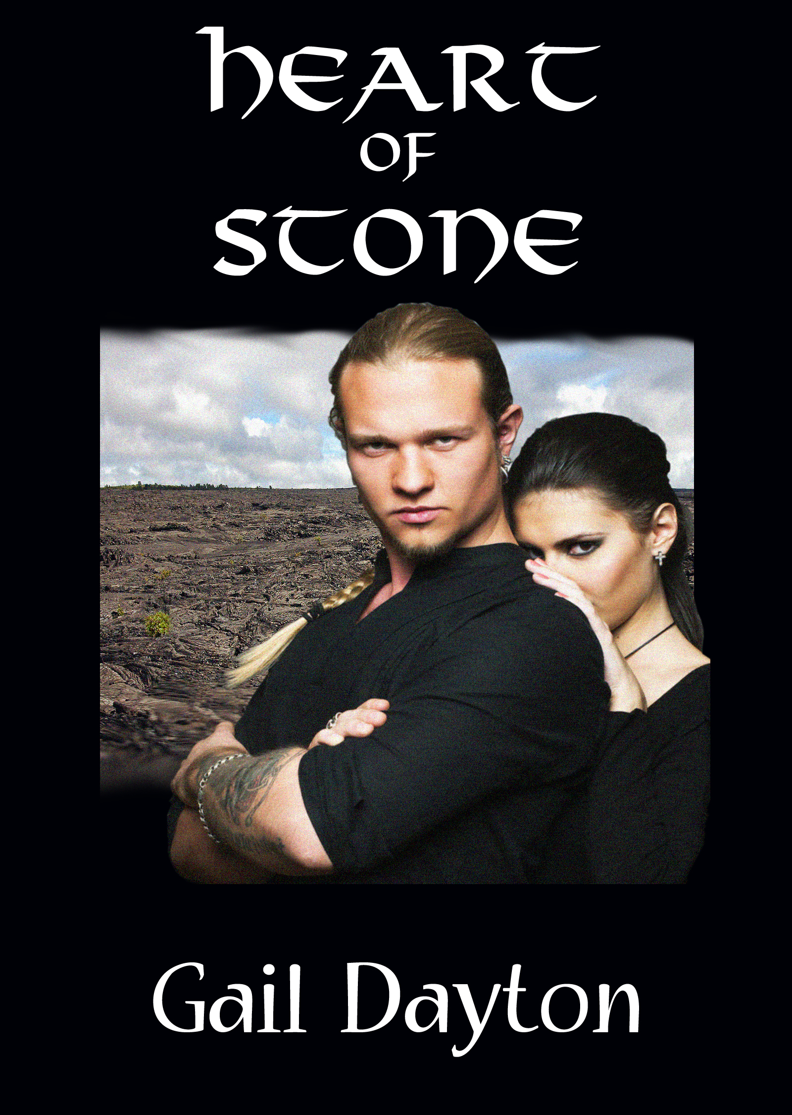
This is an adaptation of the original cover which has been deemed too small. I like the couple picture, but I’m wondering if I should just start over.
Nathan says:
Short answer: Yes.
Long answer:
I’ve come to believe that fantasy novels benefit more from custom cover art than any other genre, because the novel setting or background is such a large part of the appeal. (Compare that to a crime thriller or a romance, where no reader is upset because they can’t immediately tell from the front cover whether the setting is Boston or Newark.) I know that hearing you need to shell out some extra shekels for custom artwork isn’t what anyone wants, but compare that to what you have here: A male and a female, so romance is probably part of the story. And a calligraphic font, so there may be a fantastic or mythic angle. But the guy looks completely 21st-century American (so does the girl), and there’s no action or adventure implied.
I think you definitely want a cover with
(a) action (running, fighting, something)
(b) him in fantasy garb, her in definitely modern American clothes
(c) the background doesn’t need to specifically say “Idaho,” but something that’s both contemporary and rural would be a plus (a gas station, perhaps?)
Other comments?
Oh my god, Craters of the Moon! I love Craters of the Moon!
For cover art, if you want to pull from real life, have a shot of them traversing the inside of the Indian Cave lava tube or a shot of the cinder cones from somewhere on top of Inferno Cone. Both of those could work great as fantasy fodder, they are like a hotter, dryer Mordor.
Sorry, it’s a National Monument near where I grew up. I adore that place.
My first thought when I read the blurb was a cool cover idea would be skip the people entirely and use a picture of a beating heart (not a heart symbol but an actual heart) with lots of magical effects around it and ‘mood’ lightning. (don’t forget to use a texture background)(Maybe a black or red silk sheet to hint at the romance)
Lots of fantasy books have a single strong graphic, usually a sword or weapon, a heart would be unique and fun and still match genre expectations. Put a hint of romance in the title font with a strong genre author font. You could add some blood splatter to ‘darken’ or have the heart morphing into a flower or something to lighten it. This would be a very fun cover to make. I’m having to restrain myself from it…lol
okay, we all knew I wouldn’t be able to resist playing with this.
https://imgur.com/a/Sxchx
There, it’s out of my head and I can get back to work now!
Nice. As for using people, people have got to learn to color grade layers. I’ve seen so many almost-good covers ruined because the people don’t fit into the background.
Well, now, that is certainly an improvement!
If the artist needs armor, I have some unused…
https://pre00.deviantart.net/2f61/th/pre/f/2017/362/e/1/e147070c5936ba425b3ae3989d4b28bf-dby3s45.png
Here’s my take, from what I see when I see that cover: it’s a romance. It’s just another romance, with some other stuff thrown in, to disguise the fact that it’s just another romance. That’s what that cover says to me.
Unfortunately, it also puts me off the romance portion, because I don’t care for the look of the couple. That’s just me, not a specific “typical cover mistake.” I just don’t care for that sort of look on the man’s face, (“I’m so cool!”)and I’m really not wild about the female shoving her face into his back, either out of some type of “awwww, isn’t that cute, she’s so shy” sense, or because she’s shooting dirty looks at some other woman, because “hey, beyaatch, don’t even look, he’s MAH MAN.” Can’t say more about it; it is just a total turnoff to me.
The Celtic font isn’t helping you, either. That particular one tends to be overused, and thus, it doesn’t really stand out; it doesn’t call people to the cover. I think you should consider what Nathan said, about custom art, and work you way out from there, considering fonts AFTER you find the artwork.
Sorry. I wish I could be more constructive, but…you might consider seeking affordable “fantasy” background art–something that people would instantly look at and think, fantasy, and simply use the title, if custom artwork is not an option. I’d be delighted to discuss a possible font, once the artwork has been better addressed.
I must say, Hitch, you humorously put to words the way I felt about the expressions of the couple. And, like many others, I also feel the cover does not portray fantasy. On the other hand, I think that you, Gail, have a huge task ahead at portraying the story as a fantasy when it actually takes place in modern day America. Short of putting your male character in a suit of armor, you’d be hard pressed to make the casual book browser instantly see any fantasy element, based on the description of the book provided. I like B.L. Alley’s idea. I think that looks great, and gives a feeling of fantasy. If it fits within your story, that would be the way I’d suggest you go. If not, take a good, hard look at the fantasy elements to your story. What magical objects or symbols are important to the story, and would clearly suggest fantasy, then include the most visually appealing of them into your cover. As an example, how does he travel between realities? Is there some kind of portal? A backwards view through the portal to an obvious fantasy world could work, with your heroes prominent in front. Another example, how does he expect to carry back his king’s heart? He couldn’t just put it in his pocket (I assume.) Is there a magical container he carries for the job? If so, your male hero could be carrying this magically glowing stone or crystal container. These are just examples, of course. You need to look at the magic within the story and let that be your indication of the fantasy.
Actually, I saw this image. Now, granted, it doesn’t scream “Romance Within!,” but, it definitely lends a fantasy element. This could be cropped to the correct size, and made to work.
https://pixabay.com/en/earth-boy-man-male-world-globe-1971580/
Right, there’s no woman in it, but the author DID say that the man comes through from another world, right? Well, there you go, and the image is free.
Granted, it’s likely not perfect, but, as Nathan an others pointed out, custom fantasy imagery is frequently pricey. I saw this and thought, “hmmmmmmmmmmmmmmmmm, maybe,” so I wanted to post the link here.
There is absolutely nothing about this cover that even remotely suggests the subject or themes of the book. I can only suggest that you start over entirely from scratch. Pretty much everyone’s alternate suggestions are good ones.
It appears that you fixed the too-small cover by keeping the picture the same size and putting a big black box around it. You need to find a picture big enough to fill the entire cover. Also, those trim lines are really sloppy.
Yeah, I don’t have much to add to what everyone else is saying. All the imagery on this cover (which wouldn’t be out of place in a 3 Doors Down music video) suggests to me is that it’s one of those cheap bodice-rippers in which the setting doesn’t really matter and the paper-thin plot is only there to fill earlier chapters’ pages and give a minimal explanation of how the happy couple on the cover got together in order to justify all the heaving and thrusting expected to occur in the rest of the book. Unless that is what you’re selling (and I thought your description was pretty clear it is not), I definitely recommend starting over.
If you want any kind of fantasy, having the main characters on the cover is important, but not as important as having something fantastic to show people that it’s a fantasy. Right now, there’s nothing on your cover that we couldn’t find readily available somewhere here and now in real life; the hero-from-another-world guy looks to be wearing contemporary clothes and even his tattoos wouldn’t stand out much in any contemporary urban setting. Our world also has plenty of barren rocky landscapes like the one behind the couple on this cover, and few will recognize it as being specifically somewhere in Idaho anyway.
Start over from scratch? Well, yes, I join the others in recommending that you do so. When you do, though, you need to start by focusing on showing us something in the setting to suggest this is indeed a fantasy. If the guy is supposed to be from another world, how did he get into ours? If nothing else visually distinguishes people from his world from the ones in ours, you could at least fill the background with the magic gate or portal (or whatever) he used to get here.
Heck, when we had a cover on here a couple months ago for a horror-fantasy featuring entirely contemporary characters in entirely contemporary settings, the cover at least showed the main character (who’d been turned into a contemporary house cat) emerging from some vaguely magical-looking flames with a pair of vaguely magical-looking glowing eyes. Whether or not these vaguely magical things said horror as much as the author hoped (and I did think at least it made that cat look seriously hostile), it definitely said fantasy. If nothing else, make sure you put something at least vaguely magical on your cover as well to let your prospective readers know that even if the characters and settings are all fairly contemporary, this story isn’t actually taking place in our reality as we know it; just another world a lot like our own where someone from some other more magical world occasionally drops in to pay a visit.