The author says:
Hi all, need some direction. My book is a fast-paced high fantasy book heavy on the sorcery, (no swordplay) with the world-building of an epic but the feel of an urban fantasy set in an enchanted, no-tech locale starring a father and his young son.
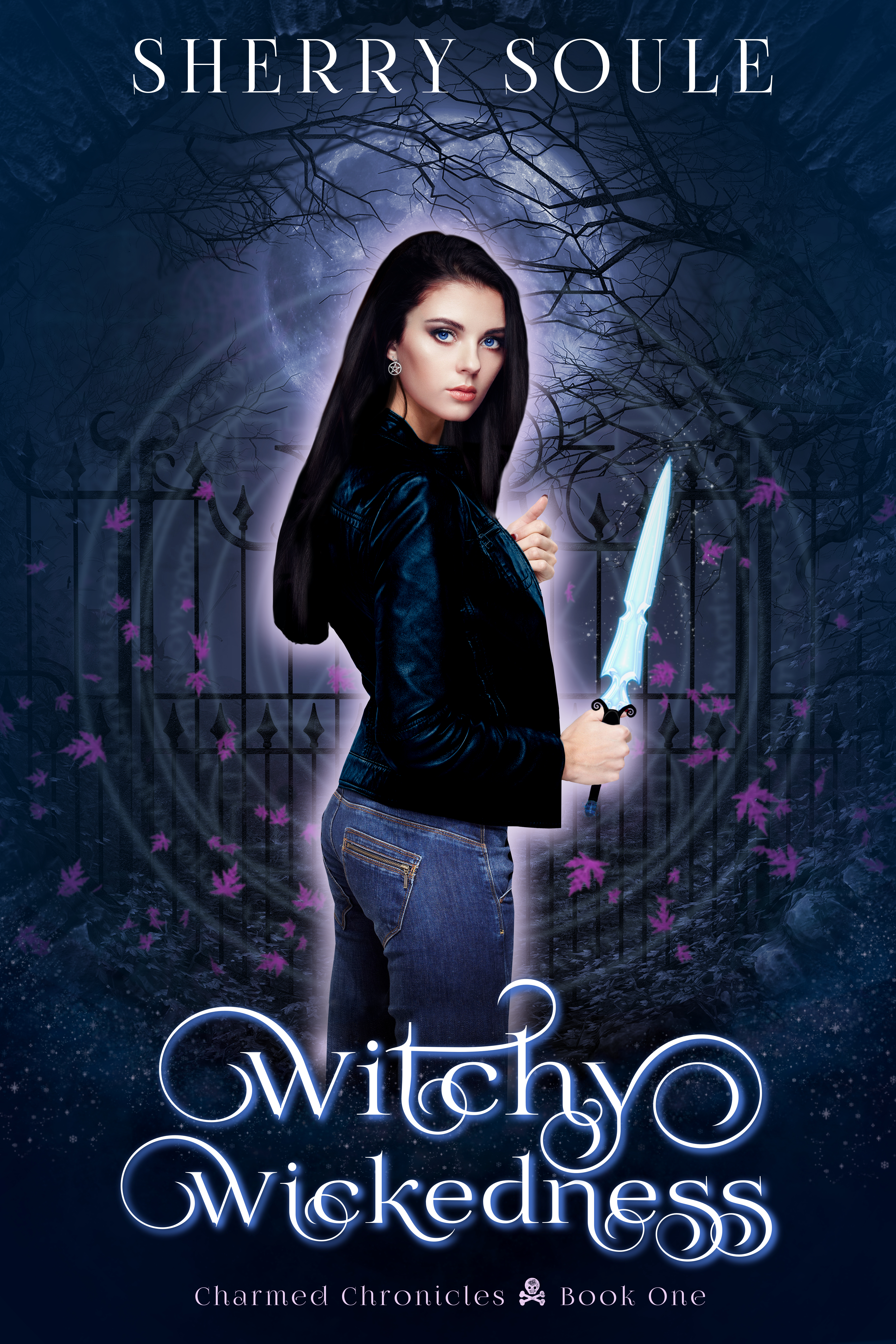
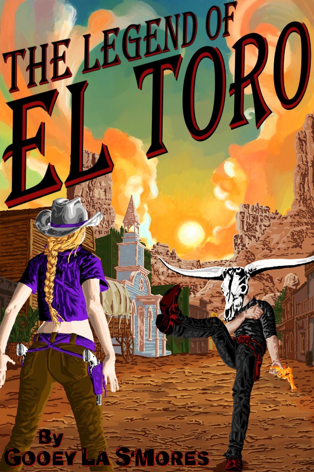
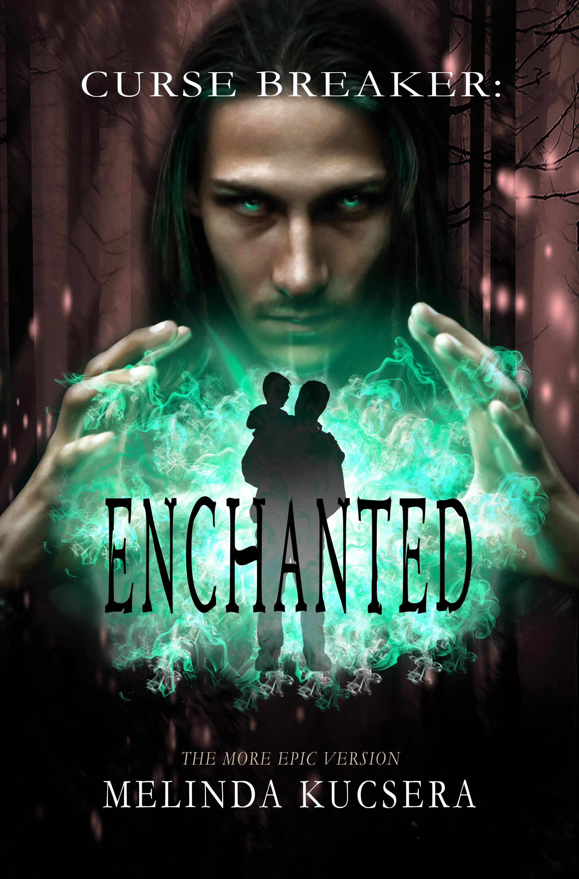
I’m not sure which book covers I should be using for guidance. High fantasy ranges from swords or symbols on the cover (GRRM) to landscapes/strangely lit arches (Wheeler) to characters looking mysterious (His Dark Tidings, etc). Other faster-paced, character-driven tales like the Palace Job or Nicholas Eames’ Kings of the Wyld use an illustrated group of mysterious people standing about looking tough with swords that look like stick figures when shrank down on the Amazon sales page. But there’s no swordplay in here, just lots of magic and enchanted trees. Did I mention this is a work of high Christian fantasy? Not so much book 1 but the rest of the series, yes. So which subgenre should I use as a guide for covers? O_o
The current blurb, which needs rewriting in case my rant above wasn’t enough:
Evil rises in the enchanted forest. One untrained mage and his son must stop it, if they can.
Start No Fires. Carry No Weapons. Do No Harm.
Those three rules safeguarded countless travelers through the enchanted forest—until they didn’t. One boy’s murder ripped open a gateway allowing evil to enter. Now no one is safe from corruption.
Enchanted trees take Sarn to where the forest failed to uphold its rules. Seeing a dead child gifted with the same magic as his son unhinges Sarn. He vows to find out the truth no matter what the cost. But his gift is untrained and finding answers won’t be easy. Sarn must balance nights serving the Rangers with days dedicated to hiding his son from the dark forces stalking them both.
When Sarn’s masters demand he abandon the quest, he faces an impossible choice—doom the ghost whose murder endangers them all or die from the backlash of breaking his word. With the odds stacked against him, can Sarn fix anything or will all be lost?
Nathan says:
I think the biggest problem is that the way the (completely modern-looking, BTW) father and son’s silhouette is shown makes it look like this is a story about things being done to them (usually the premise of a contemporary suspense novel) than them doing things. I think a father/son high fantasy is novel enough that that’s what you need to play up here.
Other comments?