The author says:
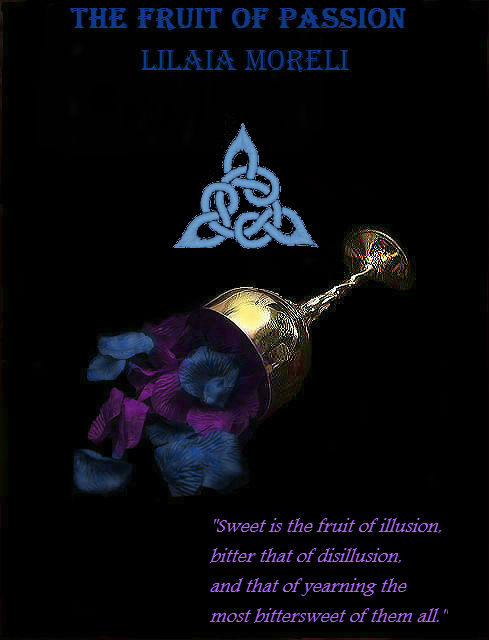
I designed this cover for my mythic fantasy novel. It’s not ready to be published. I’m just playing around with various concepts. The book draws heavily on ancient Celtic tradition and the story unfolds in a fictional island somewhere in the North.
Here’s the blurb: Since the death of her mother, Queen Blodwen of the island of Rumia, Morella has trouble adjusting to the changes in her life and cannot accept her loss. Having to deal partly with her own suffering because of that, partly with the challenges her people have set for her in order to be crowned queen, partly with a consuming love affair with Rhys, the king of the fae, and partly with driving away the military forces of the empire in the South that has set eyes on the islands of the North, Morella embarks on a quest of knowledge and maturity that will take by storm the realms of the Otherworld, offer her strong alliances with their leaders, test loyalties and friendships and, above all, prove the strength and endurance of the human spirit.
Nathan says:
The first thing you notice in thumbnail is that there’s a whole lot of unused real estate. Negative space can be a major design element, but it takes a lot of skill to make it work. There’s no reason that the cup of petals shouldn’t go edge to edge, that the title can’t fill two lines (please, some other font than Algerian), and that the knotwork can’t be behind them.
Also, that’s a big block of text for a front cover. Save that for the back cover (or the top of the Amazon blurb).
Other comments?
I love this idea and the colors, so much so I’m having to make myself not play with this cover… But I think the knot adds nothing at all. If it is an important symbol consider using for series branding. If it just has to be there make it a subtle part of the background. the title and author text is bad, placement color style and the tag line way to long but those are minor tweaks. (you need a font with strong lines as this a book about overcoming but also a bit of flair that says fantasy, off the top of my head I think belda might work but it might not be thick enough and it might be to romantic in tone to match the text inside. https://www.dafont.com/queen.font queen font might look amazing but it isn’t free. I’m sure Hutch will have some amazing ideas on this that I can’t wait to see.)
Try the text in the gold color from the cup. try making the cup itself bigger and spreading the petals over the cover. and add a hint of lighting to the black canvas. use a very soft brush in the blue and purple and just dab it randomly on the canvas. if you do this in layers with black it gives a really great lighting effect. maybe even add a hint of gold beneath a few of the petals to make them pop.
it also might be cool to add some death in there with decaying petals or bare branches
You can’t SEE the title or the author’s name. I can’t, anyway, and I figure I’m average. You need contrast. The bright gold color from the cup might work, but one needs to be able to see the title. A lighter shade of something— maybe a pale lavender— behind the cup and petals would make them show up better. I don’t think negative space is a bad thing in a cover. I personally think way too many covers are way too cluttered, but making your cup bigger would probably help here. It’s so dark it doesn’t attract attention. This is your major advertising for your book. You want to attract attention, and the darkness is kind of a sinkhole.
Well, there are a few problems.
One has already been pointed out: it is almost literally impossible to read the title or author’s name. The blurb stands out more than they do. (And, by the way, what is that quote from? The book itself?)
The same colors hurt the effect of the flowers, as well. They simply disappear into the background.
The graphic elements are a little haphazard and unrelated. I understand that the book has a Celtic setting…but I think you can get this across a little more effectively than by simply planting a Celtic design in the middle of the cover. What you wind up with are a large number of elements—the title and other typo–the goblet and the Celtic design all floating in a sea of black. You should try to tie all of these together better. For instance, make the entire background a Celtic design. You can do this and still make the colors dark. Even if this helps go toward making the background less a solid black, you should still reconsider the colors you have chosen for the flowers. They simply will not work well against a dark ground of any kind.
You may also want to rethink your choice of typeface. The one you have chosen doesn’t at all suggest the kind of setting you describe. There are any number of typefaces available that suggest “Celtic” better than the one you have.
A goblet exhibiting obvious Celtic design would be a great way to combine the symbols without losing symbolism. Considering the fae aspect, you could do with some form of mystical element in the graphics. I would suggest the cup and petals lying on a runestone amidst the heather for maximum Celtic/fae ambiance, but it’s lately been pointed out that green works poorly in most advertising. Beyond this I’ve little to add, but definitely make reading the. Words much, much easier.
🙂 Indeed, as a background color, or primary, but it’s perfectly viable for lettering, in those instances when nothing else will do. Black or deep aubergine/navy/etc. do have a number of other options, though.
I think I might consider applying a tint, to create a sort of vignette type inverted fade. You’d have the black (or whatever that is) at the end, and then lighten that black as it gets closer to the cup. Just enough so that the cup and the flowers could stand out a bit more. I don’t mean an obvious vignette–just a bit of color trickery, so that the brain doesn’t think about the paling shade, but the eyes can see the colors better, if that makes sense?
In thinking about Celtic fonts, never forget that there’s a very, very strong Catholic influence (from the Dark Ages) that always permeates those fonts–for example, finding Celtic crosses integrated into the Ts, or the like. If you go that route, I like Stonecross, as it doesn’t fall into the obvious tropes/stereotypes. It’s close to being too light, but not, for a title.
Try Sacnoth, if you can–that way, you could lose the knot on the cover. It’s only $23.00 to license. (Most of the fonts I’m mentioning you can find free or inexpensively; but Sacnoth is not free.) I won’t suggest Andron MC, because it’s pricey–and I don’t think it would be magical for this cover.
Ethlinn has a nice look and weight. Cabaletta is very interesting, and might be an interesting choice for this. You’ll have to test it; I’ve had the experience lately of recommending a font, and then finding that I don’t love it, at all on the book for which I recommended it, so, test, test and oh, yes, test. If you want to play with another, DeRoos Caps might be fun, if you have the software to tweak the fill color and the outlines. 😉
PR Uncial Alt Caps: this one is probably too lightweight for a title–but you might look at it for a title page. 😉
There’s a font called “King Arthur,” which has a nicely different feel to it, that I’m dying to find the right use for. It’s just heavy enough where it might work for a cover, if enough contrast is used.
Brandegoris is an all-caps decorative–I’d definitely try it. And a swing at Dumbledore is worth a try, too.
AvQuest, on the other hand, always channels the feeling of an exorcist movie, you know? And I really like Party Business–but it’s far, far too lght for a cover.
Don’t forget the job of a font: yes, as some will reply, it’s to look pretty. Some will say it’s to convey the information, and that’s true–but it’s not conveying merely the information that’s typed, or lettered. By using fonts that are, to some extent, stereotypes, we are telling the reader “this book is set in this place, in that time, and is about those people,” or the like. It’s graphic shorthanding. It’s easy to get sucked into some of the really foofy fonts, like Celtic 1; but those are too foofy. They struggle to convey the title, because the characters are too busy being pretentious and caught up in clever little fleurons and the like, so that the text is too hard to read.
If you want some foof, you could also mix-n-match; use the heavily decorative capital letters from Font A, and use Font B for the lower-case lettering. (e.g., Celtic Eels, or Celtic Eileen, with a typical serif, for example). Or Spiral Initials, same idea.
It’s hard to speak to a font for the byline, or the tagline/epigraph/?, without having the title font hammered out, but…probably a simple serif would be more than adequate, if/when you go with a fancier title font.
Hope some of that helps! Good luck.
Perhaps Unzialish as a font choice? 100% free….
I didn’t mention Unzialish, for two reasons.
1. because in the font world, there’s some discussion that it’s an…homage, let’s say, to Pete Rempert’s Uncial–which is not free. That being said, I personally prefer Unzialish, which doesn’t use Peter’s kind of roughly tapering-off caps (which I really don’t care for). HOWEVER, having said that,
2. The problem with both fonts is that their stems (or descenders/ascenders and loops) are awfully light, for a cover. To see what I mean, go to Dafont, pull up Celtic fonts, and type out “The Fruit of Passion,” as the sample, set it to Medium, and look at the result. As much as I’d use Unzialish, in a minute, on a title page or a chapter head, I am kinda thinking that the Stem-cum-descender on the U/C F, lowercase F and the u/c P are too light for a cover. See what I mean?
It would be okay, perhaps, in black/navy on a white background (mayyyybe), but even in stark white, on a black or dark background…I think it would be utterly lost/unreadable on a Thumbnail.
Just my opinion, and, of course, worth what you’re paying for it.
Ah yeah, that’s fair ¯\_(ツ)_/¯
@Victoria: it was an inspired idea, don’t get me wrong. I’d consider using it on the interior, for title page/ch. heads. IF the cover is redone, in a way that would allow the “finer” stems/descenders (say, a white-ish or light gray/blue background), then it could very well work. 🙂
Yes, too dark over all and poor font choice. I am also not loving the trend of centering everything – it works well with just one picture element, and gives a certain gravitas to the cover (very suitable to old Bibles) but having a more than one element, some asymmetry can give the image some pizzazz: and here, one image that forms a diagonal line, and the other that is strictly left-right symmetrical, do not match, making that ‘random cut and paste’ -look. Not that the knotwork is in any way necessary or even nice to look at, it is very simple compared to its ancestors and rather dull: a knotwork ring around the main image, somewhat faded and in the background, would work better if not throwing it out the window altogether. After all design could be incorporated to the title, or the goblet. Here is some inspiration, a goblet from Ardagh Hoard, in Ireland: http://irisharchaeology.ie/wp-content/uploads/2015/08/DSC_0200.jpg
My three recommendations for this cover:
1. That’s some nice medieval-looking goblet and intriguing imagery you’ve got there, so zoom in on it so we can all see it better.
2. Not everyone recognizes that trefoil knot as a Celtic symbol, and people who like fantasies in medieval settings won’t care whether this book is specifically Celtic or not anyway, so you don’t need it.
3. You definitely need bigger and better fonts for all your text, and better coloring for those fonts; against the dark background, those dark fonts sink without a trace in the thumbnail, which is all of your cover your prospective readers are going to see until they actually click on it. So get some better fonts, and give them some brighter colors.