The author says:
Magical Realism
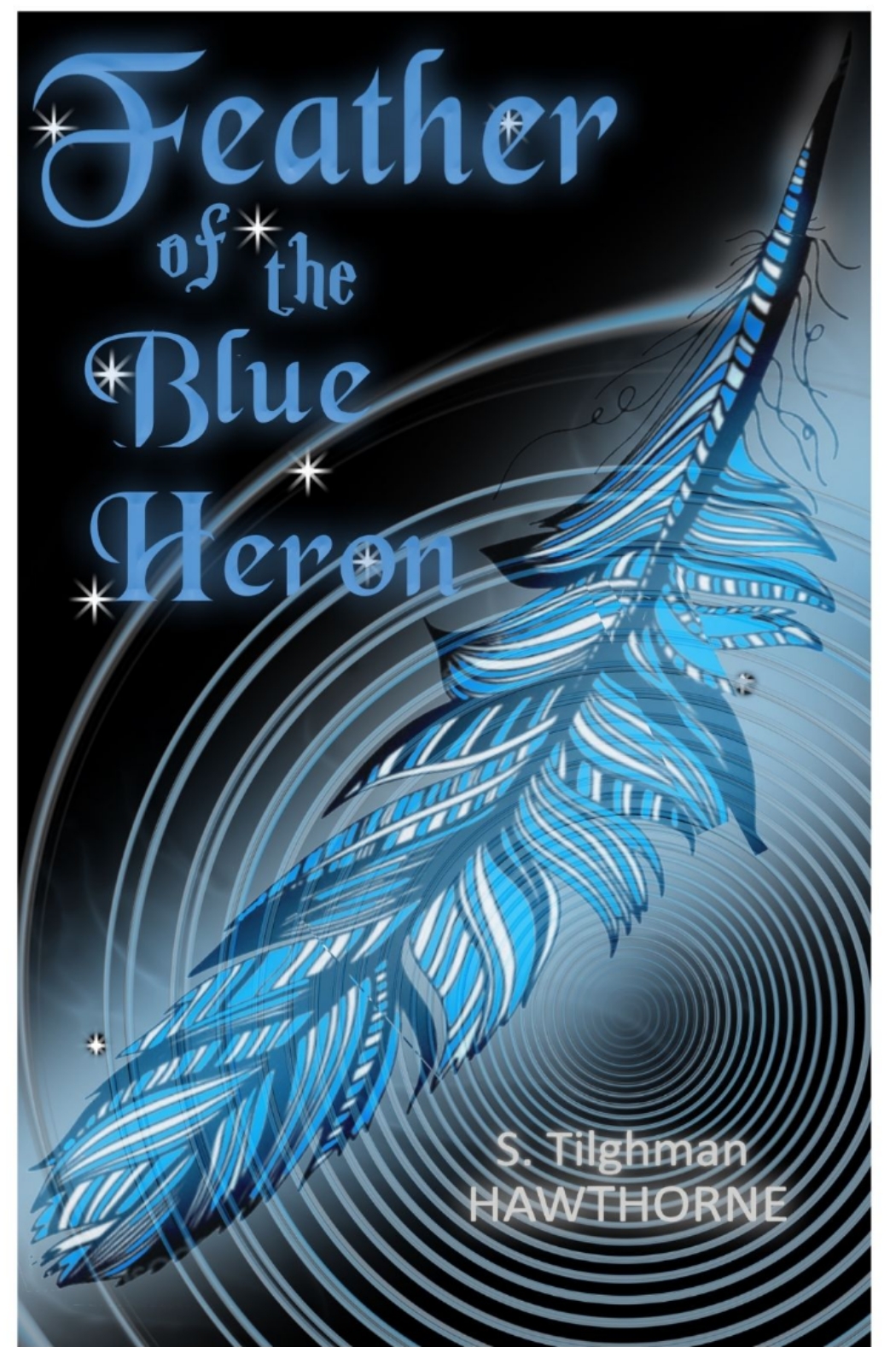
Emma’s perfect marriage has fallen apart and she’s not sure why. She’s an avid canoist and camper, so paddles off to a quiet shore to try and figure things out. A beautiful blue heron keeps pace with her, her only companion. There, she meets Little Bear, a mystical spirit who helps her look deep into herself to find the answers she seeks, and to let go of her warring emotions. When he disappears, all that’s left is a blue heron feather that she voted she’ll keep forever.
Nathan says:
I think you missed on this. “Magic realism” connotes a dreamlike quality to me, of things that don’t necessarily make logical sense or follow cause-and-effect. The imagery implied by your description — a lone canoeist, a secluded (possibly misty) lake, all would make perfect cover images. Instead you have a tightly drawn feather and a circular motif that would look more at home on a Psycho copycat.
Start over. Go with misty and nebulous. Let us see the space, literal and symbolic, between the protagonist and the “real” world. Go with a font that is whimsical and doesn’t follow straight lines.
Other comments?