The author says:
YA Sci-fi novel narrated by the 12-year-old protagonist. Takes place in the 1950s at first but then the character time travels to 2020 where he’s exposed to the worst real-world issues we’re facing now, as well as new fantastical ones. Theme extols science over religion. Lots of unexpected twists and turns. Intended to appeal to readers of Kurt Vonnegut and Mark Twain.
Nathan says:
(Before anyone cocks an eyebrow at the “bestselling author” claim, he’s for real. Scott Dikkers is a founder of The Onion. He’s probably funnier than you are.)
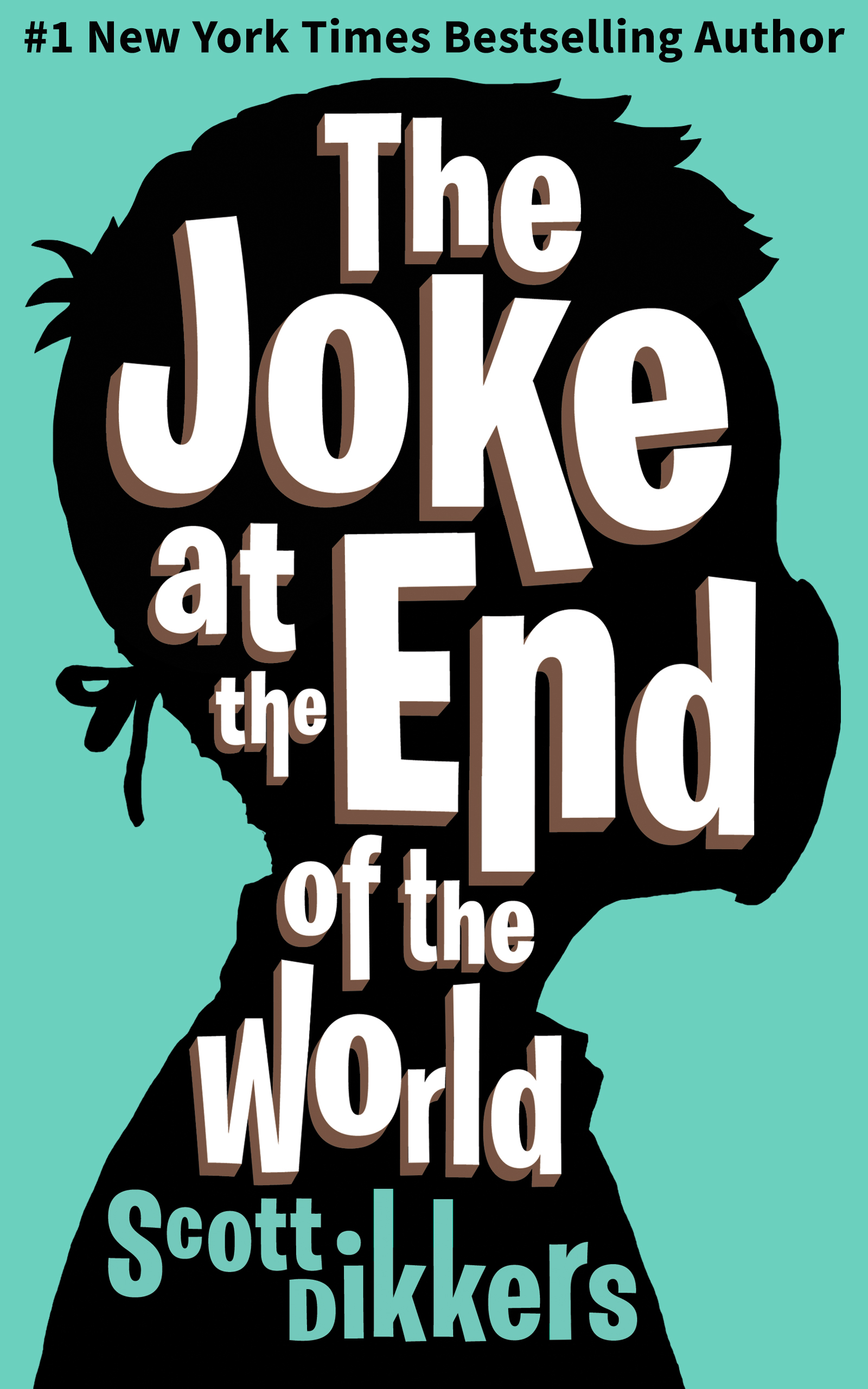
The cover’s professional, but a little flat. Maybe put a little variation into that flat teal background?
And if the initial 1950s setting is part of the hook (and I think it should be), maybe a more “Googie”-style typeface for “#1 New York Times Bestselling Author.”
Other comments?
I have no problem at all with this cover.
I might wish that the color were a little more 1950s swimming pool-bottom blue* and I don’t think that the drop shadows add much (since they are too dark to really be distinguished easily from the black—and not at all at thumbnail size), but otherwise I think it’s good to go.
*Say Pantone 14-4260 or 12-5410 for instance: something a little more aqua/turquoise and a little lighter would be more period-suggestive.
There is little that might improve the design. Minimalist covers are popular presently, and most changes I can think of would veer away from that.
If the cover could somehow evoke a Norman Rockwell painting, the presence of the mask would then evoke 2020 and really make the cover spot-on. If this were a girl it might be done by means of hairstyle, but with a boy all I can think of is to colorize his collared shirt using a checkered pattern that dates it to the 50s. Boys don’t dress like the Hardey Boys anymore. The problem is how much that would interfere with the text, which is really good as is.
Using a background image instead of the green around the silhouette might also work, but would require threading a needle between adding context and just making the cover too busy.
My one comment is I feel somewhat that the proportion of the head and the enclosed text is slightly off, in terms of the real estate of the cover. I do, of course, realize the problem. It’s stylized text, letters somewhat akimbo, inside the head, so you wouldn’t want to reduce it much, but I find my fingers itching to sort of “moosh” the head in a teeny bit, from the sides and a smiden from the top. I feel as though the accolade is smooshed (all these highly-technical term of art…) from the top edge, too.
Something about the relationship of the mouth and mask, to the right-edge of the cover, makes it feel as though the edge of the cover pushed the kid’s face in, as if he were a deranged Pekingese. (Do all y’all see that?)
I like the deployed font for the title. While I agree with Ron that the 3-D/dropshadows don’t do much at thumbnail size, they do provide a bit of relief at full(ish) size and they don’t faze me. I’m okay with them and they’re done well (Praise Jesus and pass the ammo.)
That’s really my sole observation–a bit too much head for the real estate and it makes the accolade line feel compressed. Proof positive, I guess, that no matter what folks say, you really can have too much head.
Thank ghod, someone who spells “faze” correctly.
Homonym errors. The bane (Bain) of my day, given what I do. We have a policy at my shop that we never alter (altar) anything in a customer’s manuscript without their consent and approval, right (rite!)?
But I must quietly change “forward” to “foreword” 5-7x weekly. Seriously. Every. Damn. Week. My rationale (rational!) is that their spellchecker or auto-correct accidentally corrected it wrongly, but…{shrug}, I know better. So, yup, happily, I’ve never gone through a phase in which I misspelt faze therefor (therefore!). (yes, yes, I suck and couldn’t resist…)
🙂 And it’a always lovely to see you, too, Ron.
The cover is great and I agree with the comments of Nathan and Ron about the background color, but I like the drop shadows. Another thing that I would change is the “#1 New York Times Bestselling Author” text; I wouldn’t change the typeface but write it all in caps.
Ha awesome! The Onion is a treasure.
I’m a bit less content with this cover than the other commenters so far. I definitely think it has a very solid design concept. But I also think it ought to be pushed to work much harder.
Nothing is fundamentally wrong, but neither is any part quite there yet on selling this book specifically in what it is and who it will speak to. It’s not going hard enough on the notes that will attract the specific readers enough.
I.e. I don’t really get a clue of what the specific readership is. It’s got a child protagonist – is it a kids book? A crossover? The design does signal comedy (in partnership with the title of course) but it doesn’t give a steer on the exact tone. The synopsis mentions the dry, dark, satirical authors like Vonnegut and Twain but the cover tropes signal a broader comedy to me. All those flat colours and the jaunty type feel either more in line with something more knockabout than the synopsis and author make me suspect this book is.
If I’m not getting these answers at a glance, it means that this is a cover the right readers might just scroll on by with nothing to hook their attention.
Genre is also not quite nailed down there. I think the title would tip me off this is a novel but design-wise it’s at least as redolent of pop science as fiction.
I also think that more could be done to highlight the authorship. You don’t necessarily want half the cover taken up with ‘By the no. 1 bestselling creator of The Onion’ stuff but you probably do want that credential being more clearly signalled if for no other reason than it’s going to be a really good steer for a lot of people that they’re going to like this book.
People are more guarded about trying new ‘funny’ things than perhaps anything else so if you’ve got a ‘I’m very professionally successful at being funny’ card play the hell out of it.
I think I’m going to have to do one of my work-throughs of this one! I feel like there’s a great cover there waiting to be refined. Plus comedy/science fiction/design = very much my jam.
Agree. The text inside the head is good, but the proportions are off, so the top author attribution is squinched to the top and loses it’s impact, spoiling the effect of the otherwise fantastic typography. The genre is a bit hazy (although, too be fair, satire about time travel from the 50s to modern day, about how supposedly our issues are way more world-ending than those of our forefathers, and putting science vs. religion is pretty niche, doesn’t easily categorize.)
Perhaps if this was just slightly less subtle – like a Fallout spoof poster or Norman Rockwell painting as you suggested that more heavily invokes the 50’s, but with modern elements like the mask.
I also agree on putting something about the Onion on the cover or at least the back, since that would be a potential draw.
I aways meant to tackle this one, working through how I’d approach this as a designer.
I only recently found time, but I was still interested in the challenge. The author may or may not still be seeking advice on this particular book’s cover but it should be a useful look at the process that gets to a cover that speaks to the right audience.
https://www.kathrynrosamiller.com/post/cover-advice-the-joke-at-the-end-of-the-world
The one thing about this submitted cover is the face mask–how will anybody see that and think anything but COVID? Hell, I originally read the submission and knew that this was historical and promptly forgot. With that title and the facemask, to my eyes, that’s all-Covid, all-the-time.
I agree.
I don’t want to give too much away about the book and spoilt he author’s mysteries, but having read it I wasn’t convinced the facemark image was the important detail to pull out for the cover.
The book takes a few twists and turns and so while the stuff covered in the synopsis is important and a great hook, there’s a broader intent/theme to the book than just the Covid stuff which I think can be better communicated outside of that specific image.
The masked figure is by no means a terrible choice of image, but I think if readers see the image of a person wearing a facemark they’re going to have an immediate set of assumptions about what this book is about and what the themes and satire centre on none of which really turn out to be what this book is about
Kata – thank you so much for all your thoughts and your redesigns of this cover! They were amazing. I didn’t even know about all your work until now. Nobody alerted me! I’m honored and pleased that you would take the time. Please be in touch. I’d like to follow up with you about your designs.
-Scott Dikkers
And thanks so much to all of you for your critiques! Much appreciated.