The author says:
Genre: Dystopian, Adventure, Satire
All of humanity disappeared in the blink of an eye. With constructions and monuments gradually losing place to nature, a mixture of domestic and wild animals fight for survival in a strange, new environment. A group of animals in central Brazil, with the lead of the mutt Tobi, tries to discover what happened to their old masters. Will it be possible to even survive to find those answers?
Target Audience: Distopy readers, Young Adults/Adults, readers of fictions that relies on contemporary issues and thoughts.
Nathan says:
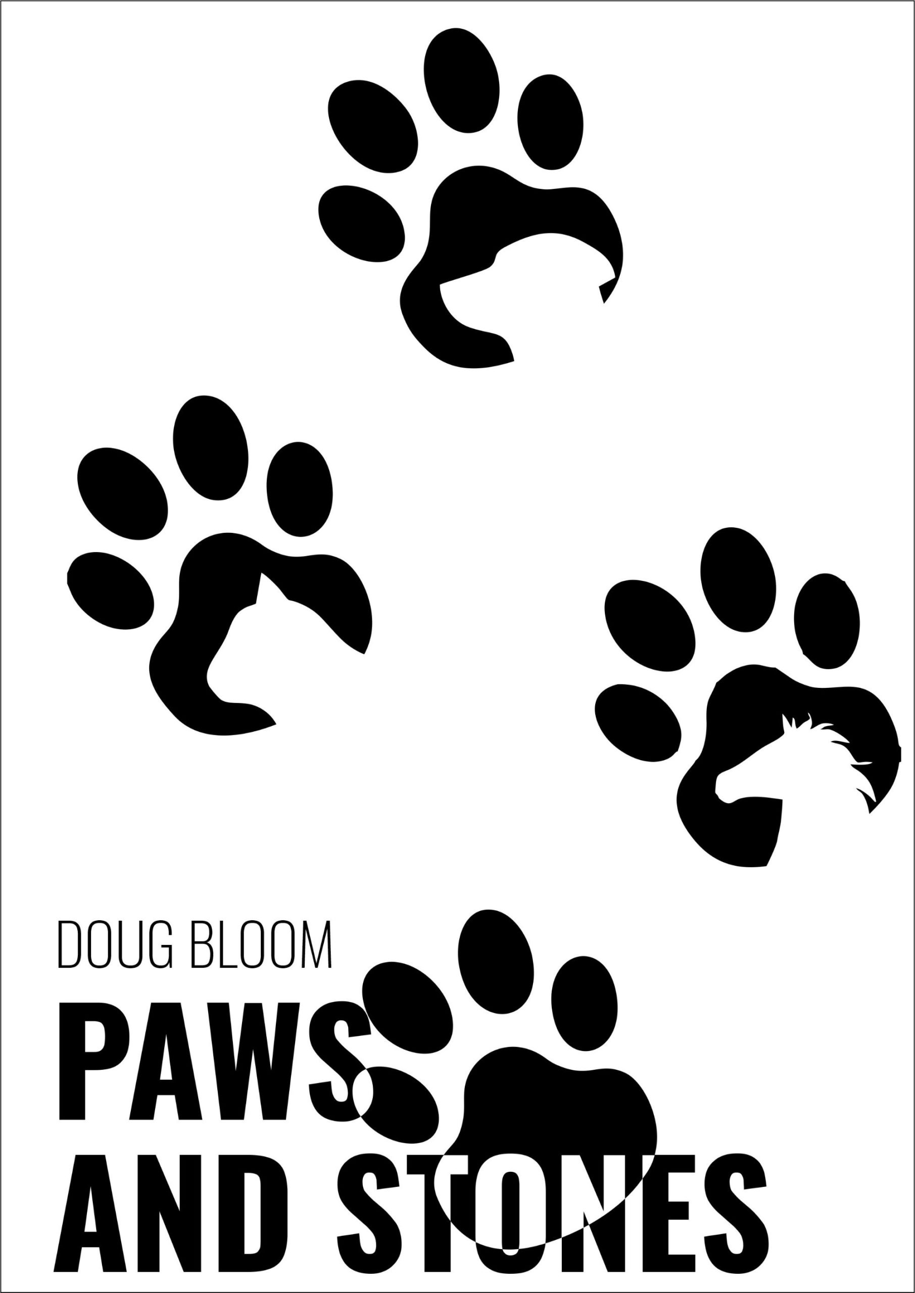
The description sound intriguing. Unfortunately, none of that intrigue shows up in the cover. At best, a potential reader would guess that there’s something to do with animals in this novel, but your target readers will be more attracted to the other books they see that more firmly proclaim, “This book is for you!”
Using the “print” motif, my idea would be to have human tracks (footprints and tire tracks, for instance) with animal prints criss-crossing and covering them. But even that would have to contain some of the hallmarks of dystopian book covers, like textures and a distressed typeface. You’d have to invest to get that kind of custom cover, naturally, but it would definitely increase the potential sales.
Other ideas?