The author says:
Magical Realism
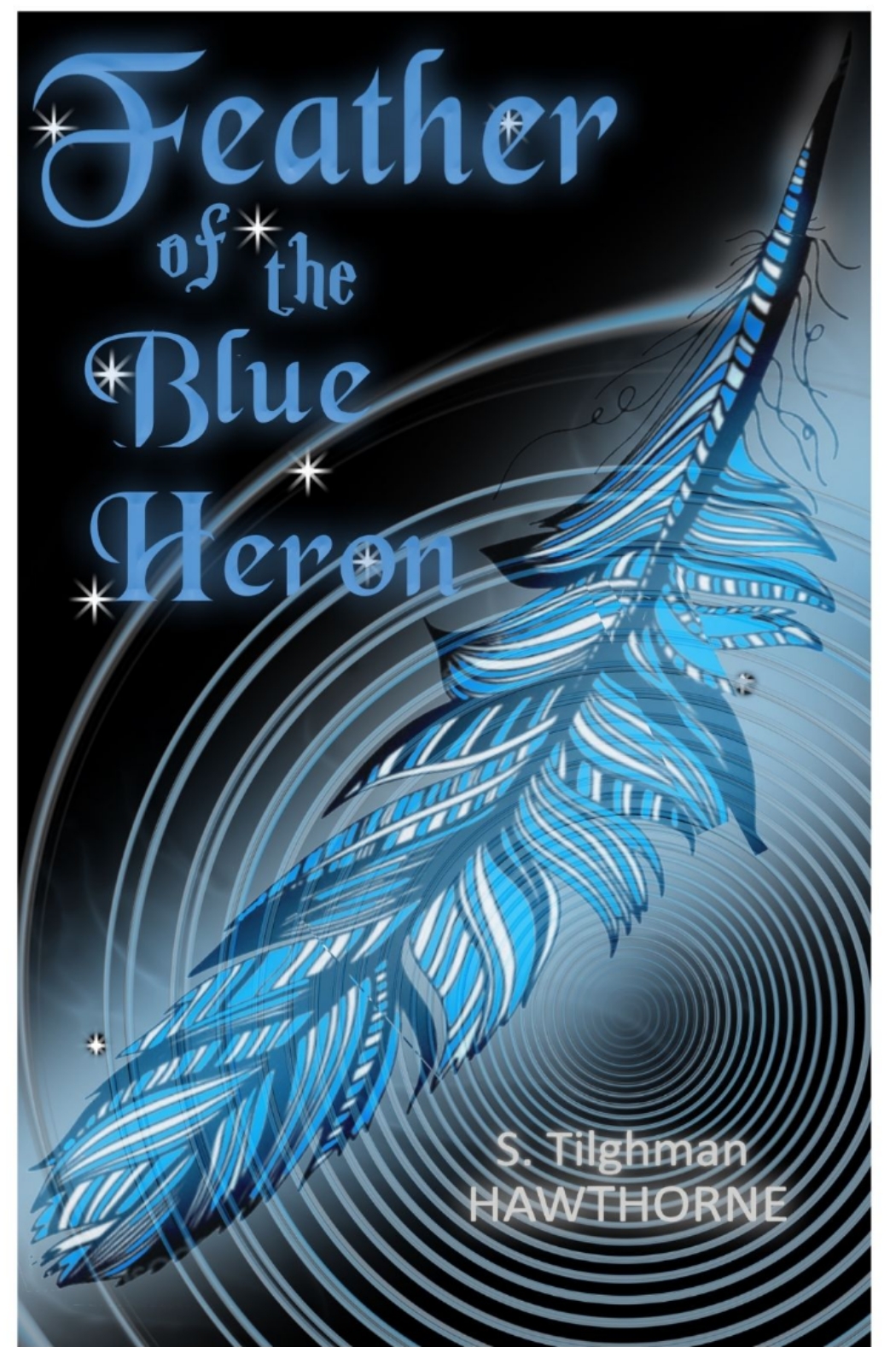
Emma’s perfect marriage has fallen apart and she’s not sure why. She’s an avid canoist and camper, so paddles off to a quiet shore to try and figure things out. A beautiful blue heron keeps pace with her, her only companion. There, she meets Little Bear, a mystical spirit who helps her look deep into herself to find the answers she seeks, and to let go of her warring emotions. When he disappears, all that’s left is a blue heron feather that she voted she’ll keep forever.
Nathan says:
I think you missed on this. “Magic realism” connotes a dreamlike quality to me, of things that don’t necessarily make logical sense or follow cause-and-effect. The imagery implied by your description — a lone canoeist, a secluded (possibly misty) lake, all would make perfect cover images. Instead you have a tightly drawn feather and a circular motif that would look more at home on a Psycho copycat.
Start over. Go with misty and nebulous. Let us see the space, literal and symbolic, between the protagonist and the “real” world. Go with a font that is whimsical and doesn’t follow straight lines.
Other comments?
I need more time to think about this, more in-depth, but at the moment, man, all I see is “The Time Tunnel” from the 60’s. I keep waiting for it to start circling around the cover…
I agree with Hitch. I thought it was a fantasy novel until I read the description. I realize that there is a fantasy element…but I think that the cover design may emphasize that to the point of missing the main thrust of the story.
In any case, this cover is an example of art explicitly illustrating the title. The title of the book is “Feather of the Blue Heron” and the art is a blue feather. That is redundant.
You might want to consider artwork suggesting the protagonist’s connection with the outdoors, or something that suggests the nature of Little Bear.
It is a perfectly good cover, for another book, but not this one. It is missing the magic. So I agree with Nathan.
I would differ with you on one thing, Rachel–and that’s that it’s simply too damned blue. Blue-black background; blue time tunnel; blue feather, blue text. It has almost no contrast and to my way of thinking, while that can work, it’s rare when it does.
Needs mo’ bettah contrast, in my humble opinion.
Converting the cover to gray scale underscores both the lack of contrast and busyness that gets in the way of “heron” being readable. In fact, the only things that really pop out are the little sparklies around the title.
Ah, good point, Ron.
I was, in fact, thinking of you today, when I thought about this cover–the “Miller Test,” in which we pretend the cover is in another language and then try to figure out the genre or topic–but in this case, we needn’t do that. Even in English, without an explanation, I’m pretty damn clueless.
Like everyone has said, it’s best to design a new cover from scratch. It would be better for you to illustrate other elements that don’t show us again what you already said in the title.
This cover violates my first rule of cover design: Thou Shalt Not Use A Font I Can Name At A Glance. Lose the Black Chancery and pick something that doesn’t come preinstalled on your computer.