Dissident

The author says:

The Hoarders have taken control of the world’s resources and withdrawn into massive fortified enclaves. Without their knowledge, people scrambling for a living outside of the walled cities are being snatched and implanted with tech that renders them into zealot-like killing machines.

This book is the second in a trilogy with YA, Sci-fi and Dystopian markets in mind. It is an ensemble cast, set in our world, Pacific Northwest, probably Seattle area.

Nathan says:

Any time we look at a later book in a series, we need to also ask, Does this continue a steady branding from the first volume? Because if any changes we suggest break the branding continuity, then it’s not helping by helping.

For reference, here’s the first book:

I can see that you’ve got a common eye motif going here, but I think it’s more cerebral than immediate, i.e., someone looking at the two covers might think, “Oh, *I* see a common motif!” but someone just glancing at the covers won’t immediately relate Book 1 to Book 2.  That might be an easy fix: Move the right eye to the same position on each cover.  You might also experiment with some texture over everything but that right eye, so that the bright skin tone doesn’t stand out so much, and add something to mimic the “divided” appearance of the first cover.

Other comments?

Fire’s Maiden [resubmit]

The author says:

(This is a replacement for a cover submitted awhile back that, um, was not popular with the reviewers. I hope I’ve learned a bit from this one)

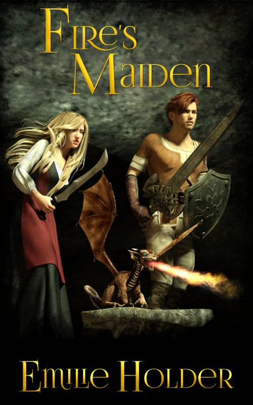
Eloise is a princess in hiding, an orphan, and an heir to the throne her uncle wants. In her grandfather’s day, Uncle Frideric would have staked her out for a dragon’s meal. Two birds with one stone, so to speak. Fortunately, virgin sacrifices to the dragons are passé now. Until the day she rescues a baby dragon, whose parents are searching desperately for him. Then she might just be food for wyrms, if they don’t realize she’s their heroine first…

[original submission and comments here]

Nathan says:

As 3-D rendered people go, this is good.  (I have a visceral hatred of “pseudohumans,” but not everyone is so irrational.)  Here’s what I would do:

  • Change something in the background — streaks of color, soft-focus trees or catacombs or whatever… just so that the filler background doesn’t look like filler.
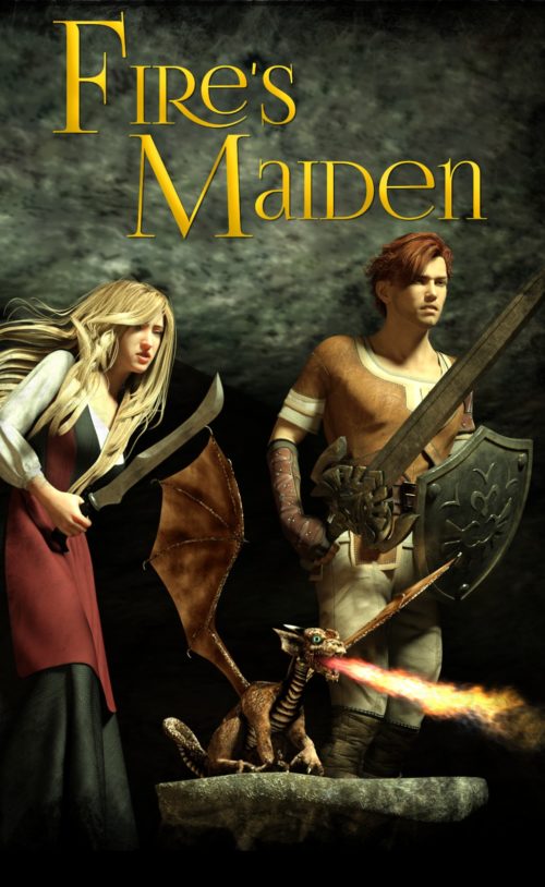
  • Crop the artwork tighter:

…and then increase the title size to fill the space and make it easier to read at smaller sizes.  (With an ornate font like this one, you really need to compensate with size for readability.)  You can easily move the byline up into the space left at the bottom without obscuring any essential detail of the artwork.

  • Possibly add a light order, or maybe just a texture around the edges, to compensate for the rendered figures. (I REALLY don’t like pseudohumans. Can you tell?)

Other comments?

Mike Delaney thriller series

The author says:

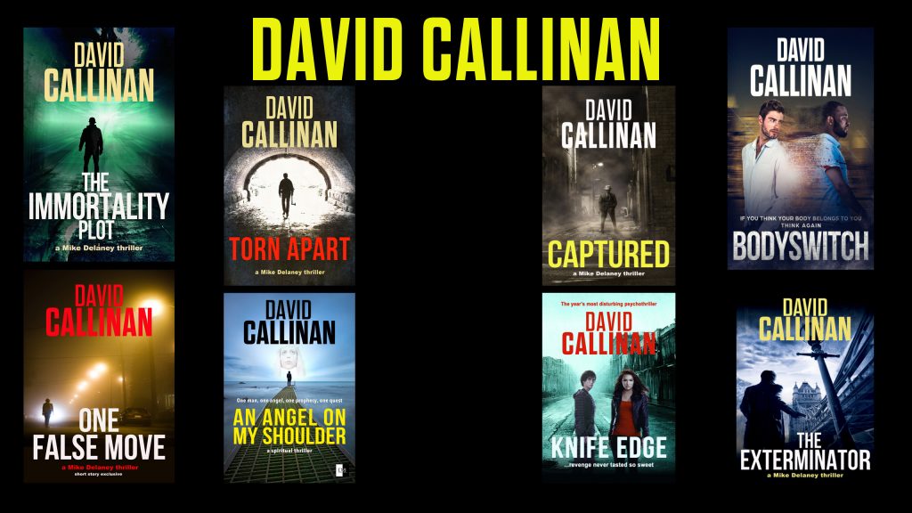
A collection of covers including my Mike Delaney thriller series. Do they present a distinctive ‘brand’? Can they live with thousands of other covers vying for attention on Amazon? Do they need redesigning?

Nathan says:

Most of them signal clearly that they’re thrillers (although Bodyswitch is a little shaky), but I wouldn’t say that they indicate a “brand,” either for you as an author or for the Mike Delaney series. (I definitely wouldn’t assume them to be a single series.) Aside from the fonts used (perfectly appropriate for the genre, but not distinctive in any way), the only commonality I can see among them is the prevalence of silhouettes, often distant — and that’s such a common cover concept for thrillers, there’s no way at can act as your specific series branding.

It’s really hard to find a good example of ebook thriller series branding that doesn’t rely on author awareness. Earlier editions of Robert B. Parker’s “Spenser” novels, for example, used a consistent cover design, but it looks dated now (and I don’t think the current editions do a good job of separating the series franchises — you have to look close to tell if it’s a Spencer novel, or a Sunny B. Randall novel, or a Jess Stone novel).

I think a redesign would be a good idea.  You should go into it having decided a particular element or motif that you’re going to keep consistent through all of the covers.  Maybe it’s a particular ink/blood splotch that will be under the right-hand side of the title.  Maybe it’s that every cover will show a partial figure in silhouette (i.e., a figure closer to the “camera” will always be visible only as an arm or hand or shoulder).  Those are just the first two I thought of; you should brainstorm some motifs, then think of how they could play into each cover.  Some of the covers would only need a moderate revision; others would need a ground-up redo.

Other thoughts?

Where Seagulls Dare

The author says:

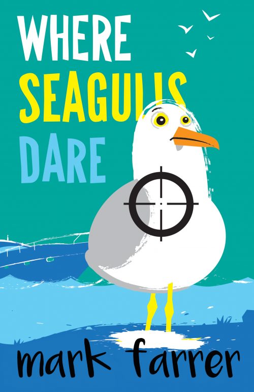
Salmon Fishing In The Yemen meets Pulp Fiction. This is a crime/comedy novel – with added salmon! Set in modern-day Scotland it involves a scheming Russian oligarch and his bungling henchmen, an ardent eco-protester and a faded Hollywood bombshell trying to revive her career by doing a stint in a Glasgow panto. The hero is an itinerant loner who lives off-the-grid ( a sort of modern-day “man with no name” – which is why the title is a pun on a Clint Eastwood film) who has a very individual sense of right and wrong and a creative way of bringing the wrongdoers (in this case the Russian and his henchmen) to justice.

The book is aimed at lovers of Carl Hiaasen, Tim Dorsey and other “Florida noir” writers where Florida is replaced with Scotland but the overall tone and feel of the story is the same. UK writers in the same vein would be Caimh McDonnell and Keith A Pearson. It is the first in a series of books featuring this hero, Cullen, and all titles are puns on Eastwood films (Pale Ale Rider, Bronchial Billy, Dirty Barry, etc) and share similar style covers.

Nathan says:

Hmm… This one’s difficult. I have no doubt that current “Florida noir” novelists could use a cover like this, but in their case, the biggest draw is their name on the cover — that one detail tells the potential reader a lot more about the novel than anything else on the cover.

I don’t know. I can see that the gunsite is an attempt to add some crime/danger to the mix, but I wonder if it’s enough. Here are the things I would try, and then A-B test them with my friends:

  • slightly less goofy typefaces on the title/byline
  • adding “A Cullen Crime Novel” above the title
  • changing the background “sky” so that it starts as burgundy at the top and fades to the current aqua by the horizon (I don’t know why, it’s an idea that just struck me)

Other comments?

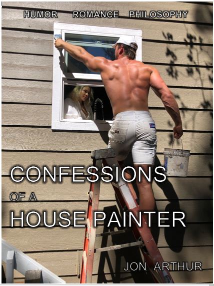
Confessions of a House Painter

The author says:

Confessions of a House Painter is a fictional autobiographical account of a man that begins with an unexpected, and oddly erotic, experience on a school bus ride during third grade, to present day. Each chapter are specific memories of relationships, sometimes romantic encounters, and humorous escapades that are a mixture of humor, romance and his philosophical approach to life. In seemingly normal situations from everyday life, He draws metaphysical conclusions from unexpected interactions with unforgettable characters resulting in often humorous, and sometimes woeful outcomes. Jonny’s philosophical convictions come from a surprising source, his Labrador retriever. Fresh from a self-aware consciousness awakening, Emmy guides her human into a new way of understanding the human experience with intriguing outcomes.

Nathan says:

The problem here is that the book described in your copy doesn’t match your cover at all. I’m not sure exactly what to make of the book as described — fictionalized memoir? coming-of-age story? literary fiction? — but the cover screams “erotic romance” (it doesn’t scream it especially well, but I’m not going to spend effort correcting it if it’s not the right cover for this book in the first place).

I think before you can get anywhere with your cover, you need to discover your “hook”: What is there in the book (which should be apparent in both your description and your cover) that is going to capture the attention of a potential reader? How is it different, and more interesting, than the books to either side of it on a bookshelf or in an Amazon display?