The author says:
GENRE: Sci-Fi action story, present day, moving into the past.
STORY: Neo-Nazi German terrorists attack the lab of time-travel scientist Peter Waylan. To save his life, he sends himself through his untested portal. It sends him on a reverse trajectory, streaming backwards through time. The Germans create their Fourth Reich and conquer not only the future but the past. Waylan is the only one who can correct this nightmarish timeline, but first he must somehow change his trajectory while on the run from Nazi assassins from the future.
APPEAL: fans of time-travel sci-fi and steampunk
Nathan says:
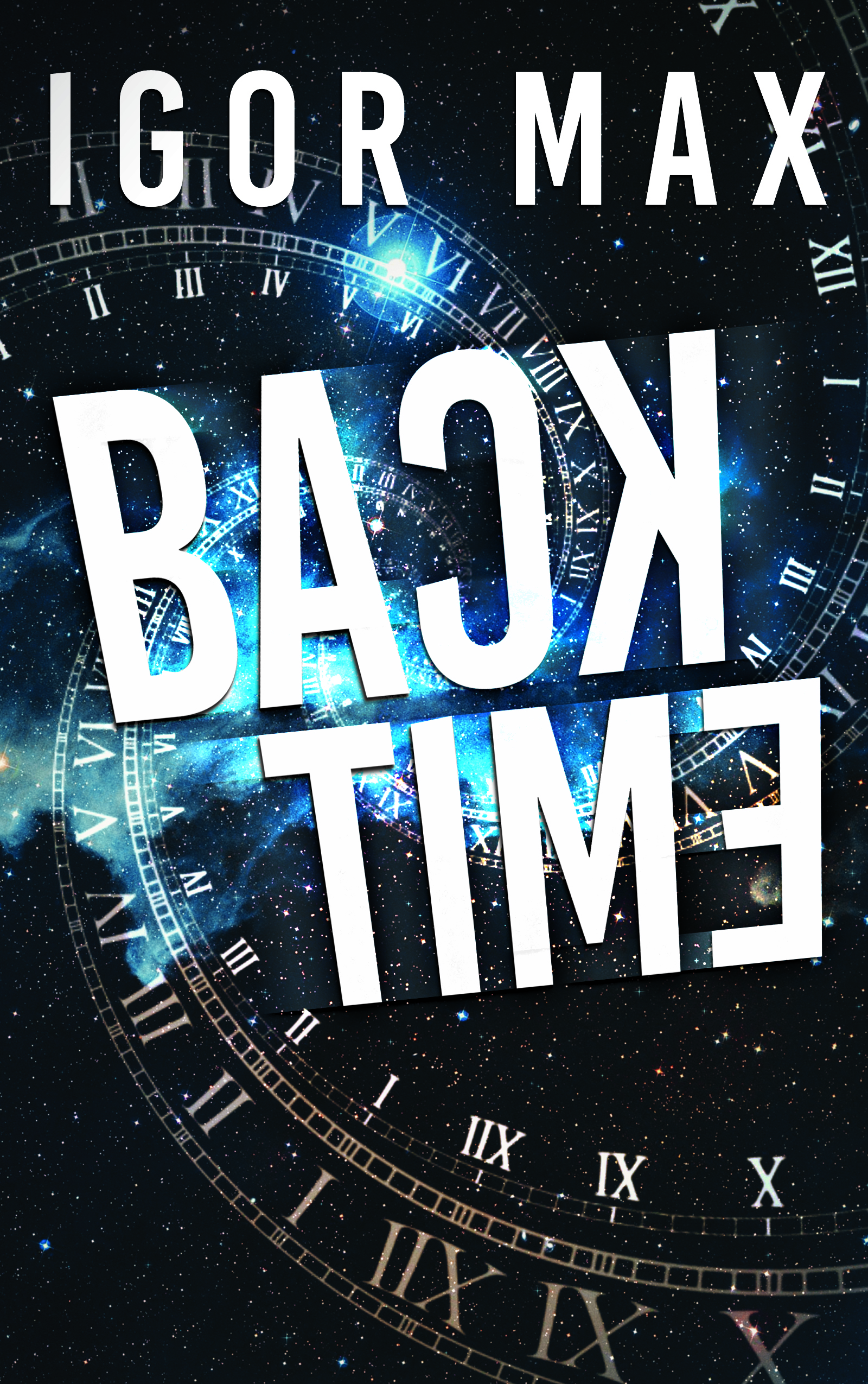
If you’ve got a novel about time-traveling Nazis and you only reference time travel on the cover (or just time, really), you’re doing yourself a disservice. Especially as both clocks and swastikas are radial designs, you should be able to work a visual Nazi reference in there with moderate effort.
And I’m sad to say that the “clever” backwards type doesn’t work for me at all. Confusing the audience isn’t the same thing as intriguing them, and I think the flipped letters work against you, especially because it’s inconsistent: only some of the letters are flipped, and in one case they’re out of order too. I think this probably works better in your head than on paper.
Other comments?
It’s a slick cover if the genre was a modern political sci-fi thriller about a theft of a time travel device, perhaps, but it’s a genre miss for Nazis and Steampunk. Nothing about this cover hints at either 😉 while you don’t (and shouldn’t) pack every element into a cover, you should consider how color choice and silouette can contribute. Even making the ‘time’ element more of a vintage clock would help, vs. the slick corporate looking Roman Numeral swashes. Steampunk tends to lean more into the neutral tones, as well.
Consider whether the Steampunk or Nazi elements predominate in the story, and look at covers in that niche for inspiration rather than going for generic modern sci-fi.
I also agree on the backwards letters being more confusing than aiding the design. Perhaps just having one letter turned, or a backwards reflection, would help – but while the “only traveling backwards” hook is cool, it’s actually not as necessary to make clear as the fact your book involves Nazis.
I kind of hinted at this in my review, but I thought I might add this reminder to the author. Steampunk is pseudo-Victorian science fiction of the Jules Verne/H.G. Wells school. A science fiction story set in the era of Nazi Germany would not remotely be steampunk. If it has any name at all it is “dieselpunk,” which usually incorporates science fiction set in the decades between the 1920s and 1940s. So rather than look for inspiration among steampunk book covers it might be better to look at covers of other science fiction books that involve Nazi Germany, or even perhaps take inspiration from Nazi propaganda posters from the period. That might make a great jumping-off point. For instance, if, as you suggest, the Nazis succeed in creating their fourth Reich, why not imagine what their art (and book covers) might look like?
Doesn’t Neo-Nazis and ‘Forth Reich’ imply it is set (to begin with) in the present or the near-future?
I find the Steampunk reference confusing too.
I agree with Nathan.
The cover is too uninformative. It may be apparent that the book has something to do with time…but that is far too general and non-specific. What sets this book apart from every other science fiction novel that involves time travel? That’s what your cover needs to convey.
The type is definitely a problem. It is cleverness for the sake of cleverness.
Your cover needs to do two things right off the bat: it needs to attract the eye of a potential reader and it needs to tell them something significant about the book: what it’s about, its nature or theme—and especially what sets this book apart, what makes it different.
The theme of the book is time-travelling Nazis and a hero trying to escape them in order to foil their nefarious plans. You need to convey this idea on the cover.
PS The book sounds a lot more dieselpunk than steampunk, by the way.
I hate to say this, but I could swear that we’d seen this artwork here previously, on another cover. Nathan, didn’t we have a time-travel book with this art, or at least, art from the same provider/creative?
I think the placement of the backward letters, atop the spiraled “intersection” of the clocks or gears of time, makes everything worse. It ruins what is arguably the best part of the image and the busyness of the image makes the backward lettering harder to read. I think that both of them would work better if one wasn’t juxtaposed atop the other. Too busy, too hard to decipher.
As the estimable Ron Miller said, you have several things to overcome in terms of theme and imagery, e.g., Steampunk is a period of time that’s 50-60 years prior to the rise of Nazism. He’s right in mentioning Dieselpunk (although I admit, as a mad steampunk fan, I find Dieselpunk sort of twixt-and-tween).
There’s nary a hint of steampunk or dieselpunk here and no indication of Nazis. That’s “no bueno” as we say in the Desert Southwest, in terms of trying to attract your perfect reader. You haven’t given them any breadcrumbs with which to find you and this, their perfect read. At the very, very least, either the Nazi symbol (the Hooked Cross), or the SS bolts, perhaps.
The other thing is, and you probably won’t love this, but typically, Steampunk features “steampunk-y fonts.” Which tend to be foofy, picking up on the Victorian era of style and dress. Honor Raconteur, who is a very successful self-published author with a lot of steampunk elements, uses what I believe is a proprietary font on her “Artifactor” series, which is arguably high-fantasy-punk, (More fantasy than the usual, involving magic and elves and the like) and uses other foofy fonts for her “Shinigami Detective” series (more magic-punk, set in a world that’s currently equivalent to 1890’s UK culture).
My point being, the right font can also convey X-punk. For Dieselpunk, I’d need to invest some time in finding just the right font. It would, inarguably, be a stronger, more ‘manly’ font than your typical foofy steampunk font. KM Weiland’s “Storming” is a solid, straight-up heavy Sans font, with some color and speckling effects. (n.b., she has custom art drawn, too, so…she can probably get away with her covers as-are.)
Tin-Can Tommies–which apparently is “pure unadulterated Dieselpunk…” according to the “Dieselpunk Podcast Network” (no kidding!) uses a very heavy specialty font. It’s not my taste, but it gets the idea across.
I’d spend some time rummaging around Amazon’s shelves, in that genre (or sub-sub-genre, if you want to be accurate) and see the covers and the font treatments. That Timepiece Swirly might be the basis for a great cover, but right now, it’s not there yet.
I think we have all seen this art more than once…
https://www.bigstockphoto.com/image-266945227/stock-photo-the-composition-of-the-space-of-time%2C-the-flight-in-space-in-a-spiral-of-roman-clocks-3d-illustratio
Which really underscores my main problem with using stock images cold: The chances of your cover art appearing on eleventy-seven other books.
Sure, but I’ve seen some remarkable covers created, using stock imagery–even stock imagery that I’ve seen more than once at my own shop, mind you–in the hands of a talented manipulator. I’ve been continually surprised at just how “custom” stock images can be made to look, when the right cover designer does them.
So, it’s not the stock images, Ron, inasmuch as…well, stock cover designers with little imagination and less photo-manip talent, IMHO.
That’s why I was careful to object to images used “cold.” Stock imagery is fine if it is used imaginatively…especially so if it is creatively manipulated or used as part of a larger visual.
The danger of using an image pretty much as it comes off the shelf is winding up with a situation like this https://www.charliehills.com/gallery/picture.php?/564/category/3
So I certainly agree with you when you say that “it’s not the stock images, Ron, inasmuch as…well, stock cover designers with little imagination and less photo-manip talent…”
Yeah, what the others have said.
The good news is this cover definitely shows some strong design instincts. The layout feels well weighted and dynamic and the sense of palette and texture mix, which are things that often trip up covers seen here, work well. This has a slick and professional feel.
It just isn’t selling YOUR book enough.
Given that your title is ‘Back Time’ there’s really nothing to add by having graphics that just say ‘time travel’. Your cover doesn’t need to be doing work that your title is already doing!
And yeah, you want to get something that alludes to the Fourth Reich/alternate history angle. That’s a whole genre of its own so there’s an audience around whose attention you want to catch.
I wouldn’t say backwards letters can NEVER work as part of cover typography but it;s not working here. For one thing there’s no pattern to your version. The B is forward, the C and K backwards, and all the other letters are symmetrical so could be either!
I get the instinct to do something to the basic letter forms to make the title look that little bit more interesting and bespoke. And I think that’s a good instinct, it’s just that this isn’t it.
And that might be a really good place to include a touch that speaks to the Nazi/alt-history idea. Except…
It’s going to be a really thin line to walk making clear the particular story of this book without using Nazi imagery tastelessly. I don’t think I’d ever use a Swastika on a cover I was designing. Maybe ten years ago it would be different but times being what they are that symbol has just got too potent and dangerous again. Probably ditto for things like the Iron Cross, the SS eagle etc.
I think there’s a wealth of ways to evoke the theme without going to images like that. But like Hitch says, the thing to do is really spend some time looking at relevant covers that already exist. Other alt-history/time travel books (and their adaptations’ poster, like The Man in The High Castle), historical fiction and non-fic history books about the war etc. Nazis have been such a subject of interest to writers for such a long time now a whole wealth of tropes and references has been worked out to suit all sorts of different approaches.
So research away!
Kata is probably right about the swastika, given today’s climate and hyper-sensitivity to anything–anything–that might, heavens forfend, offend anyone. (I personally find it a far distance from “sticks and stones may break my bones, but names will never hurt me” to “OMG, this or that or the next thing will trigger me,” but…)
Given that we’re talking about commerce, here, she is undoubtedly right in that you should steer away from the swastika. There are other ways to convey “Nazis.”
Nazi propaganda posters had a special aesthetic all their own. It might be worth browsing through some for inspiration. It’s a style that has not been exploited very much. Combining that look with some recognizably modern element might be something to try…
https://www.google.com/search?q=nazi+propaganda+posters&sxsrf=ALeKk034DUCzvb4VBdesXHHrdwV6mFVyLA:1603392533839&source=lnms&tbm=isch&sa=X&ved=2ahUKEwjHy6jT7sjsAhUUZjUKHQ4tDdYQ_AUoAXoECAsQAw&biw=2133&bih=978
In contrast to what other have said, I kind of like the idea of backwards letters – but it’s weird that everything is backwards except the “B” – maybe it’s a little overdone. What I don’t like about the cover is the background. There are also some weird things going on with what looks like a drop shadow or stylized tracers coming off of some of the letters, like the “A” – just looks weird and a little unprofessional. Other have already mentioned about the theme/genre. I definitely agree.