The designer says:
This is a book of contemporary Chinese poetry, translated into English. Zhou Li is a doctor as well as a poet, and the poems are reminiscent of Ren Hang: short and simple, about the city, nature, sometimes very explicit and sexual, sometimes everyday – about life, love, and death. The writer isn’t well known, and has never published a full book in China. The target audience is in the US, for those who like modern or translated poetry, but it isn’t intended to be a mainstream book.
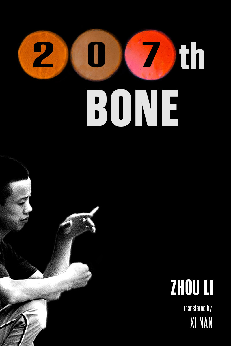
The design featured here originally had rain in the background. I liked the concept but I couldn’t make it work, as it was too busy. The translator wanted a simple design, but it needs to stand out enough, and look professional enough, to attract buyers.
Nathan says:
Well, attracting buyers for a book of poetry might be too tall any order for any cover… 🙂
The problem is that this book tells me nothing. Nothing. I don’t even know that it’s poetry rather than a novel or a memoir, and I certainly don’t know the mood or theme — nothing about “the city, nature, sometimes very explicit and sexual, sometimes everyday – about life, love, and death.”
The best I can suggest is to look at the covers of other poetry volumes that you’d expect to find on the same poetry lover’s bookshelf. Look at how those covers signaled to the reader that this book was for them. Then incorporate some of those visual cues.
Other comments?
I like this cover a lot and think that all it needs is a little fine-tuning.
I wish that the black wasn’t quite so overwhelming. This could be repaired by moving the figure a little further into the frame. The cropping of the figure is kind of nice, so perhaps this could be accomplished by enlarging the figure slightly.
I think that I would be explicit about the nature of the book and simply state outright that it is “Poetry by Zhou Li.” And you might want to think about making the author’s name a little larger at the same time.
All of these things would also result in a better-balanced composition.
Eh, I think this is what our esteemed host typically calls Mystery Meat over on this site’s companion site Lousy Book Covers. As he says, the problem is that the cover tells your prospective readers… nothing; nothing at all. What looks to be some blurry pseudo-colored photographs of planets in the title and a grainy black-and-white photo of some Asian guy with a cigarette in hand does not add up to a meaningful cover. (I know that’s specifically supposed to be a Chinese guy, but since you’ve stated your target audience is here in America, please bear in mind that most Americans don’t know and don’t care what differentiates any one Asian ethnicity from another.)
Since books of poetry can be written on just about any subject imaginable, designing a book cover for one requires that you figure out what’s uniquely interesting about the subjects covered in yours. Your summary suggests this book of (translated) Chinese poetry is mainly a “slice of life” with a fair amount of erotic material thrown in; well, it’s Chinese (which is already somewhat exotic in most Americans’ eyes) and has some sexy stuff (a common but very popular subject here and—I dare say—almost anywhere) in it, so it’s got two points of interest in its favor already. Why not capitalize on them?
My recommendation would be to display the book’s title in Chinese (a machine translation suggests it would be 一百零七块骨头) prominently across the top third of the cover in some big puffy font, and then overlay this with the title in English in some fairly common and straightforward font like the one you’re using now. (Bear in mind the Chinese title doesn’t have to be too legible since it should only be there to serve as exotic eye candy; very few Americans will actually be able to read it.) Throw in something sexy on the cover’s bottom two thirds (but nothing too explicit; an attractive Chinese woman posing a bit suggestively in some kind of form-fitting clothing amid some pretty scenery would probably suffice), and you’ve got an attractive cover that will immediately get the attention of your target audience. Add the author’s and translator’s bylines in nice big letters (to show the writer and translator are proud of having written and translated this book) at the bottom, and you’re done.
Planets? That’s what you got? At first I thought that they were blurry coins, then colored circles and then…well, I got nuthin’.
My first thought is I thought the bone referred to his strange finger that looked broken – and then I realized it was a cigarette 😉
I agree nothing seems to hint that this is a book of poetry. Actually using “Poetry” in the title would not be amiss – many Chinese poetry books on Amazon seem to do so.
Just briefly browsing through the genre there, it seems most ‘classic’ Chinese poetry includes Chinese Art on the cover – both b/w and colored ones, landscapes, people, plants, etc. but definitely art of some kind.
When I search contemporary Chinese poetry, the covers are more varied. If place/setting was central to the poetry, it might be a shot of a place. Closeups that make abstract art out of fabric folds, dirt, textiles, flowers, bones, and other objects are interestingly common.
Assuming you don’t want to go full on custom art like with “Chinese Erotic Poems” (full art cover of a pair of lovers,) then going with an abstract close up shot of a bone or some other meaningful symbol from the book might be interesting.
It seems to be a genere where subtitles like “contemporary poetry” or “poetry written in exile,” etc. are common, so take advantage of that to add some clarity to the cover.