The author says:
Genre: Urban-Fantasy/Soft-Cyberpunk
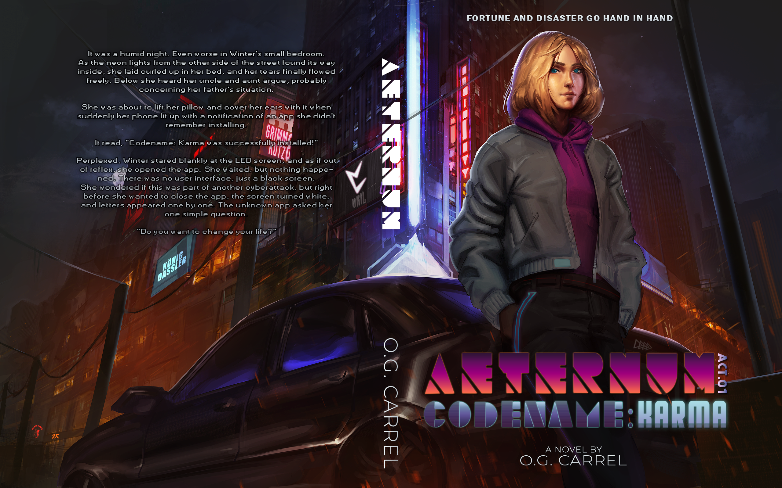
We follow a seventeen-year-old girl named Winter den Haag. She lives in Frankfurt on the continent of Germania Magna. A Planet Earth nearly identical, yet vastly different. Once more bullied before the summer holidays, and her father hospitalized, Winter eventually finds herself in tears on her bed. Deep in the night, Winter receives a message on her phone from an app that she doesn’t remember installing, asking her if she wants to change her life. From there on, we follow her as she forges her legend, and eventually becomes a pillar of the Free People of Germania.
Nathan says:
The artwork is very competent, but not at all dynamic. She’s literally just standing there with her hands in her pockets; it’s practically a placid scene. And while it looks urban and gritty, there’s nothing there that tells the reader it’s an alien world, or even that it’s science fiction — that’s a pretty contemporary car right there.
The type is a disaster. Sorry, but between the collection of fonts and the size, it’s an unreadable mess. I’m still not sure I know what the main word in the title is — I think it’s “Aeternum,” but that’s only after rejecting “Afternun” and “Aftermum.”
If I were going to try to fix this cover (instead of scrapping it and starting over), I would:
- Rotate it by 10 or 15 degrees counterclockwise, placing the central figure on an angle.
- Play with the color so it doesn’t look like she’s standing under warm studio lighting.
- Add a spaceship to the sky behind the lightpole.
- Redo the type, focusing on readability first, and make the byline bigger.
Other comments?
Second everything Nathan said. Additionally, to add some sci-fi or alien elements pretty easily, you could use the complicated ‘Aternum’ font to redo the neon signs in the background. There the unreadability might work in your favor, making the signs look like the alienese signs out of the background of a Futurama episode. It would still need a spacecraft in the background, or at least a futuristic turbofan helicopter.
Maybe I’m confused, but why are we you, Nathan and you, Kristopher) thinking that there is space travel involved here, or aliens? I see nothing in the description from the author that implies that. I hear Cyberpunk (which I agree isn’t remotely hinted at, on the cover, at all); I hear a German flavor to it and some alternate Earth stuff, which also isn’t remotely hinted at, on the cover.
I agree that the font is disastrously bad. I wouldn’t, unlike Kris, recommend it for the signage; instead I’d try something like Cebo Twin or CocoBikeR; Hikou Urban, perhaps? (Pandora Ep2 or 3?) Some of those might–might–also work for the title, but my gut says, with such a background, stick with a nice simple condensed Sans font. (GoBold Regular, maybe?) Or BankGothic, maybe, to softly and subtly convey “cyber.”
I’m not wild about most illustrated covers in this vein, so that’s a personal, and not professional, bias. I agree that it’s not exciting, even as a piece of art and that it doesn’t remotely convey anything alternative-Earth, futuristic or Cyber. And the girl’s/woman’s pose is very passive.
I’ll leave the further suggestions around the art to the artists and creatives in that area.
Hm… You may be right. I assumed from my reading that we were dealing with a very Earth-like planet, but it seems that we might be dealing with an alternate Earth. Mea culpa.
In that case, we still need to see something out-of-the-ordinary, instead of an urban street. A neon billboard saying, “All Hail the Kaiser,” maybe? A Teutonic Knights recruiting office behind her? (Are there Nazis in Germania Magna? Is it Nazi Week here?)
Hi:
I concur, absolutely that it needs something to say “this ain’t yo’ momma’s earth” in it. Hell, even the car looks like the suburbs. (I wonder if this is a piece of artwork developed by a Deviant Artist or the like, adapted to the purpose? I mean, that might explain the “regular-ness” of it; that it doesn’t feel like “other.”)
It does appear to be evil Nazi week here. “Germania” appears to not be free, so something–anything–ominous in the background would be a great addition. I’m thinking a Verhoeven-style poster or advert, done without the humor. Something like “Uncle Adolph Wants You!” is probably a bit too much and corny, besides, but…something. It needs something, anything, beyond font changes, to say CYBER and OTHER and alternate Earth.
Offered FWIW.
I dunno, the girl’s clothing has pockets, so that’s suggestive of alternate world… (j/k, I’ll show myself out)
I second this.
@Hitch
Noted and German flavor has been added in the form of Traditional Germanic (Runes). Like the Chinese, the German’s use Traditional and Simplified Germanic.
The fonts you suggested were amazing, and I have made great use of them btw. Thanks!
@Hitch, Nathan, and Kristopher
To clarify the space-travel aspect. There actually is, India and Germania have both colonized the Moon and Mars. Sigrun and several other vrilin have supposedly traveled to a different solar-system (Aldebaran) as a whole. Though, this cannot be confirmed since the Vril have not heard from their sisters in nearly 80 years. 🙂
However, and to the point, space-travel is in no way relevant to the story and just something that happens in this version of Earth.
HOWEVER!
There are UFOs, but they’re mostly considered to be means of public-transportation by civilians. The new busses and commercial aircrafts, so to say. Basically, you have a bunch of flying saucers flying around, landing on roundabouts, letting people out, and picking up new ones to transport. Only some “company” Disks actually land on the skyscrapers of those specific companies.
Now to the aliens, there are actually two different races now living on Germania Magna. The Pleiadians (the elf-like versions, not the blue humanoids some site’s show), and the Lyran. The latter traveled to Earth because they were attracted by the vril and the underlying meaning of its existence on Earth. The former, however, drifted back into existence once the atmosphere in Germania adjusted to the vril.
The Vril as in the Vril Society is capitalized, the unlimited energy source created by them is called the same but not capitalized. Just to avoid confusion. So yeah, they both came to Earth for or because of the Vril/vril. That does not mean that they are the only ones on Earth.
I’ve made sure to add those flying saucers to the cover. 😀
Not sure how that escaped me the first time around.
As for the Nazi stuff, I believe I explained most down below.
If there are further questions, however, please ask!
Again, thanks go out to everyone, and sorry for the delay!
Well…
The art is nicely done…but I wish it were a little more realistic and a little more involving. It’s simply a portrait with no emotion, no sense of personality, no suggestion of story.
There is really no clear sense from the cover that the book is set in the future, let alone an alternate world. There is no sense that the girl has ever been bullied. There is no suggestion of the sort of action or role she takes part in in the latter part of your description.
The choice of typeface was already a little iffy…but made completely unreadable by decorating it with gradients and other effects. (“Codename” is rendered utterly illegible). A good rule of thumb might be: the more decorative a typeface might be, the less it needs to be messed around with.
On top of that, you chose to use three different typefaces for the title of the book, which is two too many.
Noted!
I think I’m close to executing that part far better than it was before.
Hmmm… As I recall from a discussion over a German-themed alternate universe cover five years ago, “Germania” was also the name of Nazi-Germany-conquered Europe (including the British Isles) in the HBO direct-to-TV movie Fatherland. If Germania Magna is basically Europe as controlled by Germany (Nazi or otherwise) in this alternate universe, then the name’s fitting enough. If this is some kind of story about (say) an alternate North America as colonized by Germany instead of Britain and France and Spain, I’d recommend going with something like “The United States of Germania” in the story to clarify the setting.
Back to the cover; well, as our esteemed host says, the scene’s just too plain placid to get much of anybody’s attention. The city behind her—to be sure—looks a lot like Gotham from the Tim Burton Batman movies, but it’s worth remembering that the fictional city’s architecture was intended to be only mildly “alternate universe” from the Chicago and New York City aesthetics on which Gotham is based. You want your version of Frankfurt (which I don’t automatically assume is the same Frankfurt from our version of Germany, there being numerous cities here in the USA named after famous cities from other continents, such as Philadelphia) to be a lot more immediately recognizably alternate, with the gal in the foreground doing something a lot more active than just standing around leaning against a car. (At the very least, couldn’t we see her actively fiddling with her presumably alternate-universe-company-branded e.g. Apfel smart phone?)
So basically, yeah, you’re going to have to start over and redo your cover from the ground up. The key aspects your cover needs are to be active and alternate and Germanic. While there are several ways to do this, I’d focus mainly on making everything look alternate: big bold billboards and neon signs in the background advertising for companies that don’t exist in our universe, or close-ups of apps on the gal’s phone similar to—and yet different from—apps we’ve got here, and/or every one of the advertisements or apps using distinctly German-sounding words and Germanic fonts.
Basically, think of something like Philip K. Dick’s Man in the High Castle or L. Neil Smith’s The Probability Broach or just about any Henry Turtledove novel. What kind of weirdness that people in this alternate universe of yours pretty accept as a mundane fact of their daily lives can you prominently display on your cover? Whatever it may be, show your prospective readers that, and they’ll come flocking to your sales page.
First of all, thanks! You made a lot of great points I didn’t even consider. That made me wonder if I should scrap this cover and show Germania, or Frankfurt in this case by day. However, if I do that, any semblance of Cyberpunk would be completely gone. Mhh, well I basically already did that, since I prefer calling it Urban-Fantasy now rather than Cyberpunk.
Anyhow, by day, its basically all big stone structures in bright white, imagine a softer, modern version of Demacia’s architecture (from League of Legends).
In the night, it is as you see it, though not yet represented accordingly.
I’ll definitely try to show this world’s uniqueness on its cover!
To your geographical questions:
Germania Magna – Europe, Britain, Ice/Greenland
The Motherland Russia – Russia
The Domain of the Dragon – All of far east Asia. In seclusion for 500 years and counting.
U.S.A (United States of Arabia) – Basically Persia, Saharan Africa.
Solari Empire – All of Sub-Saharan Africa.
Indian Empire – India
The Aroi Sun Kingdom – South East Asia, Poly/Micronesia
The Mayan Federation (still working on the name) – South America + Central America + Mexico, before it was stolen by the “Americans”.
Commonwealth – What remains of colonized America, Canada, and Australia.
Again, thanks a lot!
Best regards,
O
Hello, the author here. 🙂
First of all, thank you all very much for the feedback!
Your comments and suggestions helped a lot, and I’ve already made quite a few changes. I’m thinking, as suggested, to have her hold her phone with her right. Her head tilted toward the phone, but maybe still looking at us. Almost peeking in this case?
I’ll go over your questions in detail as replies in your comments over the night.
But, let’s go over the Nazi stuff in AETERNUM real quick.
The German Empire still intact, was kind of taken over by the Nazis just like in our timeline. They also won the World War (there was no first WW). And after conquering most of Europe, they renamed the continent, Germania Magna, as the Romans called everything after the Rhine in their early years. Although, they called it Magna Germania. The Jewish people were saved before they could have been mass-murdered. However, ethnic-cleansing was still in order, albeit very subtle.
Anyhow, a few years after Hitler’s death in the late ’50s, the people found out about the things, they in extension had done. Over a few months, tensions grew. Until, mostly ethnically german people at first, went berserk and began what would eventually become a civil war. Historically knows as “Der Freiheitskampf”
Two years later, the Nazi regime was destroyed and nearly 1.4 million NS-members killed in the process.
From thereon, the Free People of Germania had to choose their own path toward the future. For nearly twenty years their lives had been pretty good. So much so, that the majority had barely noticed what was happening behind the scenes. So the choice was to stay united and choose a council of five individuals appointed every four years to rule the continent called the Ring of Five.
As far as the people in Germania are aware, the Nazi’s, and all signs of their ideology, has been eradicated. With the Vril and Thule as the exception. The Vril because they pretty much actively worked against the regime since 1942, and the Thule because they stood by and did nothing when the civil war began. The Thule left, as far as we know, the occult behind and all joined different sectors of the army years prior. Eventually, becoming its own specialized sector.
Ok, that should be enough for now. 🙂
Question: How or where can I post my updated cover version?
Don’t know if submitting it again once done would be considered spamming.
So long, best regards, and again thank you!
O
Hi O.G.,
You’re welcome to resubmit, the same way you submitted originally. (First-time submissions get posted first, so there might be a bit of a delay.)
I kind of like the girl’s stance, but she does look like she’s standing under a studio light instead of in the streets. Not much is happening in the illustration but I like the lights and the feel of it. Very cool how the lights reflect into the typeface and it becomes a part of the overall composition but as others have said, readability needs to come first. I would almost bring the title up a little higher as well – it gets overshadowed by the girl.
Thanks!
I also thought about putting the title a bit higher but wasn’t quite sure how to go about it with how the fonts were at this point.
However, now that it’s gone there is room to try this out! 😀