
The author says:
This book is a children’s picture book good for ages 6-10.
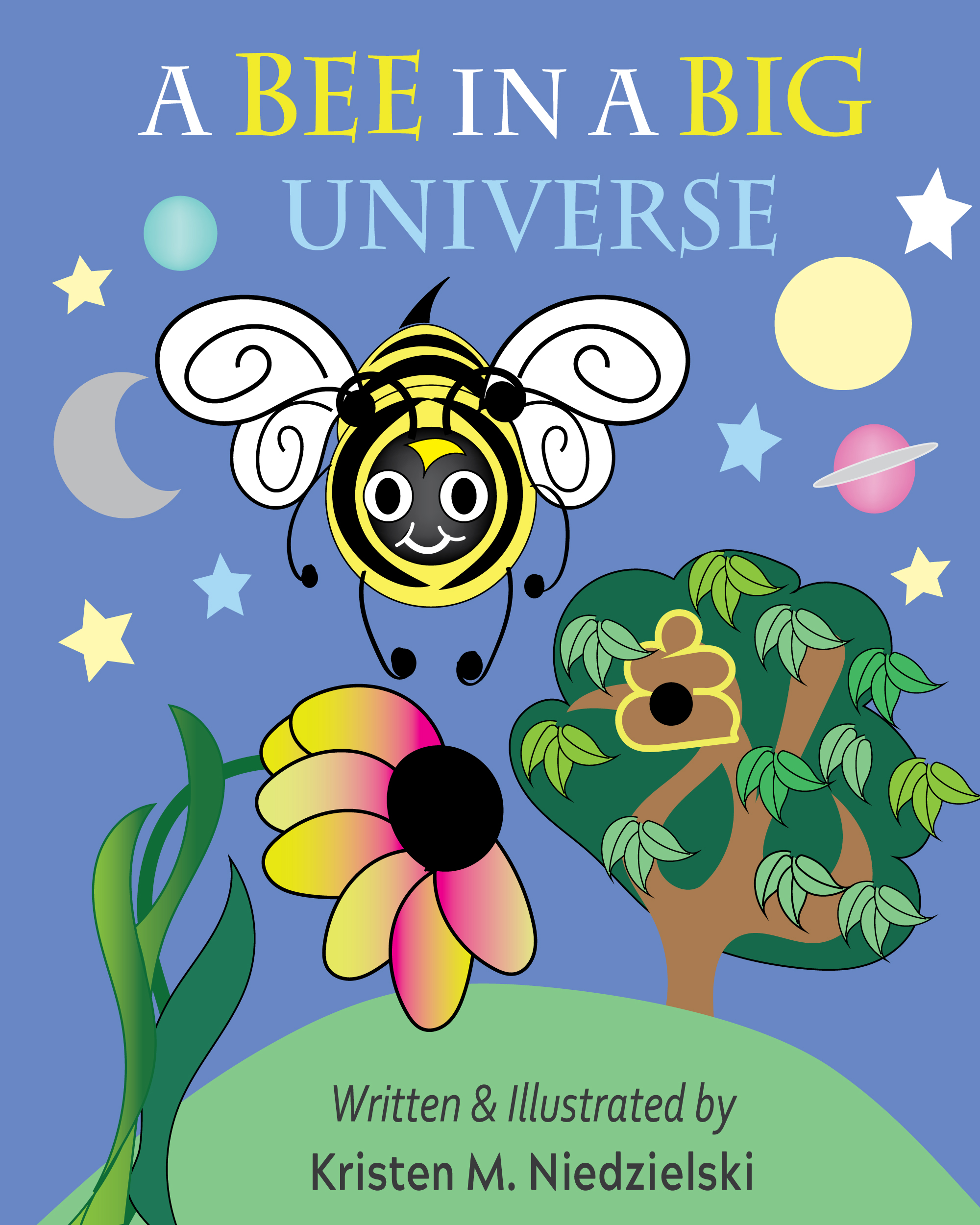
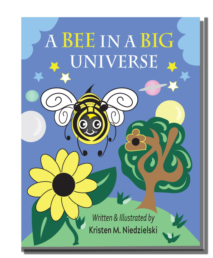
Brain the Bee is dared to fly to the end of the Universe by his best friend Sam the snail. He is confused and decides to go on a quest to find out more about our vast world and beyond. In this quest, he finds out what stars are, what is a planet, and what the big Universe is all about. Will Brain be able to fly to the end of the Universe, or will he find answers in the night sky. Fly with Brain and learn what it means to be a Bee In a Big Universe.
There is also a great story of friendship in the book. There are many science facts and bee facts. It’s a very good educational book that’s easy to read.
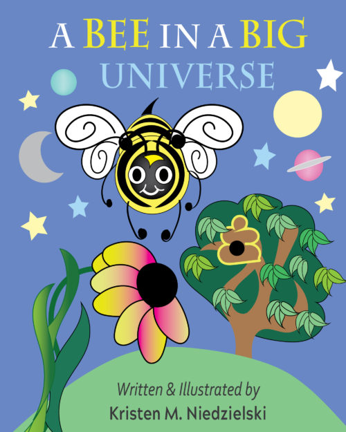
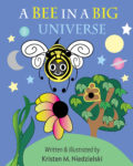
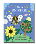
Two versions to see which you like better.
Nathan says:
Of the two, I like the second one better; the title doesn’t seem as cramped, and the complete flower would be easier for a preschooler to identify.
As further improvements, I would reduce the flower’s size and use the extra room to move the bee down and make the title bigger.
Also, the beehive in the tree looks like the poop emoji.
Other comments?