 The author says:
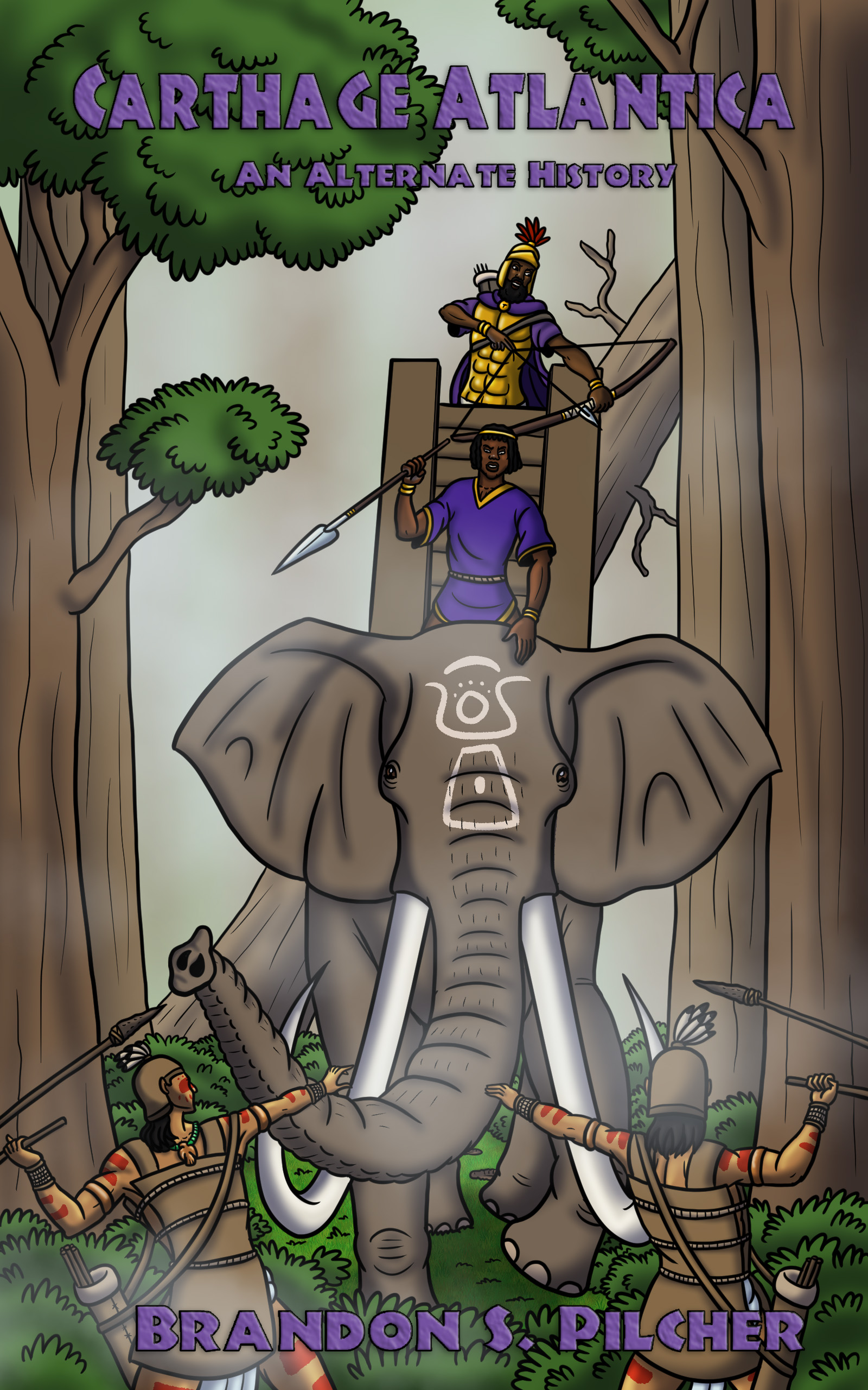
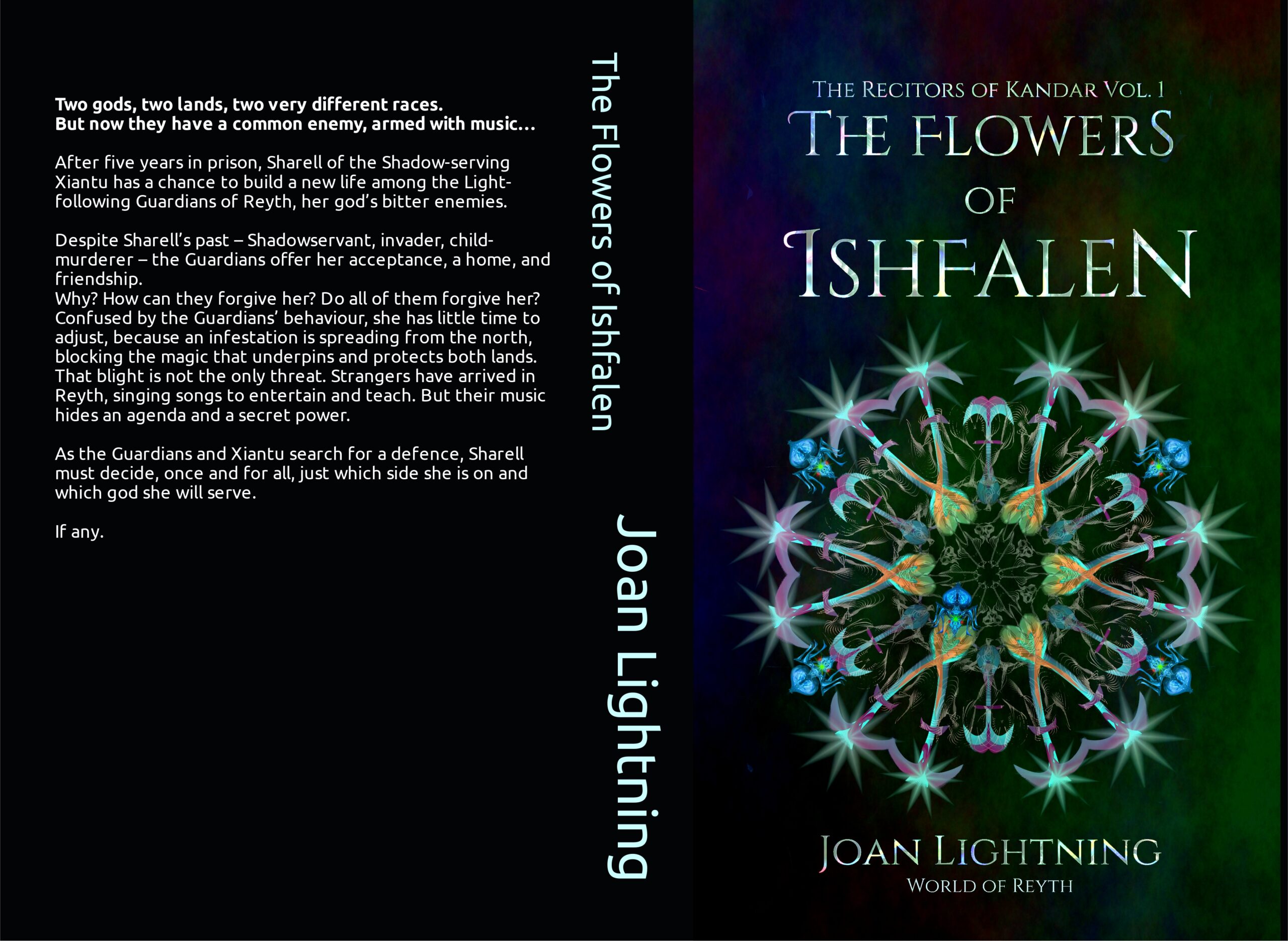
Clean Epic Fantasy/ Christian fantasy. Two gods, two lands, two very different races. But now they have a common enemy, armed with music… An infestation of strange ants is spreading from the north of the continent of Reyth, blocking the magic that underpins and protects two warring lands. That blight is not the only threat. Strangers have arrived, singing songs to entertain and teach. But their music hides an agenda and a secret power. Enemies who fought against each other in the war five years ago must now work together to search for a defence against this double invasion.
Target audience probably also reads David Eddings and Anne McCaffrey. It’s set on another world. The full blurb is on the image.
Nathan says:
You’re trying to avoid the obvious but expensive issue: Most epic fantasy — certainly the books of the two authors you mention — features full custom figurative art on the covers. It’s hard to convincingly say, “My book is like those!” when your book doesn’t look like those.
(On top of that, the font used for the spine and back cover is utterly wrong, but I’m assuming that’s just a placeholder. Right?)
My advice would be to browse ArtStation.com and similar portfolio sites to find a suitable piece of art already created. (By “suitable,” remember that it doesn’t have to have the right hair color for the protagonists and the correct heraldry on the shields — it needs to say, as you said before, that a reader of Eddings and McCaffrey would like this book.) You’d be surprised at how cheaply an artist will license you the use of his artwork if they’ve already made it for a different project or for personal enjoyment.
Good luck!