The author says:
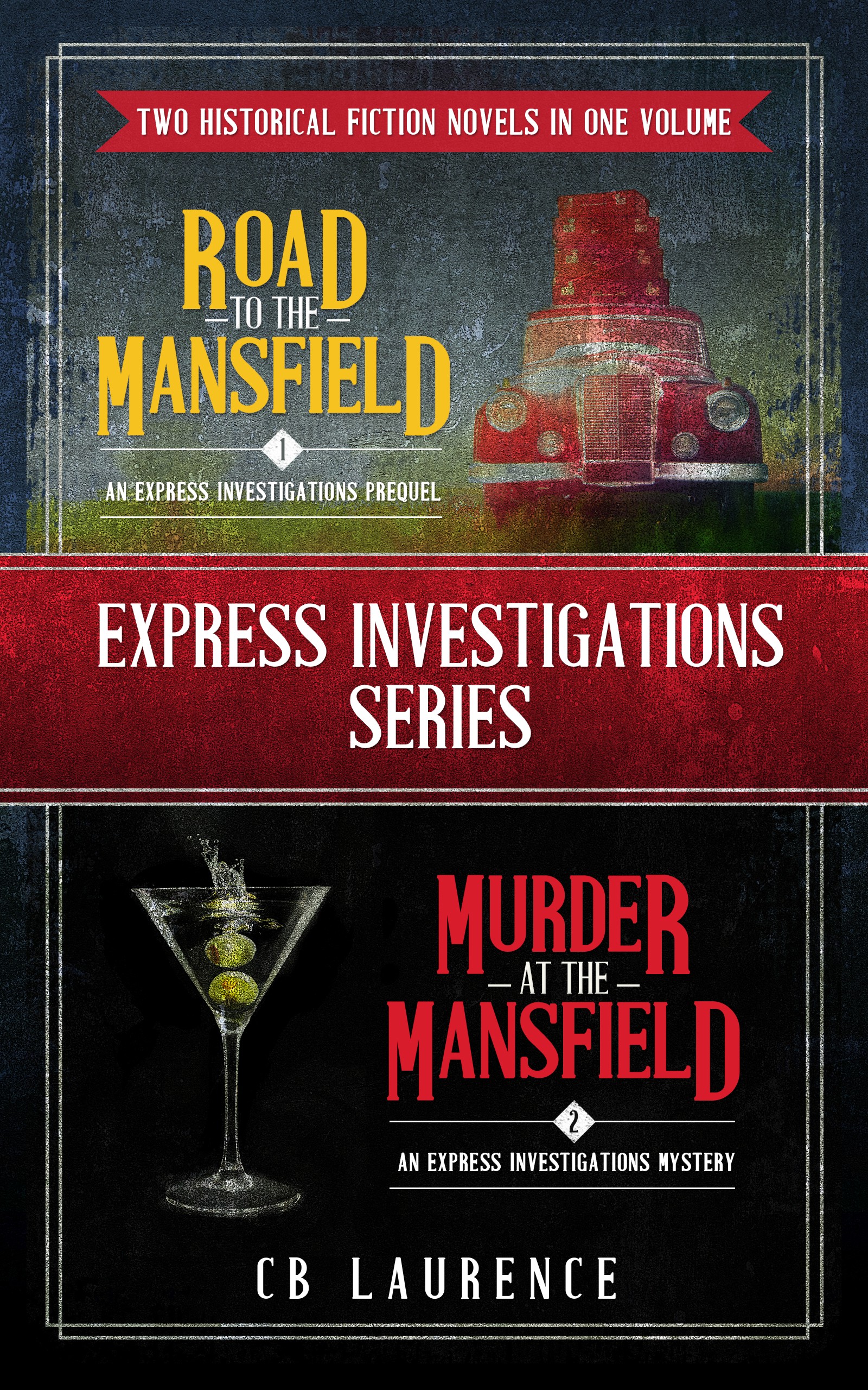
This is a double-volume for books one and two in a historical mystery series set in the 40s. They are NOT cozies, but soft-boiled (harder crimes, some sex, light swearing) Audience is historical fiction/mysteries, probably 40-60 year old women will be the target. The individual covers are those used on the double volume, but I decided to package together.
Nathan says:
There’s nothing wrong with it as such, but I think you could do a series of tweaks to see if anything jumps out at you as a grand improvement, such as:
- Make the individual titles larger (while shrinking the accompanying image commensurately).
- Balance how much “noise” (texture) the two covers have.
- Put the “Express Investigations Series” banner on the diagonal.
Other suggestions?
I’m going to add some comments in a bit, but: PLEASE, remove “fiction novels.”
That tautology drives me nuts and I know it’s a turnoff for other readers as well.
Hi Hitch,
Ooh, good insight. I see it all the time on Amazon – I don’t like it myself, but I thought readers did. I’ll take it off for sure.
Thanks!
Very professional looking but as Nathan and Hitch say, there’s some copy editing that will immediately help the design too.
I would also say you have a problem with the elements/information all competing with each other at the moment, and the eye not being clearly led through the cover in some kind of order of importance.
A clarifying and reduction of copy will help, but I think there’s also some design tweaks that are important to making this really work.
I’ve talked through what I think is going a little wrong there and how one can approach fixing it here: https://www.kathrynrosamiller.com/post/express-investigations-cover-advice
Hi Kata,
Holy moley, thank you so much for the detailed response! I will absolutely make these changes. Deleting the extra text makes a world of difference and the red is too much. The monochroming is a great idea. 🙂
Thanks again, Lauren
You’re welcome! I enjoy going through this stuff.
I always figure that if I can explain the decisions and why I make them as I work through a process, it’s the most help – because it’s that underlying logic that the author/designer can take away and apply in their development even if they choose a different specific route than I took.
I think that Kata’s comments, on her blog, cover pretty much everything I was going to note and then some. The cover’s a bit too busy; as she mentions, there’s a surfeit of text, for not-overwhelmingly-compelling reasons; the difference in the clarity of the two covers becomes apparent in her desaturated tests. (I’m not as wild about her Art Deco/period font, that she used for the series’ title[s] on her mockups, but that’s individual taste. The impulse and the workups are good and solid and their use becomes obvious once you see them, right?)
Overall, don’t get me wrong–gods above know, we’ve seen crap-tons worse. There’s nothing horribly “wrong” with this–but it could be better. And given the obvious effort that’s gone into this, I’d like to see it be as good as it can be.
Busy busy. I’d prefer not to have common elements in the story specific insets.
Something like this:
https://i.imgur.com/zVDYOin.jpg
https://i.imgur.com/NiCjzle.jpg
https://i.imgur.com/8IrH9Si.jpg
Since the lower title is red like the truck I changed the upper title to match the olives.
Hello,
Thanks so much for the input! I like the bigger author name. Need to work on that. 🙂
Lauren
To be honest I made the banner text TOO big. I should have aligned the extremes with the main border. I think my layout (with the aforementioned title adjustment) combined with Kata’s color palette could work well.
Similar to this but better
https://i.imgur.com/xlIphRB.jpg
Mmmm…honestly, CC, not sure I’m lovin’ that.
H
Nor I. I prefer the original colors or Kata’s almost monochrome version.
Yeah, it’s muting my enthusiasm. 🙂
But the banner text looks better.
I honestly don’t know if I agree. It still feels…just off. Too big or something, it’s disproportionate. Sowwy!
No need to be sorry. It’s a suggestion to help spark a solution, not an end design.
Can you comment on what the Express Investigation Series means please- is the Investigation Agency Express Investigations. I like the top and bottom pictures and layout. I know the red tape is like crime scene tape or something. But I feel like the separation is too much with the red. Have you thought of doing a diagonal cropping of the two pictures with one title and copy. I feel like the red tape needs to be smaller and the pictures and titles taking the prominence. All I’m seeing right now is the red banner. If you like one on top of another-which is cool and I love the pictures and especially the smoking martini, then maybe make the banner a bit smaller, so the book title and elements are red first not last. I do like the aged feel of your cover and the graphics and fonts. Just look at your cover and see where your eye goes first- I think it’s the red banner in the middle. I do like your cover idea though and graphics and ages effects. i’d read it.
I could be wrong–but I think that’s a splashing martini–the olives having just dropped in there.
oh I think you are right. There are drinks that have a smoke like feel. I was at a steak house and the had a blue lava smoking drink in a martini glass – lol.
DANG, that sounds awesome! I had to give up the demon rum 30+ years ago (sigh), but I’d love to see that.
Hi Kristen,
Yes, the agency is called Express Investigations. Diagonal sounds interesting… Totally agree about the middle banner – that must be what was throwing me off about the cover.
Thanks for the feedback!
Lauren
Hi everyone,
Please forgive the late replies! I’m in editing-land and it’s brutal here :). Individual replies on the way…
Lauren
Oh, fear not–we don’t actually deploy the Black Mambo Cobra No Response S.W.A.T Team for another few days yet.
¯\_(⌣̯̀⌣́)_/¯
Another idea based on a design I’ve done before is to rework this as a back cover and create a cover image in the same style but a single image that relates to both stories.