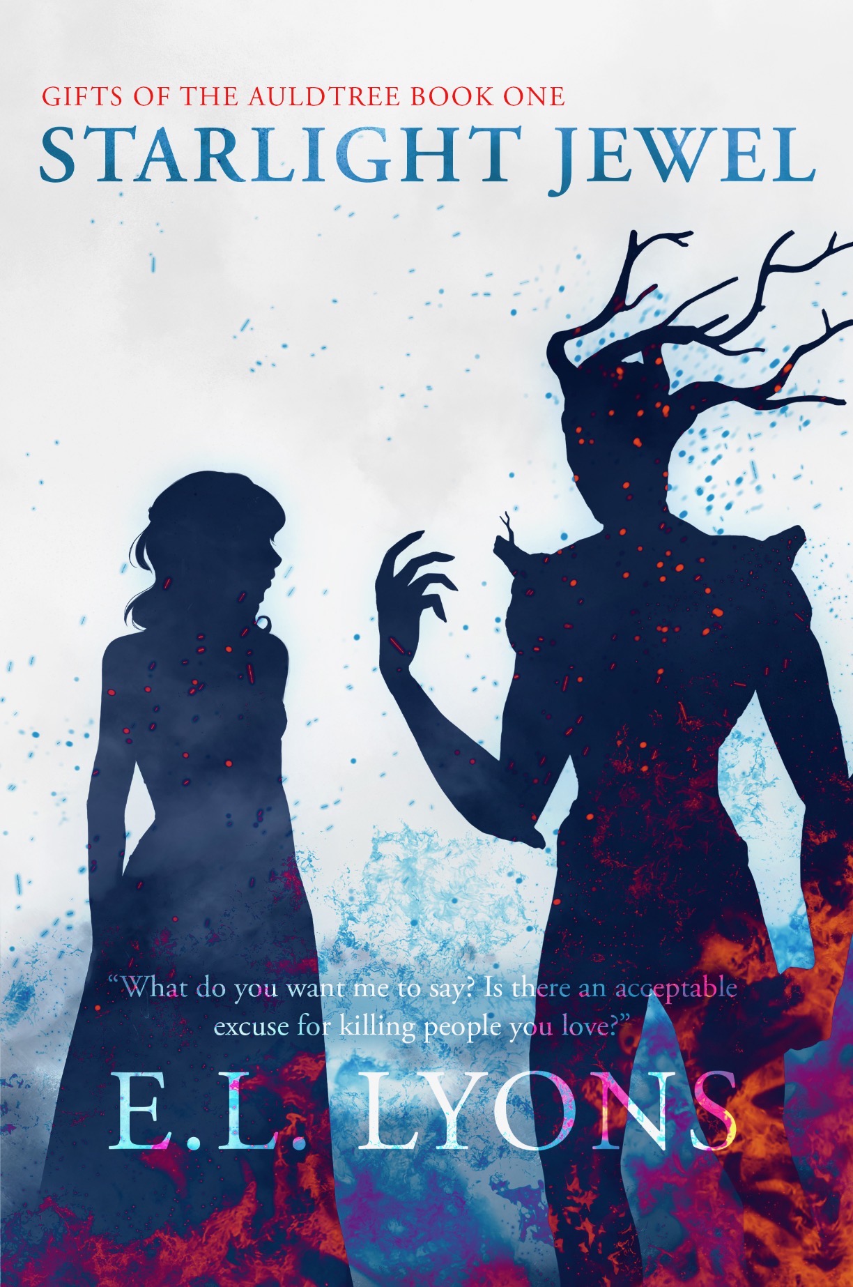
The author says:
Axly, the Starlight Company’s premier seductress-thief and assassin, will do whatever it takes to keep her brother hidden. The secrets of his origin and hers could tear their world apart. High fantasy, fantasy romance, medieval setting, adult, dark fairytale retelling. Target audience is probably women who enjoy high fantasy and fantasy romance. Somewhere between the audience of Robin Hobb and SJMaas. This is a screenshot jpeg of the adobe file.
Nathan says:
The artwork is good. I think the existing weaknesses become apparent in the thumbnail:
- The title is far too small.
- The semi-transparent tagline and byline disappear; the byline especially becomes hard to read, even at full size.
All of these are easily corrected. There’s enough space at the top to enlarge the title and have it break across two lines (especially if you left-justify it), and put the series title below it. The tagline and byline just need a change to transparency.
Other comments?
All I can really do is underscore what Nathan said.
As the others already said, the artwork is nice. Very nice. The typography is really not so great and I think, when you start poking around at the cover artwork, to address that typography, the one weakness or problem area, that I see, with the artwork, will become obvious, which is:
Unless you can fit everything in at the very top of the cover, there’s no good place for either the titling or the byline. The artist did not leave room for them, didn’t anticipate them.
One or the other is going to suffer, unless you resort to banding for the text. And as you have red/dark blue at the bottom, I would think you’re somewhat stuck for contrasting (band) colors.
If the title “Starlight Jewel” is made a lot larger, that can work where it is, but then the series name and the byline (And the invisible tag line)are all in trouble. As much as I hate to say it, maybe a white band, or a very, very very pale blue band, across the bottom, (not all the way to the bottom, but where the byline is now, let’s say) to make the text visible? Might be best served if the band is thick enough to encompass the byline and the tagline…don’t have any great suggestions for the series title. Regardless, I would not leave the series title flush-left with the title centered. It’s throwing off the page, somewhat.
My $.02, FWIW.
Spot on–no one anticipated the text issues. My artist friend, who has never done a cover, made some lovely character/scene art and gave me the layers, which I sent to my graphic design friend, who has also never done a cover. None of us knew what we were doing.
The outcome from two people not working together on something they had no experience doing is much better than I expected, but I think we just needed this last bit of assistance from people who actually know what they’re doing. Thank you!
This looked a lot better in my head, but perhaps it will still spark a solution.
https://i.imgur.com/IHOvxdZ.png
It is a cool concept, and certainly would fix some of the title issues, but I think that would be a little too flashy for my book. The jewel font allowing the antler/branches to show through is a cool touch. I don’t think it quite fits the dark fairytale vibe I was hoping for, but we are picking out a more decorative font, possibly in a darker color. Thank you!
I think I subconsciously channeled this:
https://www.artofthetitle.com/assets/resized/sm/upload/gg/h8/p8/no/romancingthestone-t-large-0-1280-0-1024.jpg?k=b3d52372cb
Well, I admit, that’s not really floating my boat. Too much fontery. 🙂
It did make me contemplate, however, instead of the scattered flames, perhaps a low wall of flames, a fairly solid one, that you could use as the banner space for the byline and tagline/teaser. Just a thought. You don’t need the length of skirt and the legs of the creature, obviously, so…put that space to better use.
Are you saying there’s no way for me to save typeface?
Well, honestly, @CC Participant…yes, that’s what I’m saying.
😀
Notice I mirrored the image to place the blank edge on the right for bleed and trim variance. If there is more image of Groot, it could wrap around onto the spine.
Thank you Nathan, I agree with your feedback and he’ll be changing the cover to hopefully fix both issues. I appreciate your time!
https://imgur.com/hpbUd37
this art is awesome! I really love it.
play with text spacing and color and placement. Another option would be to put title over the darker bits of the bottom. what you don’t want is for the text to look like an afterthought. using a slightly different text between author name and title will furth declinate it.
it’s okay to make the words different sizes too, so that’s also an option.
you could put the tagline above author name and series info on the bottom or even leave it off completely.
You have such a good eye for this stuff. That looks great.
Wow, that looks better, and the font even fits with the book. Great placement and everything’s so clear! We may try and mimic what you’ve done if that’s okay. What font is that?
I’ll pass along you compliments on the art, I’m very lucky to have talented friends.
The titling font, unless I’m losing a step in my old age, is Brilon 1.2. (We use it a bit at my shop.) I don’t instantly recognize the byline font–a bit too generic, but I’m sure that Shel can tell you.
Brilon as Hitch said with Adobe Carlson: Author Regular with spacing tweaked and the other words italic. Any Serif font would work like Times New Roman
The title was a mix of color taken from the flame- the pink base with that orange color set to soft light on the center bit. that tiny detail of mixing the color gives the title a further purposeful look like it was made to match art, which I think it needs so that it doesn’t look crammed into the available space.
Another option would be to use a sans serif font but add in the same detail from the man’s antlers to the text- the same kind of lines and curves. Or write out the text and have your artist draw in some custom detail to it. It doesn’t need a lot. Just a hint of ‘special’
Thank you so much Shelley and Hitch! The designer experimented with fonts that we both picked out from Envato, Googlefonts and Adobe for hours yesterday and we didn’t like any as well as the Brilon, nor could we find it with the whatthefont tool. I really think you found the perfect font for the book, not too much flair, but just enough. You have a wonderful eye for design, and it still blows me away how so many talented people have taken the time to help me make this book happen for nothing in return.
Thank you!
Well, Brilon 2.1 is a foundry font–not free to use, in other words. You can find it at https://creativemarket.com/heritagetype/6816268-Brilon-Font-Extras
Good luck! I agree that Brilon has a distinctive look.
Figured you might want to see the result of your contribution! We went with something quite similar after a few hours of experimenting with placement and spacing.
https://imgur.com/a/OqXKwxS
Nice 🙂
thanks for posting it!
Nice to see one mature this way, eh? 🙂
I’m still not a fan of Groot being cut off by the trim variance and bleed instead of using the empty space on the left.
We might end up flipping the image for the hardcover version. On the paperback I prefer him on the right, for no reason I can articulate, but more of him gets cut off in the hardcover version when he’s on that side.
You really should create one image that can be applied to all formats. It’s going to look like a mistake to potential readers when they switch between them.
As I said before, I’d also wrap it onto the spine if there is more to that side of the image.
I like it! It’s got a nice silhouette design!