The author says:
Matt Evans’s world crumbles when his father unexpectedly dies. Consumed by grief, he vows to keep the family business afloat and takes a risky loan from local thug, Jeff Holden. Once Jeff realizes he won’t be getting his money back, he pushes for an alternative deal. Matt is to assist a scientist with his covert projects to cover the debt. Although unconventional, the deal seems to be the only possible solution. But underneath the scientist’s pleasant demeanor lies a minefield of secrets and personal crusades. With every visit to the underground lab, Matt’s sanity is put to the test. The only one who can put an end to it is Jeff, but he has money on his mind. Matt must fight the growing flames of madness before they consume him, but can he survive the chaos that follows?
Nathan says:
There really isn’t anything wrong here — it looks competent and professional, which means that my suggestions are less necessary than usual, even.
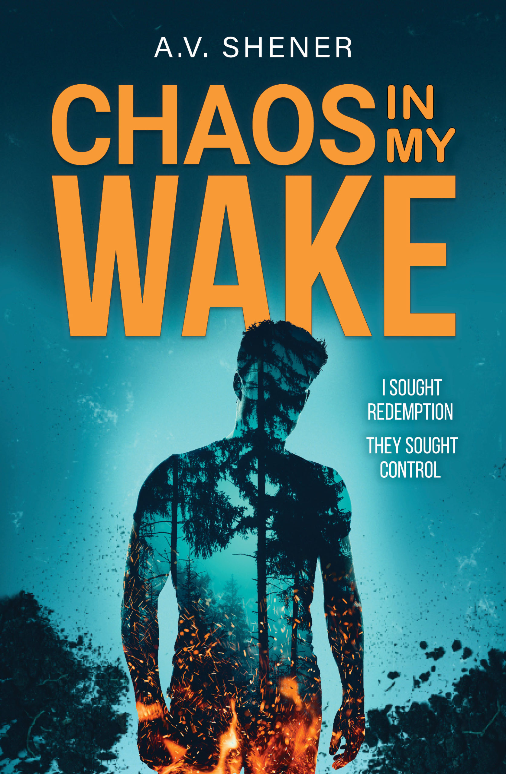
- Make the byline bigger and easier to read.
- If possible, let the flames fill a larger proportion of the body silhouette; the fire gets lost in the thumbnail.
- Even if the novel itself is in first-person, I’d change the tagline to third-person; first-person taglines always seem like nonfiction memoirs to me.
Other comments?
Not much to add to what Nathan said. Very nice job.
I would be sure to raise the flames further so they don’t look cut off.
Four different typefaces is a bit much. At the very least use the same type throughout the title.
Third-person tag.
I agree to raise the flames within the silhouette to avoid eliciting the phrase “Liar, liar…”
I’d raise the entire image and place the byline at the bottom, across the legs, with a darkening gradient fading from the bottom of the cover. At least make it larger. Don’t be afraid to show pride in your work.
I would sample the flame color for the title, and possibly sample two colors and use a gradient to better tie the title and image together.
I know this is Cover Critics, but if you intend to use the description for promotion then it needs work.
Two Typefaces, More Flames, Third Person, Proud Author, Color Sampled Title:
https://i.imgur.com/0prlIWk.jpg
(It’s not really two typefaces it’s three, but I used the closest I had for the mockup)
I dunno–the fire kind of implies something else, like FireCrotch, so I would definitely increase the height of the flames, so that it’s less localized to the groin area.
Teal and orange–always a good, high-contrast combo. There’s a reason you see it everywhere.
@CC, in your mockup, I felt that the byline was too large–it distracted from the title. I’d reduce it a bit–yes, larger than it was in the original, but not quite as bold as you had it.
Aside from some other slop, I should have used the bottom of the W as the reference point for the byline.
I agree with the others. Taglines in the third person would set the tone better, and the forest fire’s not showing up properly in the thumbnail. Rather than show it just starting, I suggest using something from a full-blown in-progress forest fire, e.g. this picture.
I really wish Savoy were here. I know this is silly, but aside from the Fire-crotch thing, and the byline and the tagline…I just feel like there’s something else here that is missing. Or was missed, or…just SOMETHING.
I don’t mean this is bad–let’s not kid ourselves, this is better than 96% of everything we see here, if not 98%; it’s competent and smooth…no doubt. I just…does anybody feel like there’s something niggling at the back of their brains around this one?
Other than mentioning flames in the description there is nothing tying it to the story.
Perhaps something hinting at the project, whatever it is.
Well, for starters, the pitched plot is more than a little vague: loan shark makes a guy in his debt work for a shady scientist doing… some kind of shady research, I guess? The burning forest shown in the guy’s silhouette seems an oddly literal depiction of those “flames of madness” which sound like they’re meant to be entirely metaphorical. Speaking of silhouettes, I also notice most of you colleagues of mine here usually don’t like them very much on book covers, though maybe you’re making an exception this time because this one is drawn in a more detailed and sophisticated manner than most.
If it were up to me to guess what kind of shady research an underground researcher with ties to the local leg-breaker would be doing, my guess would be it had something to do with illegal recreational drugs: either developing and testing some new formula (possibly on involuntary human subjects), hybridizing plants to make the drugs easier to produce (as in one 1980s Punisher comic I remember reading in which the Punisher killed off an underground biologist who’d recently engineered a hardy breed of “flake” one could allegedly “grow on the hood of a Dodge” by hybridizing coca and sumac plants), or making a given drug’s extraction and refinement process quicker and more efficient. How any of that squares with the “personal crusades” in which this book’s seemingly affable scientist is said to be engaged, I don’t know. If he were researching something more sophisticated, such Dr. Moreau-style experiments with human genetic engineering, I’d think he’d be getting his funding (and assistance) from something bigger and more corporate than a petty loan shark like this Jeff Holden guy.
Finally, there’s the question of what kind of chaos the protagonist Matt Evans could be spreading in his wake by working with this unnamed researcher. Granted, anything to do with producing and selling recreational drugs could certainly wreak lots of havoc and misery on people in general; one needs only look at all the deaths by overdose and gangland violence going on in inner city ghettos to see how that works. Again, though, I have no idea how any of this would feed into the “personal crusades” that scientist is said to be pursuing.
Maybe by withholding the scientist’s name and what exact personal agenda he’s pursuing from us, the author is just trying not to spoil some big plot twist. I can’t help thinking, though, that we’d probably have a better idea of whether the imagery is appropriately advertising the story therein if we had some idea just exactly what kind of chaos the protagonist is supposed to be spreading by working with an underground researcher. A burning forest might be very appropriate imagery if the remorse-stricken protagonist ends up trying to exterminate some horrible coca/kudzu hybrid plant with a flamethrower to keep it from spreading out across the entire continent; but if that’s not the big twist, I’m not sure what else would fit so well with a silhouetted forest fire.
I interpreted it as scientist working on some form of mind control and having a different goal for his work than that of his backers.
That said, I think the blurb reads as very much an urban/inner city setting while the imagery in the silhouette is extremely rural. Even if it’s meant to indicate the protag’s mental state, it’s an unusual choice, given the info we’re provided.