The author says:
Contrarian: can a duo of paid guns for hire stop a criminal syndicate before they cause irreparable environmental harm?
Nathan says:
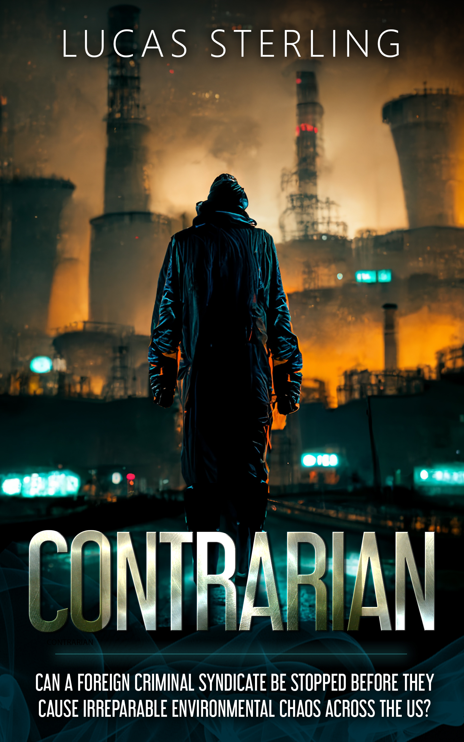
Very cleanly done. I have four suggestions:
- Either make the central silhouette bigger, or lighten the background right around him to make him stand out more, especially in thumbnail.
- Make the darks in the title lighter so it can be read at thumbnail size.
- Where’s the byline?
- The length of your tagline is cumbersome. Try to distill it down to something pithier.
Other comments?
I think the biggest problem lies in the tagline: it’s too long—definitely too long for the condensed typeface you’ve chosen.
The textures in the title don’t really add anything to the cover, other than to make the title hard to read in thumbnail form.
I wish there was a little more suggestion of character/personality in the central figure. It’s one of the problems with showing figures from the back: it’s hard to convey personality and expression. And you lose the immediacy you can get by making eye contact with the potential reader. In this case, the figure is also essentially a silhouette. So you have pretty much an uninformative black hole in the middle of the cover. On the plus side, there is enough of the costume showing and enough of the pose to convey a sense of foreboding or something sinister…but not much more than that.
I also find no value in the figure. How does wearing a Hefty bag make one a contrarian? If applicable, a figure facing us wearing a Hazmat suit would convey more.
Tag is far too long and cumbersome.
Byline is far too timid.
I agree the texture on the title looks cool at full size but it all but vanishes at thumbnail.
I would move the taller title to the open area above and the byline to the bottom, with the tag in the less interesting part of the lower image.
https://i.imgur.com/hK9uOF6.jpg
New figure:
https://i.imgur.com/4UrhD0F.png
Hmmmm, okay.
Technologically, hard to fault. As our Fearless Site Owner says, cleanly done; I personally love the shading/ombre-ish effect on the text–if it didn’t screw up the readability at the size that 99% of all people will ever see that cover, initially.
I’m not sure how I feel about the lava/fire-sleeve effects. I mean, I get why they are there, but the lighting source for them confuses me. Having said that, let’s not kid ourselves that the typical reader/buyer of books sits around caring about that crap–they don’t. For them, it’s the eye-catching contrast and if it works…(shrug).
I do agree that the silhouette is a bit…I don’t know, off-putting? He feels creepy, like a horror-movie villain, rather than a protagonist??? Not sure what, exactly, is making me feel squishy about him, but that’s my reaction, for whatever it’s worth.
Yup, that tag line? GOTTA GO. “Irreparable environmental chaos” needs to be replaced, certainly. For the purposes of the COVER, why does it matter if they are foreign? Or a syndicate? Why not simply “criminals,” or singular, if that works? Why “across the US,” instead of “in the US” or…something shorter? it’s horrendously too wordy and worse–far worse–it’s eye-glazing. Not good and as a reader, it would make me keep looking on a list of search results, which is, to repeat myself in two languages, no bueno.
I love the strong use of contrasts; you neatly and subtly worked in that ubiquitous orange/teal theme that we’ve been inundated with (to good effect, don’t get me wrong!) all these last 10 years. I think Brave really started it, possibly, but it’s been everywhere since then. Nicely handled.
Lots to like here, but it needs…something. Perhaps a bit of emotional distance and a rework.
I made the tag pithier.
https://i.imgur.com/gL45EYA.jpg