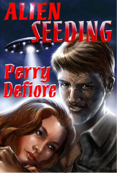
Tropic Death [resubmit]

The publisher says:

This book was first published in 1926 in the Harlem Renaissance. Short stories, fiction, about life in the Caribbean at that time. All the stories have a sinister ending: getting leprosy in Panama, a poor kid dying from eating too much dirt, a vampire bat, etc. For anyone interested in the Harlem Renaissance or colonialism: fans of Toomer, Hurston, latin-American writers, etc.

[original submission and comments here]

Nathan says:

My honest-to-Pete first reaction: “Where are the dinosaurs?”

I think you’re still flailing. If the significance of this book is its relationship to the Harlem Renaissance, show me something indicative of the Harlem Renaissance.

I’ll repeat my advice from the first submission:

I find that covers for new editions of “significant” literature from the past works best using one of two starting points:

    • A photo of the author.
    • An image sourced from the time period of first publication.

Other comments?

Reptiles in Love

The author says:

Set in New Orleans LA An alien hiding in New Orleans, now known to FBI who is investigating him. There is a series of murders, investigation by female detective, also complicated by a spiritual assailant/witch.

Nathan says:

It looks like the disparate cover elements have been assembled without a plan. For instance: The male figure is too large to balance with the female figure beside him, but he’s not so large that he intentionally dominates the layout.  And the woman up top, instead of adding anything to the first impression, just obscures the New Orleansiness of it all. (The Poser-made male also clashes with the photographic female.)

My advice: Scale down the number of elements so that in thumbnail it communicates clearly at first glance.

Other comments?

When the First Conker Falls

The author says:

Historical fiction/Coming of age and adventure mainly based in late 1960s rural England with elements of magical realism. At its heart, a boy’s love for his dog. Should appeal to readers of books such as ‘A dog’s purpose’/’Old Yeller’/’The art of driving in the rain’

Nathan says:

This one’s got conceptual difficulties. I might have gotten “rural” and “dog” from the cover, but the ghostly eyes and the suspense-thriller tagline work against the description you give.

If the milieu/setting is an important draw for the book, then I need to get a hint of that on the cover. If the boy-and-his-dog element is as important as you say it is, then I need to get a hint of that on the cover.  (Just a dog doesn’t cut it.)

I think you need to start by finding or creating (or having created for you) an image of a boy in dated clothes with his dog. Couple that with an era-specific typeface, and then start experimenting.

Other comments?

Abandon Us

The author says:

A BLOODY CIVIL WAR A RAPIDLY COLLAPSING ECONOMY A DEADLY GLOBAL PLAGUE

Twenty-eight-year-old service technician Robert Ashton endures dangerous city streets trying to scrape by. His partner Zilv is his only light in a world enshrouded in polluted darkness. As society buckles, the pair finds safety in the city’s underworld. Working as a smuggler, Robert builds a new criminal life to keep himself and Zilv fed. Soon, the battles from the world above seep down into the underground, forcing Robert to return to the surface. In the hellscape of the Third World War, he endures a nightmarish wasteland of violence and death. When civilization falls apart, just how hard will a man fight to live?

Abandon Us is the prequel to E.T. Gunnarsson’s multi-award-winning book Forgive Us, a story readers call “thrilling, brutal, awesome, and completely unique.”

Nathan says:

Because this is a prequel, it’s important to see what branding has already been established, so here’s the cover for the previous book, Forgive Us:

Definitely on-brand, then.

I’m going to make one suggestion for the front of the Abandon Us cover: Make the human figure larger. (One of my rules of thumb: “Nobody feels bad about not seeing feet.”)

And for the back, I’m going to suggest that a serif font works increases the readability of big blocks of text.

Other comments?

Rosie’s Flowers

The author says:

A picture book about a cute little mouse who is a fanatical gardener. It covers the topics of nature, friendship, and determination. It is aimed at 0-6-year-olds. It is very sweet and of course, has a happy ending.

Nathan says:

I think this is adequate as it stands, so let’s see if we can make it more:

  • While the title type is okay, it would be confusing to beginning readers.  If you could find an iteration or substitute in which the letters didn’t randomly change size, that would be perfect.
  • You don’t need to tell me that it’s “beautifully illustrated” — a sample illustration is there on the cover, so I can decide on my own whether it’s beautiful or not.
  • If you must tell us what the story’s about, put it under the title, not the byline. “Rosie’s Flowers: A Story About Friendship and Nature.”
  • Then you can just leave the byline as “Steven Tod,” or “Written and Illustrated by Steven Tod,” or “Words and Pictures by Steven Tod,” or…

Other comments?