The author says:
This book is a children’s picture book good for ages 6-10.
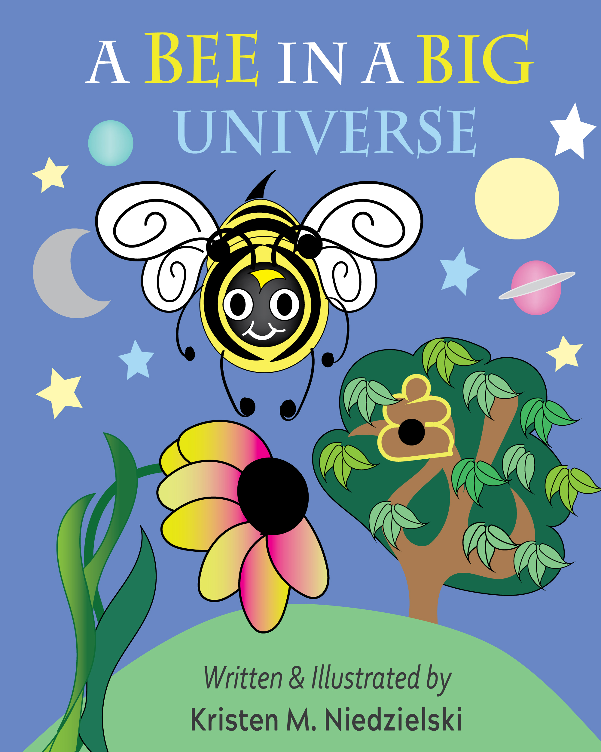
Brain the Bee is dared to fly to the end of the Universe by his best friend Sam the snail. He is confused and decides to go on a quest to find out more about our vast world and beyond. In this quest, he finds out what stars are, what is a planet, and what the big Universe is all about. Will Brain be able to fly to the end of the Universe, or will he find answers in the night sky. Fly with Brain and learn what it means to be a Bee In a Big Universe.
There is also a great story of friendship in the book. There are many science facts and bee facts. It’s a very good educational book that’s easy to read.
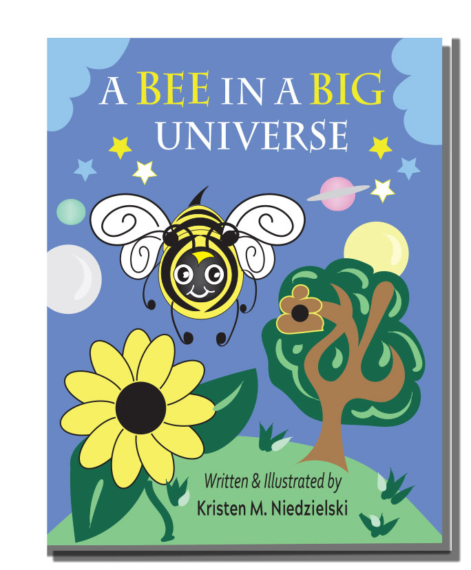
Two versions to see which you like better.
Nathan says:
Of the two, I like the second one better; the title doesn’t seem as cramped, and the complete flower would be easier for a preschooler to identify.
As further improvements, I would reduce the flower’s size and use the extra room to move the bee down and make the title bigger.
Also, the beehive in the tree looks like the poop emoji.
Other comments?
Not too much to add to what Nathan said…and I certainly agree with him about the beehive!
The only thing I might suggest is a second look at the big flower on the left: it is really overwhelming. The eye tends to go directly to that big black spot.
I suggest a more fun, kid-friendly typeface for the title. I also agree with Nathan about the full flower.
I also prefer the second example. There are too many primary elements, and secondary elements which don’t directly serve the concept.
Make the tree smaller as a background element and lose the poo emoji.
Leave the flower in place but reduce it slightly, then move the bee to the right to balance the two elements in the space.
I don’t think the planets add anything since the Bee’s universe isn’t the literal universe but more like a neighborhood.
Either have stars or clouds, but not both. For stars, darken the sky and horizon. For Clouds, keep it brighter, but a little darker to make the Bee and flower pop.
For either I’d suggest a more distinct difference between the two colors of your background gradient. Possible a yellow or orange below transitioning into blue.
A quick mockup: https://i.imgur.com/p975m8c.jpg
Thanks everyone. The story really is about the Universe, the stars, and planets-he learns about them by looking into the night sky and from his mom and friends. I watched Nova the TV show, and thought the meadow with all the bees and flowers looked like the Universe. I was just trying to explain the concepts of big and small and cool things about space. Sounds wierd but it makes sense in the book.
Yes, someone else did say the beehive looked like the poop enoji. I will change that. Also I did recently fool around with some fonts for the title-something a bit more fun. The colors of blue match the sky colors in the book, so I may have to keep it that color to be consistent, but I may be able to do a darker gradient at the top-we’ll see. I wasn’t sure which one I liked better, but I see the improvement in the second one. I’ll change the poo bee hive to one that’s rounder-beehives are brown paper like things. WE had one on out telephone poll. It hung down over our driveway-but the bees never bothered us. WE have nice bees.
https://i.imgur.com/XCKpqrZ.png
It’s very very cute. Still the blue dosen’t match the interior of the book. Thank you for trying.
Obviously it’s not meant to be your finished artwork but rather suggest ways to simplify to give the important elements more focus. The submissions are simply too busy. Ironically.
LOL (too busy…mwahahaha).
I do like the ombre fade, though. I like the suggestion of sky-up-to-outer-space!
To better convey the universe.
Yes, agreed. That’s what it said to me, anyway.
Kristin:
For the title font what about Two Fingers Bodoni Regular? Might that work?
I mean, sure, there are myriad more “kiddie” fonts, like Hank BT or LifeSavers, etc. but I was thinkign that TwoFingers might just
be right. I haven’t played with a mockup, though, so…it’s entirely possible that it would be godawful. LOL. I always need to mockup and LOOK. Otherwise, I can suggest some pretty egregious layouts. !
I would prefer the first one because of the contrast of colors there.
There are lots of kids’ books with much more brighter and colorful covers and yours might get unnoticed when grouped with other books in your genre.
(As a rule, I pretend I’m a kid in the age group of the book I’m writing and ask myself if I would be awed by my own cover.)
I agree that the font should be more child friendly like the one in the mock-up shown to you.
The Bee is the main character of the story and ought to be in the middle of the cover where it can be the main focus of attention.
I would suggest adding more colorful (non-yellow) and smaller flowers to the hill, as was shown earlier to you here: https://imgur.com/XCKpqrZ
The bee is already yellow. Having more yellow flowers takes away from it, so use contrasting colors to highlight the bee’s color to make it the main focus.
Also if the bee will go to outer space to see the universe – which is usually darker than the color you have in both covers, it would seem proper to add a darker gradient of blue to differentiate the space background (where the planets/stars will go) from the sky background where the clouds will be.
Again the example shown to you in the link above shows this feature quite well.
It isn’t easy to come up with a great cover so I wish you all the best!