First Steps

The editor says:

Each story was written to the the theme of “A short fiction piece between 800 and 5000 words, in which the main character is traveling, either in flight or on a journey of self-discovery.” This book is the first anthology of short fiction by members of the Madrid Writers Club in Spain.
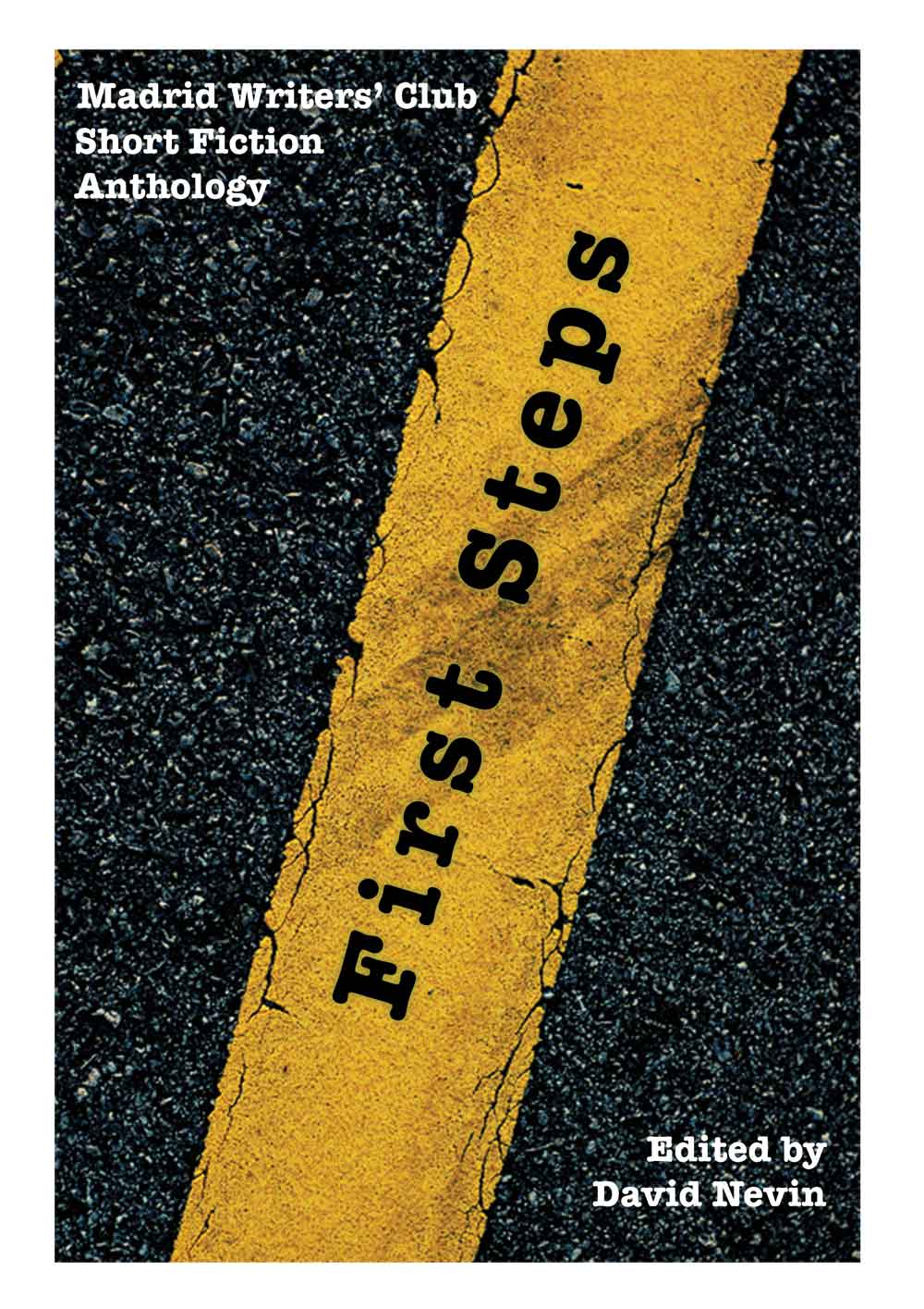
Anthology1

Anthology1


Nathan says:

I like the idea, and the image. Here’s what I’d do:

-The further text is from horizontal, the harder it is to read. Even another ten degrees toward the horizontal would help.

– Put the writing and editing credits together (don’t worry about not overlapping the yellow strip).  That will also give you more room for…

– A subtitle (or supertitle) of some sort. Something like “Fifteen [or however many] Voyages of Discovery.”

Any other ideas?

Tesla’s Signal [resubmit]

The author says:

A classic-style SF novel. Visionary genius Nikola Tesla sends a signal to “Mars”. When the “Martians” respond, their agenda is not so benevolent. Soon Niko and his colleague Clara are in hiding from alien captors and human law enforcement alike. They are the only ones who can save humanity. Based on the real life of Nikola Tesla, except for the alien invasion. A previous version of this cover was submitted in July 2014

TESLA's SIGNAL version3

TESLA's SIGNAL version3

[original submission and comments here]

Nathan says:

Maybe it’s just me, but I think this is a step backwards.  The almost monochromatic color scheme is less interesting, the Tesla tower fades into the background and is almost invisible at less than full size, the blue block at the bottom keeps all the text from being a part of the whole design, and the tinting on the old photos makes them look… well, poorly tinted.

I think the best way to go with the photographs is lose them entirely.  Tesla’s name will be enough of a signal to readers familiar with him.  Add weight to the tower, add back in some color, and make the text part of the image instead of keeping it separate.

Other options?

Among the Red Stars [resubmit]

Cover aged2

Cover aged2

[Original submission and comments here]

Nathan says:

Quite a lot of little tweaks here, most for the better.  Here’s what I’d still have on the to-do list:

  1. Still more contrast to the artwork. Until I can clearly tell in the thumbnail that I’m looking at an airplane, the artwork’s not doing its job. (If you’re hesitant to lighten the foreground airplane further, maybe you could try increasing the red sunset glow behind it to make it stand out.)
  2. Play with the font for the supertitle text — perhaps something serif and period-appropriate.
  3. I’d make it “daring Soviet airwomen.”

Other ideas?

Art and Humor [resubmit – previously Art For the Unwashed Masses]

The author says:

Target audience: Adults and kids who like color and clean humour. I have implemented many of the changes suggested here, as they were very good ideas. I am also considering the following title changes. Again, my objective is to cause a browser to open the book to see if he or she wants to buy it. In your view, will it have this effect? Possible title/subtitle combos include: 1) Title: The ART of the Unwashed Masses Sub: Art and Humour for the common man 2) Title: Art and Humour Sub: A visual Guide to the Curves of Life 3) Title: The ART of the Unwashed Masses Sub: Cautionary tales to guide the common man 4)(current post) Title: Art and Humour Sub: The Illustrated Adventures of a Roving Artist Or any combination of the above. Your thoughts, and new ideas, are much appreciated, Will

Art for the Unwashed Cover1

Art for the Unwashed Cover1

[Original submission and comments here]

Nathan says:

That’s the one weak point of this kind of crowdsourced critique: You’ll get differing, and sometimes contradictory advice.  Here’s mine:

I don’t like the title featured here. I know some people had problems with the original title (I was not one of them); I think that this one is far too generic. I also realize that you’re limited in your ability to retitle, as the word “Art” is part of the artwork and you have to work the rest of the title around it.

And your name could be bigger still. Self-publishing is not a venue in which modesty is a virtue!

I’ll leave it to others to debate the options for your new title.