The editor says:
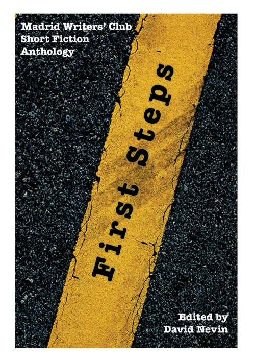
Each story was written to the the theme of “A short fiction piece between 800 and 5000 words, in which the main character is traveling, either in flight or on a journey of self-discovery.” This book is the first anthology of short fiction by members of the Madrid Writers Club in Spain.
Nathan says:
I like the idea, and the image. Here’s what I’d do:
-The further text is from horizontal, the harder it is to read. Even another ten degrees toward the horizontal would help.
– Put the writing and editing credits together (don’t worry about not overlapping the yellow strip). That will also give you more room for…
– A subtitle (or supertitle) of some sort. Something like “Fifteen [or however many] Voyages of Discovery.”
Any other ideas?


I also find it easier to read from top to bottom and from bottom to top.
It is a bit hard to read the white text because of the mottled road.
I suggest outlining it in a faint black line to help legibility.
Maybe this is okay for an anthology of short stories. The cover doesn’t seem unprofessional, but it just doesn’t seem like something I’d like to have on my Kindle or bookshelf.
I know this is a tiny thing, but the words ‘First Steps’ don’t quite align to the same angle as the yellow line on the road. They are close to being at the same degree, but not an exact match. Once I noticed it, the misalignment is what I keep noticing.
I like the idea behind the book’s title traveling along the yellow line of the road; I just don’t think the image needs to take up the entire front cover and that it isn’t working quite as well as it could because the text direction conflicts with the direction readers take when viewing a cover (top to bottom).
I’d suggest a ‘text on a block of color’ at top and bottom might help to make the subtitle and author name (or rather the editor’s name in this instance) pop and give room for those details to span from left to right so they become visible even at thumbnail size; and either rotate the title so that it is on less of an angle as Nathan suggested or perhaps change the direction of the yellow line so that the title flows downwards instead of up to prevent the Editor details being skipped over. At the moment the viewing creates harsh angles (start at the top, travel downwards, take a sharp turn upwards to read the title, take a sharp turn downwards to go back and read the editor name).
Thanks for the excellent feedback. David Nevin