The author says:
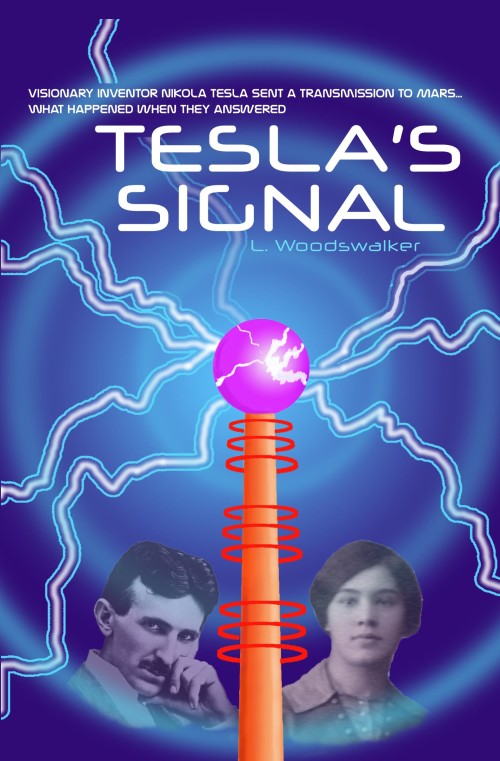
Visionary inventor Nikola Tesla and his assistant Clara must use their extraordinary talents and devices to save Earth from alien invaders. This is a SF novel set in the early 1900s, with the themes of advanced ‘weird’ science, alien invasion, mind control, interdimensional travel and telepathic beings. The target audience is readers of classic SF, and any fan of Tesla, who is a cult favorite of nerds and New Agers alike.
Nathan says:
The historical back-and-white photos look like they’d be more at home on a nonfiction book (especially the assissant Clara, since the poor quality of the photo makes it look like “this is the only documentation we have of her”). I’d say lose both photos, as they really don’t fit with the rest of the full-color cover. If you’re worried that that leaves the bottom half empty-looking, then move the Tesla tower further down the page, put your byline at the bottom (and make it bigger), put your blurb closer to the top, and increase the size of the title (which would also help correct the almost-but-not-quite-centered look). You might also want to experiment with making the dark blue even darker, and perhaps adding a subtle texture to it. (You could also play with adding a subtle texture to the main part of the Tesla tower; at full size, the computer-generated image looks a bit plain, and a slight texture could help set the tower off from the lightning emanating from it.)
Other ideas?


Not a bad concept, but it’s spoiled by cut-and-paste appearance of the heads (simple feathering can take care of that). The faces are crowded into the bottom of the image as well.
It would be nice if the art resembled a Tesla coil more, but instead it looks more like art from the Jetsons. It might work by itself but, as Nathan points out, the photos tend to clash with the style of the art.
The image of Tesla might work, though, if it were considerably enlarged and repositioned. Posterizing it slightly as well would make it more compatible with the Tesla coil. (And it might fit well if it were flopped left to right and the bottom right lightning bolt removed.)
I would certainly lose the image of the woman. Aside from not adding anything to the cover, it makes the book look like a biography (which I thought it was until I read the blurb). An image of the planet Mars would make a great replacement (and I would use a photo of a Lowellian globe as well, or another of that vintage).
Finally, the bolts of electricity look weak. I would give each a solid white core.
PS
A second thought: replace the globe in the middle with Mars. And have Tesla’s portrait fill most of the space below.
Adding to what others have said…
The tower thingy looks too cartoon-y and childish for my taste.
I like the idea of the tag line, but the way it’s written doesn’t quite work for me; I’d do something like:
In [fill in the year] Nikola Tesla sent a radio signal to Mars.
This is what happened when they answered…
OTOH, you might want to avoid being too reminiscent of the tag line to the movie Species.
Sans portraits, I think this is a good concept (it has a very old-school pulp sci-fi look to it, which is probably a good thing) and it looks fine in the thumb, but at full size, the execution is just not that good: The rings shouldn’t be solid-colored and aren’t erased quite right, the lightning should be variable width and should come from the sphere instead of from behind it, and all the edges should be antialiased so they don’t look jaggy. It needs to be redrawn or replaced with another image.
Sparks, properly done, not only look more realistic, but can really grab attention. The spherical wavefronts and b&w pics make too much blurriness. The orange, pink, and red don’t coordinate well. If the sparks are done well, you can do without the wavefronts; the cover seems too busy with both. Make it less busy, get the colors to work better, and pull the sparks off, and you may be able to pull this concept off.
Thanks for your helpful feedback, folks! I’m surprised nobody criticized the title font…