The author says:
A picture book with short humor featuring the artist’s art, writer’s short stories of 50-80 pages.(same guy: me) Cover objective: Make viewers want to own the book. Book objective: Create exposure to, and desire to own, the artist’s work.
Nathan says:
You’ve certainly got the illustration part down!
I only have three suggestions for the present cover:
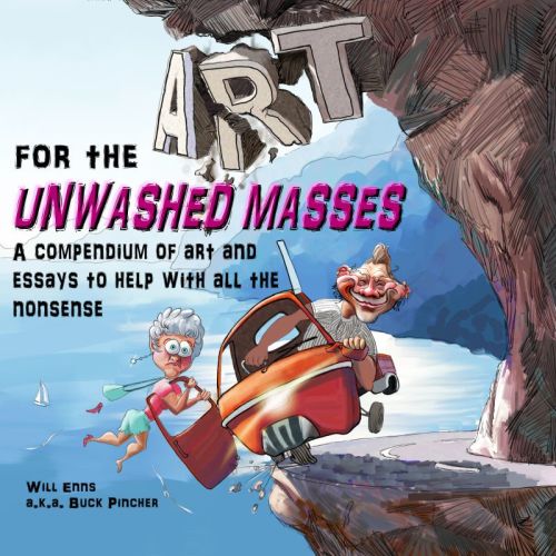
1) The way the title is placed, it looks like it reads “For the Art Unwashed Masses.” If you could put “for the” to the lower right of the huge “Art,” it would read more intuitively.
2) My rule of thumb is, “The smaller the type is, the more readable the font should be.” That subtitle/description is an awful lot of text to wade through in that irregular font.
3) Inflate your name, dude! The byline shouldn’t be the smallest thing on the cover!
Other thoughts?


Nice work. I will just echo Nathan’s comment about “inflating” your name. It should be much larger. Other than that, it looks very good to me.
Great illustration!
Nathan and Adrian are right about both the size of your name and the way the title appears to read.
My only comment is that the art seems to have nothing to do with the title of the book. If I were to see the title and the cover art separately I would never think they belonged to the same book. And when I do see them together on a cover, I find myself scratching my head and wondering if something might have gotten mixed up.
I had a little trouble reading the text on the cover. Like the illustration.
I like the illustration. Like everyone else, I have a problem with how the title reads, which now is “For the Art…”
Also, I think you need to finish the thought of the subtitle. All the what nonsense? Maybe “…with all life’s nonsense”?
The characters in the illustration are drawn in quite an interesting way, especially the face on the one on the right, and the background is OK, but I can’t make out what it is they are supposed to be riding in. It looks like a combination of a Dodgem car and an aeroplane fuselage. I think there are too many fonts and the text is too big. I would make ‘for the unwashed masses’ smaller and put it under the ‘Art’ and perhaps move the other stuff down to the bottom near the author name, and make that smaller and the author name bigger (just the first name and not the second, or vice versa depending on how you feel about their relative importance).
The car might be a Reliant Robin, I guess…but I still haven’t a clue what the entire illustration has to do with “art”—for the unwashed masses or otherwise. It’s a nice illustration but, so far as I can tell, completely irrelevant
Thanks everyone for your comments!
This is my first stab at book cover design.
Good critique is fiendishly difficult to get, and negative (constructive)critique is the rarest of all. I am seeing that here, and I thank you all for it.
I think the suggestions make lots of sense, and I will be implementing most of them.
My rationale: (not a defence, just an explanation)
-The cover art [is] a piece of art – that’s all it has to do with the title. It’s a sample of the art that is to be found inside, like the subtitle suggests. The comments here tell me the subtitle needs some tweaking.
-The objective of the cover is to get someone to look inside the book, not to tell the whole story.
-The vehicle is an Italian Piagio, a 3 wheeled mini pickup much used in Italy. We drove along the Italian Amalfi Coast, which looks pretty much like that, except for the word “ART” carved in the rock.
-The title story “Art for the Unwashed Masses” is a satire about the common man’s perception of art being produced today. It explores some of the different viewpoints that people express to me as an artist. The rest of the book has a variety of commentary and illustrations about subjects like fixing your car, fashion, government, etc. Hence the term ‘nonsense.’
Again, thanks to each of you who commented. Your honesty is much appreciated.
Will Enns
http://www.willenns.com
Thanks for the explanations! I think, though, that you may have fallen into the trap that ensnares many authors who are trying to create their own covers: lack of objectivity. What is meaningful and clear to you may not be quite so much for someone who is not as familiar with the book as you are.
Certainly, the cover is a work of art, but it’s not as obvious as you may think that this represents the “art” referred to in the title. Rather, it looks as though it should be illustrating the theme of the book (as explained in your fourth point)…but it doesn’t. The title “Art for the Unwashed Masses” accompanied by a depiction of a couple careening around a hairpin turn on the Italian coast simply seems like a visual non sequitur, like illustrating “Gone With the Wind” with a picture of someone salmon fishing in Scotland.
You are right in saying that the object of a book cover is to get someone to open a book and look at it…but neither should it be so confusing or irrelevant that someone may give it a pass or so misleading that they are disappointed if they do open it.
OK I googled it http://allcarznews.com/photo/im/piaggio-ape-150-c/06/default.htm That’s pretty cool, but could you modify the vehicle in the illustration a bit to make it look more like that? It’s mainly the front of it that looks odd. I assume the glowy bit in the middle is meant to be the headlamp now I’ve seen the original, so can you tone the glow down and draw the headlamp in more detail? It also isn’t obvious that the grey bit at the bottom is a front mudguard — can you make that a bit clearer so it’s more apparent that’s what it is?
This is really looking at the trees instead of the forest. First of all, it presumes that anyone would recognize a Piaggio if they saw one, accurately rendered or otherwise…and, frankly, I suspect the answer would be “no.” Second, it side-steps what I think is the overwhelming issue of the appropriateness of the artwork.
From what I gather, this is a book of the author’s cartoons, and since this is a cartoon by the author and reflects the nature of the book’s contents, it does not strike me as inappropriate. Customers looking at book covers will notice the ‘trees’ as well as the ‘forest’.
It’s an obscure thing illustrated in a bit of a distorted and two-dimensional way that compounds its obscurity and really does not help shed any light on it. I feel it needs to be illustrated in a more realistic and less conceptual way to help give some idea of what it is and how it fits together. A picture of a car drawn in an abstract or very simplistic way is identifiable by most people as a car, because most people are very familiar with cars as everyday vehicles. This is a novel vehicle that most people won’t be familiar with. A bit more detail is needed to get across the feel of it.
I certainly agree with your second paragraph.
The problem with the first is that no one knows the book is a collection of the author’s cartoons until they open it and look at it. Neither the cover art nor the title makes it really clear what the book is about. In fact, it was not until well into the discussion that I realized that the book was not about art in general. At the moment the entire cover is much too coy. I think a lot of the ambiguity could be cleared up by changing the subtitle to something much more explicit, such as “Cartoons and essays by Will Enns.”
I know the object under critique is the look of the cover, and not the text, but in this case I cannot but notice the text. There is too much of it, to start with, and secondly: Art for the Unwashed Masses? Since we don’t know it is a name of an essay in the book, we can only presume it is who the book is meant for. Say I am a potential buyer: I am not an unwashed mass. (I may be, but it is not something people willingly admit to. I also did shower earlier.) Thus, I obviously do not want this book.
Simply, the title and the cover illustration create only confusion when placed together. ‘compendium… nonsense’ should perhaps be in the blurb, and the cover only have name of book, and just simply ‘cartoons and essays’ as a description. The cover picture, on its own, is fine.