The author says:
A classic-style SF novel. Visionary genius Nikola Tesla sends a signal to “Mars”. When the “Martians” respond, their agenda is not so benevolent. Soon Niko and his colleague Clara are in hiding from alien captors and human law enforcement alike. They are the only ones who can save humanity. Based on the real life of Nikola Tesla, except for the alien invasion. A previous version of this cover was submitted in July 2014
[original submission and comments here]
Nathan says:
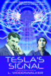
Maybe it’s just me, but I think this is a step backwards. The almost monochromatic color scheme is less interesting, the Tesla tower fades into the background and is almost invisible at less than full size, the blue block at the bottom keeps all the text from being a part of the whole design, and the tinting on the old photos makes them look… well, poorly tinted.
I think the best way to go with the photographs is lose them entirely. Tesla’s name will be enough of a signal to readers familiar with him. Add weight to the tower, add back in some color, and make the text part of the image instead of keeping it separate.
Other options?


Odd. The image in my email is purple and this one is blue. Either way, the bright solid colours seem to clash with the photographs. Since this is fiction, I also think you can drop the photos and just stick with the tower. Or at least, just have his picture and give it a treatment that will make the look more cohesive.
The photographs also look really blurry. If you absolutely have to have Nikola and Clara on the cover, I’d recommend paying someone to draw them for you.
The tower and electricity look a lot better, although your linework is still too jaggy and too uniform in width. I’d use a lightning effect like this one.
As for the photos, I agree that you just want drawings instead of photos.
After refreshing my memory with a click on the original, I disagree that this is a step backwards. It’s definitely better, albeit a bit on the blue side.
The tagline is difficult to read, and the tower is a bit on the ghost side.
I agree that Tesla’s name is strong enough that those two pictures may be unnecessary. They look better here than the first submission. But since they’re tinted blue—along with everything else—that I’m not sure that they’re helping.
Thanks for your comments! This image was done in CMYK and the colors in print don’t look at ALL like they do on the screen. In fact the image on this page looks like crap compared to how it looks in Photoshop and in print (I made a PDF and took it to a print shop. The result looks beautiful.)
One thing I have learned is how badly an image can be mangled by putting it thru multiple apps.
The reason I have the photos, especially the girl, is because without that, it looks too non-fictional. Putting a woman on a book cover about Tesla is a giveaway that it is fiction 😉
If so, you can use a better-quality photograph.
To me at least, the photos make it look non-fictional, because non-fiction books usually have photos of the subjects on the cover. (this biography, for instance, looks a lot like your cover.)
Hi! If I had a better photo I would surely use it… 🙂 my problem here is how to convert a print quality image into a low-res jpg that is small enough to upload to this site. I have no idea why the image reproduced so poorly.
Thanks for your comments! I have another version, but I don’t want to over-use this page. (how many versions can I upload?) I’ve fixed the color, put the Tower in positive color with some lightning and glow behind it, put some Space/galaxy imagery in the background…but as for getting rid of the photos…I respectfully decline that suggestion. (I have 300 dpi versions that don’t look blurry.) A human face will always attract more attention and interest than a device or landscape. Also, Tesla is a pretty recognizable face, so just using drawings of random people is a no-go. That would really offend my readers!
Tesla is certainly recognizable, but the woman certainly isn’t; you’re free to use some other higher-quality image for her.
There’s no hard-and-fast rule for the number of times you can resubmit, but I’ve noticed a relationship between the number of resubmissions and the dropoff of useful comments.
The “sticking with these images” idea seems to be pretty hard-and-fast, so the worst things(s) about this cover aren’t going anywhere. {shrug}.
And the author/publisher/cover designer is right–it’s his cover. If he feels that’s what is needed to sell the book, that’s his choice. I personally think it’s a bad call, but obviously, he’s not going to change his mind. Hopefully, the LITB (Look Inside the Book) will sell this title. As far as resubmission, I don’t know what would make the two images look commercial enough to make me change my feelings about their use.
FWIW.
http://www.amazon.com/dp/B005WKF97C And look what the Amazon box recommends – seems a bit similar? I am not sure what you should do or anything, but take a look.
Thanks, I own this book.
This is pretty much why I am adamant about keeping the photographs. Now I suppose I could put an alien ship in there or make Tesla holding a ray gun…naaahhh, I don’t think so.