The author says:
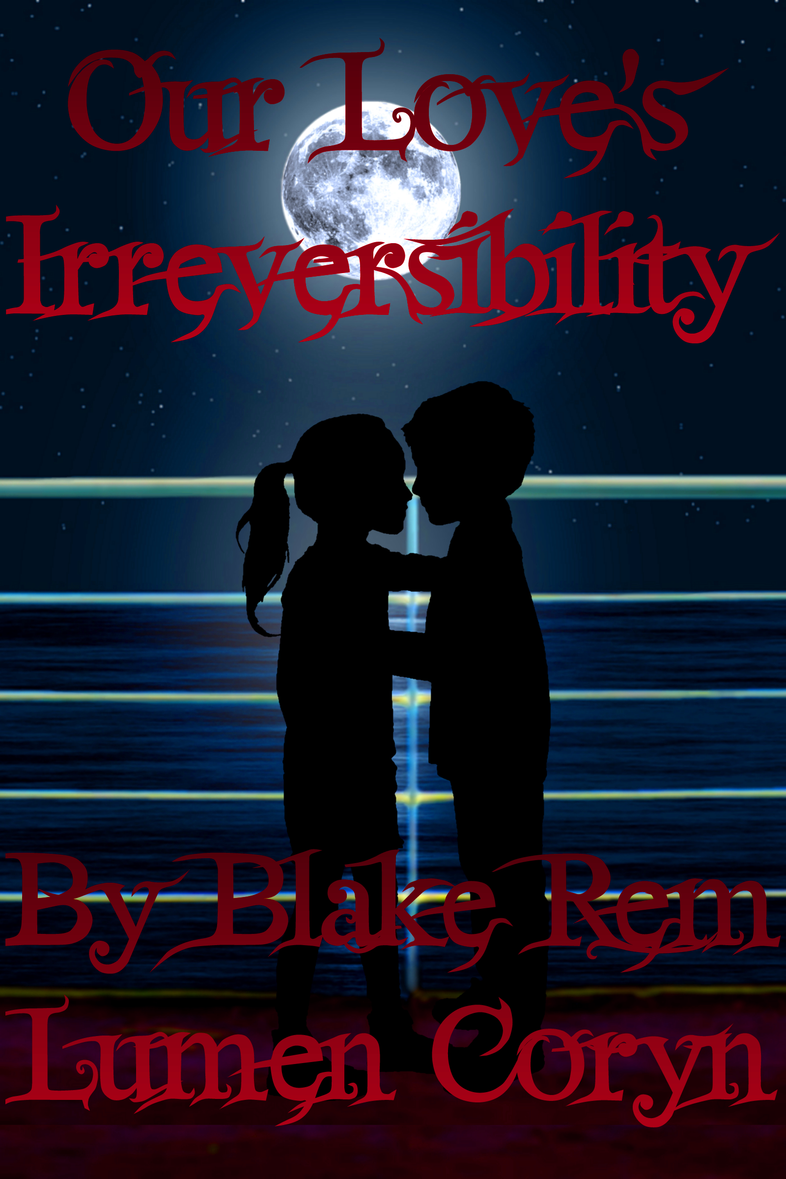
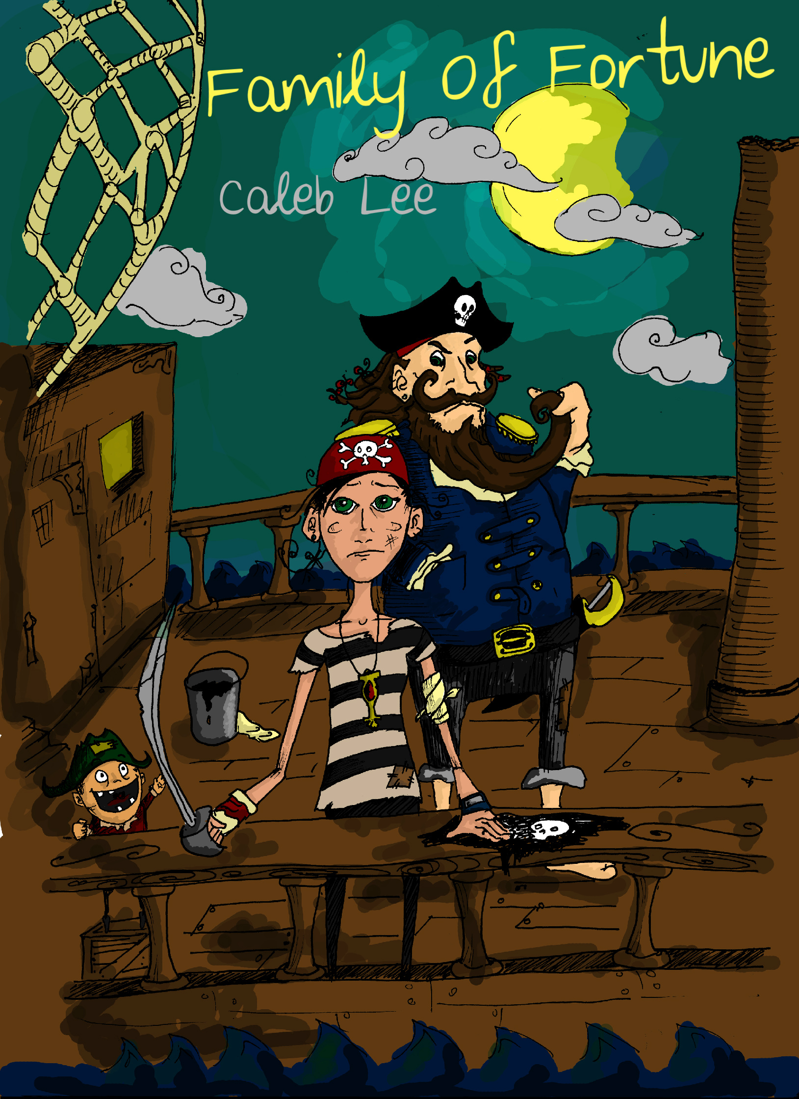
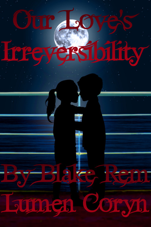
(Note to Mr. Shumate: I hope you’ll pardon the verbosity; this is a fantastically complicated story. Also, this is a *very* preliminary “scratch” cover: I haven’t finished writing the last third of the novel yet, and I’m considering hiring a professional artist to do the actual final cover.) Truth can be stranger than fiction, as Don Richards knows: his unlikely modern fairytale marriage with Denise, the unwed teen mother he hired to take care of his little son Jackie after his first wife died in a car wreck, has Don doubting his life can possibly get any more bizarre, even with their Carribean honeymoon cruise passing through the legendary Bermuda Triangle. Fiction, however, proves to have a few surprises of its own as the Bermuda Triangle proves to be a place in which paranormal events long dismissed as exaggerations and mythical mumbo-jumbo are rare, but do happen. The trouble is, when myths come true in reality, metaphor is powerless to dispel these paranormal events the way it does in all the made-up stories. In Mr. and Mrs. Richards’ case, this is especially problematic because their minds have also been swapped with those of his nine-year-old son Jackie and her eight-and-a-half-year-old daughter Jaymee, respectively. What will they do if their swap proves to be irreversible? This is an adult paranormal romance with just a hint of time travel and a kind of “trash TV talk show meets the Brady Bunch meets Freaky Friday meets John Varley’s ‘Air Raid'” plot to it.
 Nathan says:
(I hope the author doesn’t mind that I included his note to me in his description above, as I think it contains important information.)
Your cover ideas have good elements. I always encourage going with a professional, but the following may be helpful if you either decide to go it alone or want to give the designer other ideas:
1) Is your byline really “Blake Rem Lumen Coryn”? That may be your name, but I think it’s ungainly as a byline — there’s distinctive (e.g., Martin Smith adding his “Cruz” middle name to stand out), but then there’s unwieldy. People are unused to author names that are more than three names long — it doesn’t look like a name at first glance. I think “Blake Coryn” is distinctive enough to stick in memory much better than a four-part name would. (Also, once your name looks like a name, the “By” is unnecessary.)
2) There’s a lot of unused background space. Especially when you look at it at thumbnail size, you can see that the large areas of nothing-but-rail to left and right add nothing. You can make the child silhouettes larger and thus more immediately recognizable.
3) One of my rules of thumb is “big words need simple fonts.” Irreversibility (which my spellchecker isn’t even recognizing as a word) is a perfect example. As you can see especially in the thumbnail, the word easily turns into “bunch of letter that cause me to tune out.” Also, the gradient in both the title and byline reduces the contrast and thus the readability.
4) There’s such a thing as having too many things aligned to the center. Shifting the moon off to one side (my instinct says to the left, but I can’t back that up) adds a little bit of variety to the layout.
Other ideas?